Painting Kitchen Cabinets in Newton, MA

The last time I painted kitchen cabinets, it was to prepare a home for sale – and this time was for clients who just bought a new home!

My client Maggie and her husband just moved to a new home in Newton, MA and are in the process of freshening up the house and updating the style to their tastes.  Part of this project includes their kitchen – which had high-quality cabinets, but in a dark cherry color that does not fit with Maggie’s tastes or her plans for redecorating her downstairs.  Rather than incurring the high costs of replacing her kitchen cabinets, Maggie reached out to me to explore having them painted instead!

For the bulk of the kitchen, Maggie wanted to go with white to brighten things up and make the kitchen look more modern.  Maggie has also had white kitchens in the past and strongly prefers the clean look of white to the dark wood.  For the island, Maggie wanted to spice things up and add a contrasting, bold color.  To tie in with surrounding rooms, she wanted a darker color in the green family – but she still wanted to keep it bright.  After looking through options, Maggie gravitated toward a darker green in the teal family, and ultimately decided to go with Benjamin Moore color “intercoastal green”.

With colors decided, I proceeded to go through my typical process of removing cabinets, sanding, priming, sanding, painting, more sanding(!) and more painting.  In the end, Maggie and her husband were thrilled and are enjoying their "brand new" kitchen!!

There is still some work to be done to the walls behind the cabinets – but following are the “before” and “after” shots of the kitchen so far!

Enjoy,

Jason

The kitchen before painting

The kitchen before painting

And after!

And after!

close-up of the island

close-up of the island

Commissioned Art; Turning a Snapshot into a Treasured Gift

Last year, my client Aubrey came to me to create a special present for her boyfriend Vito – and she came back to me to do another commissioned painting this year!  Vito is from Cirigliano, a picturesque town in Italy that Aubrey and Vito visited in the summer of 2016.  To celebrate Vito’s birthday this year, Aubrey wanted to take one of the many snapshots they took on this trip and turn it into a painting to be cherished for years to come.  Making this even more suiting, Vito is an art enthusiast who loved last year’s painting.

This year, Aubrey chose a photo from inside the city – with just a sliver of the rolling hills featured in last years’ painting showing in the background!  Making the painting even more customized, Aubrey is featured in the picture, strolling up the narrow street appreciating the amazing old buildings.

We went with a final size of 12”x9” (making Aubrey’s portrait in this piece the smallest face I have ever painted!).  Aubrey wanted to stay pretty true to the photo, with small tweaks to lighten the shadowed areas, remove the overhead wires and accentuate the carving on the door she is looking at. 

As I did with the last painting, I joined Aubrey at the framer to pick out the ideal frame to complete the gift.  I was first to the framing shop, and the framer actually recognized Aubrey in the painting from meeting her the year before!

Aubrey was thrilled with the painting and - better yet - so was Vito!!

Enjoy,

Jason

The original photo

The original photo

The original photo, lightened

The original photo, lightened

The final painting!

The final painting!

Custom "Mural" on a Guitar Pickguard!

I love doing a variety of different kinds of projects!  Most recently, I had the opportunity take a new twist on my “statement wall” murals by applying the same concept to a guitar pickguard!

Since I am also a guitar player, this project was particularly enjoyable.  My client Greg was building his dream electric guitar, and while he knew exactly what he wanted in terms of the type of guitar and components, he wasn’t sure what to do with the colors and the final look of the guitar – which is when he came to me.

To keep a simple, classic vibe and also have the type of wood Greg wanted, we went with a maple neck and fretboard and a medium-brown stained ash body.  For the knobs and pickups, we used a classic Fender-style “mint” to add a splash of color while still keeping to the classic look.  However, Greg still wanted something to take it visually over the top to make the guitar unique and striking – which left the pickguard.

In looking at my work, Greg particularly liked my abstract “statement wall” murals where I start with a pattern from nature but blow it up and tweak the colors to make something new and dynamic.  Doing this with a pickguard was the perfect match with what Greg was looking for!

After sending him a number of pictures of different patterns from nature, we settled on this picture of agate:

JG agate 3.jpg

For the pickguard, I chose the section that work best with the shape of the guard and pumped up the colors to create a wild but classy look to top off the guitar.

Here is the final guard!  Below is the guard laid out with the guitar body, knobs and pickups to give an idea of what the final product will look like.  Now I can’t wait until Greg has it all put together!

fullsizeoutput_ba8.jpeg
fullsizeoutput_baa.jpeg

Enjoy,

Jason

Custom Furniture Painting

The key to a lot of the work I do comes down to the word “custom” – and a couple of recent painted furniture jobs are great examples!

The first example is a table my client Amy had made to fit a sitting nook in her home.  Once the table was complete and in its raw-wood form, Amy contemplated many different finishes to fit her space.  Because I was part of these conversations with Amy and her interior designer, I was keyed in to Amy’s thoughts and preferences.  We went from using greens and golds in a distressed and striated pattern to a red to white-wash.  With the green and red samples, Amy liked the idea of making the table a statement piece – but ultimately decided that the table was too large in a relatively small space to make it such a bold statement.  She did like the striated pattern in my first green and gold concept, and also liked seeing some of the grain in the wood – which is what led her to considering the whitewash option.  This ended up being just a little too busy, however – and her designer recommended a flat color, using a neutral but very pretty color called Purbeck stone using Farrow & Ball paint.

After applying primer and 2 coats of the paint, I lightly sanded the surface to apply a third and final coat --- but ended up loving the sanded surface!  The result was a very subtle striation from the grain of the wood; where the grain was raised got sanded to a smooth matte finish, while the valleys of the grain retained the eggshell finish of the paint.  The sanded finish was beautiful to the touch and visually captured all of the things Amy had been looking for!  We accomplished the striated look of the grain, while keeping it subtle and not too busy.  The new finish also became something special and distinctive without being too bold.  I called Amy and she came to my studio that day to see what I ended up with – and absolutely loved it! 

The second example is a backgammon table my client David had made – which also was in its raw-wood state when I was called in.  In this case, the legs and frame of the table were upholstered in a silver leather and the outside of the backgammon table (when closed) was finished in a textured and patterned fabric in white and grays.  David’s initial instinct was to paint the backgammon board in just black and white – but after talking through options, we ended up working with the colors in the table and the room to incorporate 2 different grays with black and white.

After prepping and priming the surfaces, I painted 2 coats of the base colors – using a lighter gray for the board background and a slightly darker gray for the frame/surround and the trays on either side.  I then measured out the space to draw the correct number of triangles  - which I ultimately painted using tape to keep crisp edges. Finally, I finished it off with 3 coats of acrylic polyurethane to hold up to years of use!

The end result gave David and his family a functional backgammon table – but also created a piece that fit perfectly into their beautiful home!

Enjoy,

Jason

IMG_5264.JPG
IMG_5265.JPG
IMG_5260.JPG
fullsizeoutput_b85.jpeg
IMG_5301.JPG

Faux Painting to Add Subtle Beauty to a Room

I love doing custom faux finishes!  By changing from straight-forward single color walls to faux painting, a room can be transformed into something bold and dynamic to something with subtle beauty.

I recently worked with a client in Dedham who has a historic home with high ceilings and large rooms – where the more subtle approach was a perfect fit.  The main living room is divided by pocket doors, and was used as 2 separate rooms for many years as my client Susanne’s children used half of the space as a play room (which conveniently could be closed away with the large double pocket doors!).  Now that the kids are older, Susanne and her husband decided to re-claim the space and integrate it with the other half of the room.

To integrate the 2 rooms into one, Susanne wanted to match the faux finish that was in the sitting room – which was a very subtle, mottled treatment in a soft green color.  Since most faux finishes use multiple colors and different techniques, matching them can often be difficult – but I was able to deduce most of what I needed in the first visit to do a test board.

With the match done – I was on to painting the faux finish in the 18’x16’ room.  To accomplish the look, it was a multiple step process – starting with a flat color to match the under-color in the other half of the room. On top of this color, I applied another 4 layers of tinted glaze with a couple different techniques to build up the understated patterning and rich color.

Because the end result was so subtle, it was hard to capture with pictures – but below are some shots the give a sense of how the room looks.  Most importantly, Susanne was thrilled and is looking forward to decorating her “new” room!

Enjoy,

Jason

fullsizeoutput_b58.jpeg
fullsizeoutput_b8a.jpeg
fullsizeoutput_b88.jpeg
IMG_0059.JPG

Painting Cabinets to Sell a Home

I have previously written about painted cabinets in my blog, but usually I paint cabinets for homeowners who decide to extend the life of their existing cabinets by facelifting them with a paint job.  My most recent client also wanted to spruce up her existing cabinets – but in this case it was to make the house more appealing for sale!

My client Paula is a realtor who will be putting her own home on the market in the spring.  Paula’s kitchen cabinets were in very good shape – but she knows from experience that their dark cherry color is not what home-buyers want these days!  The trend in cabinets is to go with a painted finish, and Paula knows that having a kitchen that is in line with design trends helps to sell the house.

The kitchen has 2 banks of cabinets, and one half of the kitchen had newer cabinets that already had a painted finish in a slightly warm off-white.  To keep the kitchen cohesive, we chose a color that matched this perfectly.

With the color chosen, I was on to my usual process.  I first remove the cabinet doors (making sure to label everything carefully to make sure everything goes back together correctly!).  I paint the doors in my studio and the frames on-site.  All parts of the cabinets get scrubbed to remove dirt and grease, and then sanded to remove the sheen (shininess) of the old finish.  Doing this helps to make sure the next step – the primer – sticks for the long haul.  When the primer is dry, that gets sanded as well to make it nice and smooth and to also help bond with the paint.  Finally, I move on the paint – using a specialty cabinet paint that dries hard and flat for a durable and smooth finish.  This gets 2 coats with another sanding in between to help make certain the final finish is as durable as possible!

Often, I work with cabinets that have more wear than Paula’s did – and I can anticipate the improvements before I even start.  With this job, I was surprised at how much the paint improved the kitchen!  Paula was thrilled as well, noting how brighter the space was with the white cabinets, and how updated and modern the kitchen looked!

Below are some of the "before" and "after" shots of this project - enjoy!

Before

Before

After

After

Glazebrook before 4.jpg
IMG_4989.JPG
Glazebrook before 2 (1).jpg
fullsizeoutput_b24.jpeg

High Gloss, High End Faux Finish in Newton, MA

As a decorative painter, I am aware of the perception that faux finishes on walls are old-fashioned and out of date --- and looking at some of the sponge-painted finishes that were big DIY projects back in the 80’s and 90’s, I can understand why!

However, the right finish in the right space can be bold, fresh and downright opulent.  Of course, a good interior designer can make all the difference in making these decisions – which was the case with my most recent faux finish project in Newton.

Interior designer Jessica Seth of Jackson Seth Designs was working on a re-model project and called me in to help make the dining room a centerpiece of the home.  Jessica had already chosen a patterned grass paper for the ceiling and had the trim and walls painted a base color to work with the tones in the paper.  To take the whole look to another level, Jessica asked me to come up with a faux finish that would tie in to the darker tones in the wallpaper and have a mottled look – similar to venetian plaster but more subtle.  To pack some extra visual punch, she also wanted the walls to have a high-gloss finish!

As usual, my process started with creating a board to show Jessica my interpretation of what this could look like.  We reviewed my board and decided to look at another design option (more subtle in the patterning) and different gloss options for the homeowner to choose from.  Jessica and I were both happy to find that the client liked all the options – but after some fun collaboration, they settled on the more subtle pattern with the highest gloss as the final option. To accomplish this finish, I first did a 2-step glaze technique to produce the pattern that would not be too busy, but would still have nice depth and interest.  Once this was done, I was on to the high-gloss challenge!

Oil-based options offer a nice gloss with a smooth finish, but some are not well-suited for walls – and any of them would quickly yellow and throw off the color scheme!  Instead I used a water-based polyurethane, which can be challenging to get a smooth application.  To address this, I used a very low-nap mohair roller and applied 4 light coats – which achieved a smooth, even finish with a nice deep gloss!

Following are some pictures of the final result.  The wallpaper is not yet installed, but you can easily see how this finish is a great way to make a stylish statement!

fullsizeoutput_b42.jpeg
IMG_0016.JPG
fullsizeoutput_b43.jpeg
IMG_5194.JPG
IMG_5186.JPG

Enjoy!

Jason

Specialty Paint Repairs

How do you fix a damaged decorative plaster fireplace surround? How can you address chipped tiles without replacing them?  My faux walls are dinged, but I don’t want to re-paint the entire room – what do I do?  I drilled holes in the wrong place on my new cabinets – what now?! I want to address water damage without re-doing my entire room, is that possible?

These are all questions I have recently been able to answer with paint!

The first example is a fireplace surround in a Newton home that was originally crafted in decorative plaster.  The effect is fantastic, but unfortunately over the years, the plaster had chipped in many places – in addition to getting slathered in some sloppy painting. What was once an elegant look had become an eyesore in the room. To get this back to its original look, a contractor partner called me in!

After filling in the holes, I was on to my favorite part – mixing paint to match!  Each tile has multiple colors that make up the mottled pattern, and in each the colors are different than the next!  Toaddress this, I treated each tile like its own little painting.  Along the edges, I needed also re-create grout to cover the white wall paint that overlapped on to the tiles.  There were damaged areas in many places, but below are a couple of before and after examples.

Before and After fireplace (1).jpg
Before and After fireplace edge (1).jpg

The second example was a smaller fix to help complete a kitchen remodel. While the counter top and cabinets were being replaced, the homeowner wanted to keep the original tile.  This would have been no problem – but there were chips that presented a challenge to the contractor because the tile is no longer available and therefore impossible to replace! 

However, with some plaster and some careful color-matching, I was able to make the problem go away:

Before and After tiles (1).jpg

The next example is something I have done a number of times – touching up existing faux finishes!  In this client’s home, their entry foyer, stairway and upstairs hallway were all done in the same faux finish.  Overall, the paint was in decent shape, but after about 10 years of use, there were dings and wear marks.  Additionally, there was a finished basement that was done entirely in a different faux finish that had a good amount of chips and dings after many years of being the teenager hang-out space. Rather than re-paint all of these spaces, my client decided to save time and money and have me patch all of these spots by matching the faux finish in both rooms!  I forgot to take “before” pictures of the entry/stairwell space, but below is just one example of the many chips I needed to make disappear in the basement:

Before and After faux (1).jpg

Another service I have provided a number of times is touching up newly installed kitchen cabinets.  Sometimes cabinets are delivered with small dings, or sometimes during installation there can be some damage --- and sometimes, the holes are drilled in the wrong place!

Obviously with cabinets, I don’t need to worry about replicating patterns or complicated detail – but matching the color and finish exactly is essential!  Here are a couple of recent examples where I have helped make the new cabinet owners happy by making damage go away:

Before and After cabinet.jpg
Before and After grey cabinet holes (1).jpg

The final example was some water damage in an 1859 home in Boston.  The damage was an eyesore to say the least – but my client couldn’t get a quote to fix just that area (without re-doing the entire room).  Doing this was a challenge, as the paint color and finish for the ceiling, trim and wall all needed to match up – but the end result was one of the most dramatic before and after paint fixes I have done!

Before and After ceiling (1).jpg

Enjoy,

Jason

The 3 P's of How to Paint Cabinets

So you want to update the look of your tired old wood cabinets, but you don’t want the big spend of replacing them? Painting cabinets can be a fantastic answer to overhauling your kitchen or bathroom on a budget!


Like most projects, however, knowing the right way to paint your cabinets can make all the difference in how successful and long-lasting your efforts are.  Following are tips I have learned along the way that will get you great results that you can enjoy for years to come! 

At a high level, there are 3 P’s that need to be heeded to make your job a success… PROCESS,

 PREPARATION and the right PRODUCTS

The first step in the PROCESS is disassembling your cabinets by taking off all of the cabinet doors and drawer faces --- but don’t start yet!!  It may seem like it will be easy to put everything back – but it is essential that you know which doors and drawer faces go back where --- otherwise, you will create big headaches for yourself later on. First, make sure you have plenty of zip-top plastic baggies, a permanent marker and some masking tape. Then follow these steps:

1)    Inside of each door, put a piece of tape with a key code that is specific to that door/position.  For example, I always start at the top, left-most door and call it “T1” for “Top, number 1”. 

IMG_4914.JPG

2)    Before removing the door, mark with a fine-point sharpie where the tops and bottoms of the hinges are on the frames.  You will use these marks later to align the hinges in the same exact position for re-hanging

3)    Now take the door off by removing the hinges from the frame (they will still be attached to the door at this point)

IMG_4913.JPG

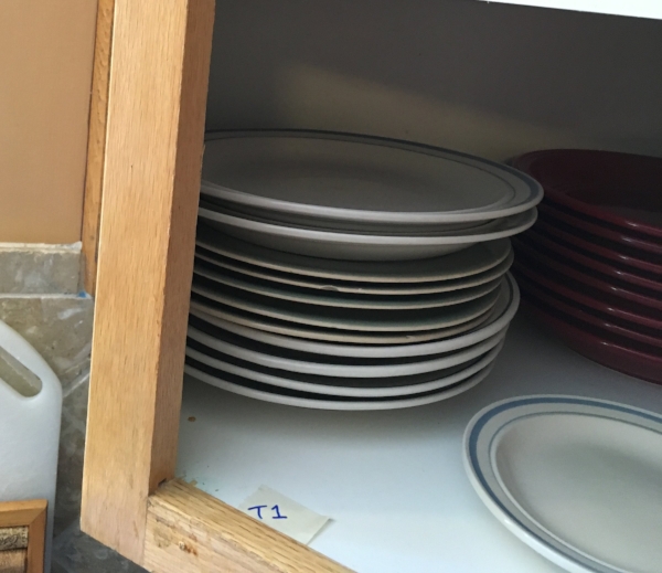
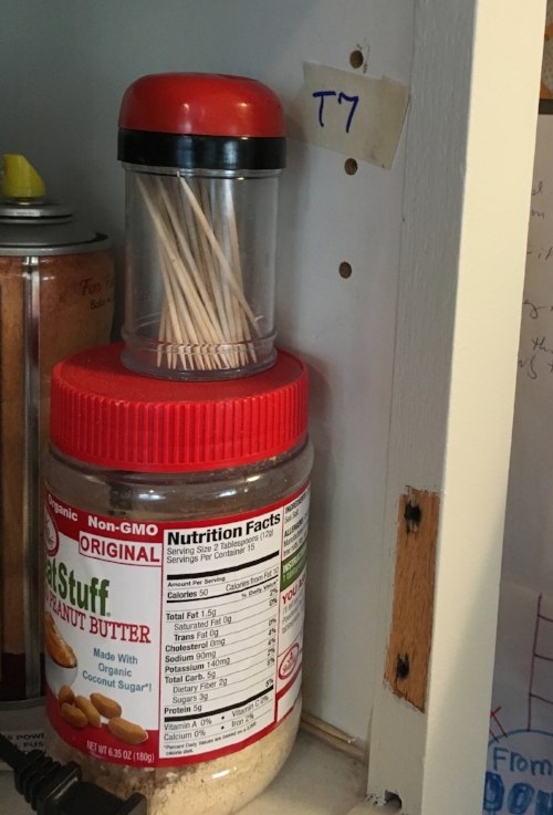
4)    As you take the hinges off the door, put tape on each one and mark it “T” for the top hinge and “B” for the bottom hinge.  The hinges and ALL of your screws then go into a zip-top baggie labeled “T1” so you know which hinges and screws go with which doors.  The handle/knob and associated screws for T1 also go into this same baggie.

5)    Finally, label the cabinet door with “T1”.  The best way to do this is to write it in sharpie on the inside of the door where the hinge gets mounted.  That way, your writing gets covered up when you put the hinge back on (just make sure you don’t paint over it!).

Repeat this process for each door and drawer face.  Each door and each drawer face gets its own code and baggie!  The naming convention is not all that important -- as long as it makes sense to you and you don’t re-use any codes.  I usually continue with “T2”, “T3”, etc on the top, then “B1”, “B2”, etc on the bottom and “D1”, “D2”, etc for drawer faces.  I keep all of the baggies with screws, hinges and hardware together in one bucket and put that aside in a safe place.

OK – now you have a stack of doors, drawer faces and a bucket full of hardware-filled baggies.  The next step takes you to PREPARATION – which starts with CLEANING.  Yep – it is not glamorous, but it is absolutely essential.  Paint does not stick to dirt or grease – so if you just paint over it, your paint will crack, peel or chip off.  Adding to this, cabinets by nature have way more dirt and grease than normal painting projects – so don’t use any past success you may have had painting without cleaning as your guide! For this cleaning step, I use a heavy-duty degreaser called TSP – which is specially formulated to remove grease and dirt for painting.  Because you want to paint a clean surface, I usually start with the frames and go right to the next step of sanding and priming – and THEN move on to cleaning the doors. When cleaning the doors, you will often need a scraper to take off heavy residue and/or old adhesive bumpers.

You are not done with PREPARATION yet!  A clean surface is essential, but paint also does not stick to the shiny surfaces you will have on your original cabinets.  To address this, the next step is sanding.  I use 220 grit sandpaper on a sponge sanding block and start with the frames.  Since you only need to dull the surfaces (not actually remove the finish), I hand-sand everything. You want to sand in the direction of the wood grain and make sure you hit all surfaces.  You can check your work by looking at your surfaces at an angle in the light – this will show you what is still shiny, and what is now nice and dull for painting.

Ready for paint?! Not yet!! There is still more to the PROCESS.  Now you have dust from sanding all over your project – so you will need to vacuum it off with a brush attachment and make sure your surface is dust-free.

Now, we are on to the importance of the type of PRODUCTS you use --- starting with the right PRIMER.  Primer covers any knots or blemishes in the wood, but more importantly, it acts as a bonding agent to make sure your paint gets good, hard adhesion for long life.  You will want to use a bonding primer for this; my favorite is a product by INSL-X called STIX that you can pick up at any store that sells Benjamin Moore products.  If you are painting your cabinets a medium or darker color, have your paint store tint the primer to get it as close as possible to the final paint color.  The primer will never actually match the exact paint color – but the closer you get it, the better your paint will cover the primer (a dark color paint over white primer is a big challenge!). To apply the primer and paint, I use a 1.5” high-quality angled brush to cut in the edges, and then a mini roller with a mohair blend roller sleeve to get a nice smooth rolled finish on the flat surfaces.  When applying primer, make sure you don’t let it drip or glop up anywhere – you want your surface to be as smooth as possible.  Prime all surfaces you will want to paint (both sides of doors, faces and edges of frames).  When priming the edges of frames, paint right up to your thin sharpie lines for the hinges so you know where to re-hang the hinges when you are done.  Likewise, do not cover the code on your doors and drawers as you will need that to be readable when you reassemble!

Paint around where the hinges go!

Paint around where the hinges go!

And paint around code on door (it will be covered by the hinge!)

And paint around code on door (it will be covered by the hinge!)

Let your primer dry – and then you get to sand again!  This is a light sanding to smooth out any brush marks or drips that also helps the paint bond to the primed surface.  And of course, now that you have sanded – you need to vacuum again!

OK – NOW we get to PAINT. Choosing the right paint may be the most important step of all in this process.  A regular satin or semi-gloss trim paint won’t be smooth or hard enough to get you a good cabinet-grade finish.  I recommend a urethane acrylic paint or a waterborne alkyd paint.  These give you the nice smooth leveling and hard finish of an oil paint, but the faster drying time and low fumes of a water-based paint.  My favorite is a product called Cabinet Coat by INSL-X, which can be purchased anywhere Benjamin Moore products are sold.  The only limitation of Cabinet Coat is that you can only get it in light colors.  For darker colors, I use Benjamin Moore Advance (Advance takes longer to dry and can be a bit trickier to use than Cabinet Coat, but it creates a beautiful finish!).  In either paint, I always use a satin finish – which gives you great washability but does not highlight flaws as much as semi-gloss or gloss paints will do.

When applying these types of paint – you want to do it in nice, thin smooth coats. You will have to do 2 coats anyway – so remember that 2 thin coats are much better than trying it in one thick coat!  Again, I use a high-quality brush to cut in the edges and a mohair blend mini-roller for the flat surfaces.  When loading the roller, make sure you don’t get too much paint on the roller as you don’t want to get the “orange-peel” look that can result.

Let your first coat dry overnight (read instructions on your paint – some paints need 16 plus hours before re-coating!).  Before applying your second coat, you will want to do another light sanding!  This is important for bonding purposes – you definitely want your second coat to stick to the first coat!

OK – you are almost there!!!  If you can, it is best to give your newly painted surfaces a couple of days to cure before re-assembling your cabinets.  Once you are ready to put everything back together, you will be very happy you followed this PROCESS.  Using your coded baggies, put the hinges back on the corresponding doors, and then hang the doors where you have your hinges marked….

And enjoy what looks like a brand-new room!

Before

Before

After

After

Before

Before

After

After

Before

Before

After

After

Illustrations of Antique Vehicles for the AACA Museum

I recently had a fun change of pace in my mix of projects when the AACA Museum (an Automotive Museum in Hershey, PA) reached out to have me do some illustrations of antique vehicles for them!

The museum is launching a new Automotive Heritage Award that will be presented at a ceremony coming up in October.  As the AACA team was designing the award, they settled on an approach that incorporated line drawings of 5 vehicles that would be etched into the award.  With pictures of the vehicles and a trophy vendor chosen, they just needed someone to turn the pictures into illustrations – and I’m thrilled they called me!

The first step was to collaborate on the final images to be used – pairing down a number of options to the final 5 images based on which would work best in the layout and would translate well into line drawings.  I then worked with the AACA team on the layout.  The plan was to place each image in a 2” circle and arrange than in a horseshoe pattern.  Based on this, I suggested we place images that showed a ¾ view facing right on the left side of the horseshoe so they point in toward the middle, and do the opposite on the right side.  For the top-most image, I suggested a head-on view to keep everything balanced.  Below is my (very) rough layout “sketch” to illustrate this

museum trophy rough layout.jpg

With this idea approved, I then needed to design the circle border that would be used around each vehicle illustration.  Rather than do just a circle or a decorative pattern, I decided to run with the automotive theme and use a steering wheel rim!  I looked online at different options, and landed on the steering wheel of the Austin 7 since on this car you can clearly see the ridges from the front of the wheel.  Below is the drawing that was approved to be used as the border around the vehicles:

Border for all_Austin 7 steering wheel.jpg

With this done, it was on to doing the final drawings! The images we chose were a 1929 Cord, a 1921 Duesenberg race car, a 1948 Tucker, a Gump Bus and a vintage police motorcycle.  The final images will measure about 1.5” in the largest dimension (to fit inside a 2” circle), but I drew them at 3” to capture more detail and then reduced the scans of my drawings to the final 1.5” size.

Following are the final drawings:

1929 Cord Drawing (1).jpg
1921 Duesenberg drawing.jpg
1948 Tucker drawing.jpg
Gump bus drawing.jpg
police motorcycle drawing.jpg

I was happy to hear that the AACA team was pleased with the results – and we all look forward to seeing them on the final trophy!

In the meantime, they sent me this proof of how it is shaping up!

AACA updated proof png.png

Enjoy,

Jason

A Mural of a Colonial Quote for a Colonial Home Remodel in Milton, MA

While most of my murals depict a scene or pattern, my most recent mural changed things up a bit with an Abigail Adams quote!

My client Suzy is in the process of refurbishing a beautiful home that was originally built in 1802.  While Suzy and her husband are doing a pretty comprehensive remodel, they are paying special attention to keeping the colonial style in tact.

Keeping this in mind, Suzy looked to history when considering how address a feature wall she wanted in a sitting room.  As a proud Massachusetts native, Suzy wanted something that was connected to the area while being consistent with the age of the house – and of course she wanted something that was meaningful to her!

To address all of the above, Suzy hit the nail on the head with a fantastic quote pulled from a letter Abigail Adams wrote to her husband John Adams in 1776:

“I long to hear that you have declared an independency.  And, by the way, in the new code of laws …I desire you would remember the ladies. …If particular care and attention is not paid to the ladies, we are determined to foment a rebellion, and will not hold ourselves bound by any laws in which we have no voice or representation.” (When Suzy first called me to talk through her idea, I was surprised to hear she wanted this particular quote as I was actually familiar with it!  My wife Gwynne uses this very letter when teaching her students about literature from this era.)

To keep with the theme, Suzy and I then looked for a font that would look appropriate for something written in 1776 without being too fussy.  To accomplish this, we landed on the font “Allegheny”, which worked perfectly!

The only decision left was the color.  To make it stand out without being too harsh, we decided on a taupe color that was slightly darker (but in the same family) as the window trim. With all of this decided, it was on to laying out and leveling the quote on the wall and painting it to keep the look of the Allegheny font!

Suzy and her family are thrilled with the results – and I am excited to see pictures with the special light she will have mounted above it!

Enjoy,

Jason

The wall before the quote

The wall before the quote

The finished product!

The finished product!

Transforming a Dresser With Faux Burl Wood Paint

In the process of moving and prioritizing furniture to keep, my client Nancy almost got rid of a small dresser that had a heavy, cracked and peeling coat of white gloss paint (over many coats of various other colors!).  In this state, Nancy didn’t see a spot for this dresser – until her sister (also a client!) suggested she have me do a faux wood finish similar to the look of a larger piece Nancy was going to keep.

Below are pictures of the dresser before refinishing and the “reference” bureau.  The first step was to scrape off all the loose paint and sand all the surfaces to clean it up as much as possible and to make sure my paint would stick.  Adhesion is always important – so my next step was to go over all of the painted surfaces with a good bonding primer (I have had great luck with a product called Stix by INSL-X).

The dresser before faux painting

The dresser before faux painting

The "reference" dresser

The "reference" dresser

Before painting the dresser, I then did some test finishes on a separate board.  First was the task of picking colors.  I wanted the result to look fresh and clean – but it still needed to have a slightly aged, yellowed cast to look in place with the other pieces.  To accomplish this, I chose a wood tone that was slightly darker and more yellow than “new” wood as a base color, and a slightly darker shade of the same hue for the wood grain on the sides and back.  For the burl, I used my fine-art acrylic paints and mixed colors using Nancy’s pictures of the larger dresser as a guide.  Once I was happy with the test – it was on to the dresser.

First, all surfaces got 2 coats of my base color and then I jumped into creating the faux wood grain on the top and back.  When this was dry, I went over the surfaces with a thin coat of dark walnut stain to get the color where I wanted it and create a more authentic stained wood look. The drawers I did using a chip brush and a few different colors of my thinned-down acrylic paint to simulate the swirling wood grain and knots of the burl.  As I did this, I put the drawers in the dresser to make sure the overall look was cohesive between the drawers and the dresser frame, and between the drawers themselves.

Once I got this to where I wanted it, I sent pictures to Nancy who thought it looked great!  To finish it up, all that was left was a few coats of acrylic polyurethane to give the finished product some shine and protect it for years to come. Now it just needs the antique brass knobs Nancy has for it!!

Enjoy!

Jason

The completed dresser (just waiting on knobs!)

The completed dresser (just waiting on knobs!)

Before

Before

After

After

Before

Before

Faux Painting Plastic to look like Aged Copper and Distressed Wood

I have faux painted a lot of different things since I started, but this was my first faux painting of a plastic Tower Garden!  My client Pam works with Juice Plus, and part of her healthy living offering includes a Tower Garden designed to grow vegetables and herbs year-round, inside or out.

While the Tower Garden is fantastically designed for aeroponic growing in a small footprint, the green and white plastic may not go with every décor.  To address this issue, Pam had me faux-paint her Tower Garden to look like the bottom tub and stand were aged, patinated copper, and the tower was distressed white-painted wood (the tower needs to stay light in color to prevent it from getting too hot).

My first challenge was making sure my paint would stick (which can be tricky with plastic!) to make sure the finish would be durable enough for indoor and outdoor use.  The lid of the tub and the tower just needed some good bonding primer, and I was ready to go! The tub, however, needed to be sanded first, before I could get the bonding primer (and ultimately the paint) to stick. With this addressed, I started creating the aged copper look.

As a first layer, I used a spray paint color called, conveniently, “aged copper”.  This gave me the metallic look that I needed and was a good, rich color to build off of. To make it look older, I then rubbed a dark brown exterior stain over the aged copper spray paint, rubbing it off in some places to reveal the glimmer of the metallic paint, but leaving it looking dull and smudged in other places.  Already I had the look of a large old kettle!  To complete the effect, I then added the patina, using the exterior stain in a color I mixed to get that great old-copper green.

For the tower portion, I started with an aged white color and then added in chips and wear in the areas where it would logically happen – using colors to make it look like exposed wood under the chipped paint and years of patina from outdoor use.

It was a fun project and best of all, it was exactly what Pam was looking for!  Below are some shots of the before and after -

Enjoy!

Jason

The Tower Garden before transformation

The Tower Garden before transformation

After!

After!

Close-up of the "copper" tub

Close-up of the "copper" tub

Detail of the tower

Detail of the tower

The lid showing that shiny and dull look

The lid showing that shiny and dull look

Nature's Faux Painting

Well, not painting really – but with all of my focus in making colors and patterns align seamlessly in my faux painting and restoration work, I definitely enjoyed this photo taken by my daughter!  As it turns out, she shares my appreciation for tricking the eye.

Can you find the toad in the shot below??

Here it is!!

And a close-up to show just how amazing this is:

Enjoy!

Jason

Mural Restoration in Brookline, MA

As I experienced during my most recent project, I have come to enjoy restoring murals almost as much as creating them!

When my clients Jean and Peter explained to their interior designer Anne Langton that they had a mural that needed to be repaired, Anne called me to come check it out.  The mural was originally painted in 1992 in a room of Jean and Peter’s house that began as a porch, but had been converted many years ago into a 4-season sitting room.  Even at 25 years old, the mural was in great shape – except for the unfortunate damage caused by a recent leak in the ceiling.  The water affected the walls as well as the ceiling, and the corner of the room would need to be re-plastered.  Fortunately, Anne called me in before the plastering was done, so I was able to see the mural in the damaged area before it was covered over.  In my first visit, I took pictures of the area that needed repairs and used my paint swatch books to match all of the various colors in the mural.

Once the plastering was complete, I came back to see some fresh white walls and other various patched areas that would need to be re-painted and blended to match the rest of the room.

I began along the ceiling of the damaged wall, making sure I had my paints mixed to match the off-white background as well as all of the subtle variations of color streaked over it.  With these colors matched, I moved to the right corner where the damage was worst.  Using my pictures, I was able to first re-create the breaks where the off-white blended with yellow and then into a light greyish-blue that is a continuation of water from the other side of the door.  With the background painted, I was able to replicate the leaves that were once there – and added my own twist with a branch that balanced things out nicely.  At the bottom of the corner, there was a distant mountain that needed to be replicated – and all of the areas needed a light wash of a taupe color to match the subtle patina of the rest of the mural.

There were a few other spots throughout the room that I touched up while I was there – and then I finished off by replacing the names of the original artists!

Jean and Peter were shocked and thrilled with the results… saying that it looked like I took a picture of the old mural and figured out how to stick the picture back up on the walls!  Following are some shots to show the original (damaged) wall, how it looked when it was plastered - and then the final result.

Enjoy!

Jason

The final mural including my repairs above and to the right of the door

The final mural including my repairs above and to the right of the door

The corner before plastering -- showing damage and original mural

The corner before plastering -- showing damage and original mural

The corner after plastering -- my newly white "canvas"!

The corner after plastering -- my newly white "canvas"!

The corner with restored mural

The corner with restored mural

The bottom corner before plaster

The bottom corner before plaster

The bottom corner after plaster

The bottom corner after plaster

The bottom corner restored!

The bottom corner restored!

Repairing Faux Wood Painted Trim and Doors

Sometimes the lowest-impact solution to a problem is the best! That was the case with my recent project helping my client Cathie fix up her dinged-up trim.

The trim has shown this wear since Cathie and her husband Kurt moved in, so they weren’t certain how the damage happened. After looking closely, Kurt deduced that instead of being stained wood as it appeared – it was actually faux-painted. When I came to take a look, I found that Kurt was right – and that it was actually the paint that had chipped off making the damage more obvious than it might have been if the woodwork was stained.

The solutions seemed a bit more difficult than deducing the problem, however.  One option was to remove the trim so it could be completely stripped down and re-finished – but this ran the risk of damaging the surrounding venetian plaster.  Another option would be to sand the trim down in place, but that would be less than ideal in terms of associated time, mess and cost.

After talking with Cathie, I offered a 3rd solution – which was to just re-paint the damaged areas – matching the existing faux painting around these areas to make it all blend in.  This would be tricky to match all the different colors and patterns – but certainly possible and far less impactful!

After less than 3 days on-site, I was able to take care of all the trim and doors on their second floor --- and the difference was significant!  Cathie and Kurt were thrilled with the results and how easy it ended up to get there!

Below are a few “before” and “after” pictures.  I forgot to get before shots of the doors – but these images of the trim help tell the story.

Enjoy!

Jason

A Mural of an Historic Airplane to Celebrate an Historic Pilot!

As part of my mural painting and commissioned art business, I get the opportunity to paint a wide variety of subjects – as witnessed by my most recent project! My client MaryLou reached out to me with the idea to paint a Boeing KC97 airplane as a present for her husband Bob.  Bob’s 84th (!) birthday is coming up, and flying for the Air Force after college is a treasured memory from his younger years.  The plane he spent the most time flying was the KC97, a mid-air refueling plane that he flew in 1957 and 1958..

To pick the location of the mural, we looked to Bob’s favorite spot to enjoy his crossword puzzles and the occasional golf tournament on television. His chair in this room looks up at a wall with a great horizontal space that is perfect for this 5 foot by 2 foot mural!  Rather than paint the mural directly on the wall, we decided to do this one on canvas so they would have the flexibility to move it if they need to down the road.

My first step was to measure the space to suggest a size that would fit the space well without overwhelming the room.  We also looked at the colors in the room to pick blues that would go with the other pictures as well as the rug in the room.

With this done, I then did online research on the KC97 and sent pictures that I was considering using to Bob for him to review.  Since I am not an expert on aircraft, I wanted to make sure I picked an image that was exactly what Bob was looking for!

With an approved picture of the plane, a final size and colors picked – it was on to the final painting!  Based on my conversations with Bob and MaryLou, I wanted to keep the painting very clean and bold – with the emphasis on the plane itself.  Since Bob is a history buff, it was also important for my details to be completely accurate!  With that said, though – I did decide to make one small change as a fun surprise for Bob by making the tail number his birthday!

When I delivered and hung the final mural painting, Bob and MaryLou were thrilled!  It was “even better” than what they had in mind.  Bob loved the accuracy of the painting – and the customized tail number was a hit.  Happy 84th Bob!!

Below is a close-up of the mural, a shot with me installing it to show the scale -- and a shot with the proud new owner!

Close-up of the painting

Close-up of the painting

Faux Wood-Grain Painting in Walpole, MA

According to Wikipedia,  "faux painting or faux finishing are terms used to describe decorative paint finishes that replicate the appearance of materials such as marble, wood or stone”.  While I have done faux finishing that replicates marble, wood and stone – I have also found that sometimes I need to replicate somebody else’s faux painting!

My most recent client Charlie called me when the faux wood-grain painting he had on the railings of stairwells in his home had worn off after many years of use.  Since there were 2 stairwells with this faux treatment and not all of it was worn down, we wanted to re-do only certain sections, touch up other parts and leave the portions without damage alone.  This meant that my challenge was to not only accomplish the wood look my client wanted, but also to match the previous faux painting job to make it all look seamless together.

To make sure my work would last, I began by sanding down the sections that needed to be re painted.  For the sections that needed touch-up, I used a deglosser to help with paint adhesion without marring the surrounding areas.  Once the prep work was done, I could begin the 4-layer process involved to recreate the wood grain look.   Most often when doing faux painting, I use latex interior paint (with lots of mixing to match colors!) and a latex glaze.  For this project, however, I found that I needed to use acrylic artist’s paints to match the saturation of color that was in the existing faux paint job.

Once I had my colors mixed and started laying in the “wood-grain” layers, it all came together! I was able to accomplish both the grain and the colors of the existing finish to the point where Charlie couldn’t tell where my work ended and the previous finish began.

By wrapping it all up with a gloss polyurethane, I was able to get all of the railings looking the same – and good as new for years to come!

Following are “before” and “after” shots of some of the section of the railings I painted

Enjoy!

Jason

Faux Painting to Match Barn Board

I have mentioned several times in this blog how much I like the diversity of the projects I get to do with BlackBeak Studios – but I also thoroughly enjoyed two very similar back-to back jobs that tested my faux painting and matching skills!

The most recent of these projects was part of a redesign of a unique space in Wellesley.  The room started as a partially finished garage, and it was being transformed into a game room with a golf simulator.  The homeowner worked closely with their contractor Tim to come up with a look for the room that included reclaimed barn board paneling on all of the walls – which looked fantastic.  The problem they encountered was with the windows (and the door frame!).  Once the barn board was installed, the plain, stark white of the windows and door frame looked completely out of place (the door itself will have a unique tin treatment).  They considered painting them a single color that would match the barn board as close as possible – but what they really wanted was for the windows to look like they were also made from the same old wood…. Which is where I came in!

I have worked with Tim in the past (matching wallpaper, matching damaged faux finishes), so he had an idea that I may be able to also match the barn board.  I first visited the space to get a sense of what was needed, and Tim sent me home with samples of the wood to help collect the perfect paint colors.

Once on site, I was able to dive right in.  I started by painting the windows in flat colors that I mixed to match the “general” look of the surrounding wood. I then approached each section of wood as a separate painting to make it look like the windows, like the walls around them, were made from different pieces of previously distressed wood. As a reference, all I needed to do was look around me!  In addition to the striated texture, I incorporated what I saw in the paneling – from knotholes, to water damage, to cracks, chips and even bullet holes!

For projects like this, just seeing that match come to life is extremely rewarding – but nothing is better than a happy customer.  Both the contractor and the homeowner were enthusiastic about the results!  Below are some of the pictures – enjoy!

Window 1 before

Window 1 before

Window 1 after

Window 1 after

Window 1 detail

Window 1 detail

Window 2 before

Window 2 before

Window 2 after

Window 2 after

Window 2 detail

Window 2 detail

Door frame before

Door frame before

Door frame after

Door frame after