Making a Dentist’s Waiting Room look like a Spa with Decorative Painting

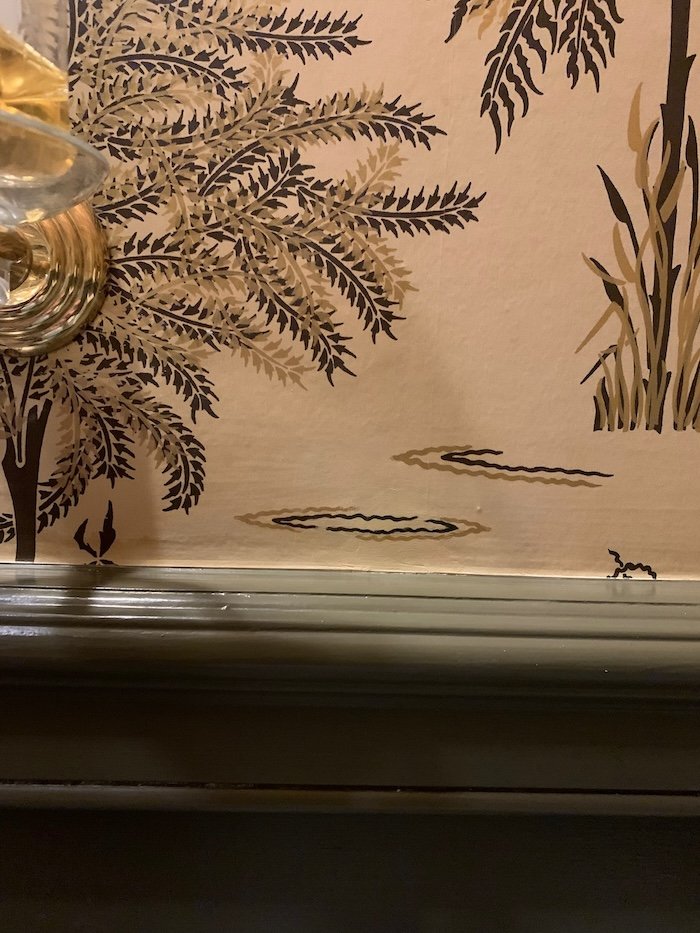
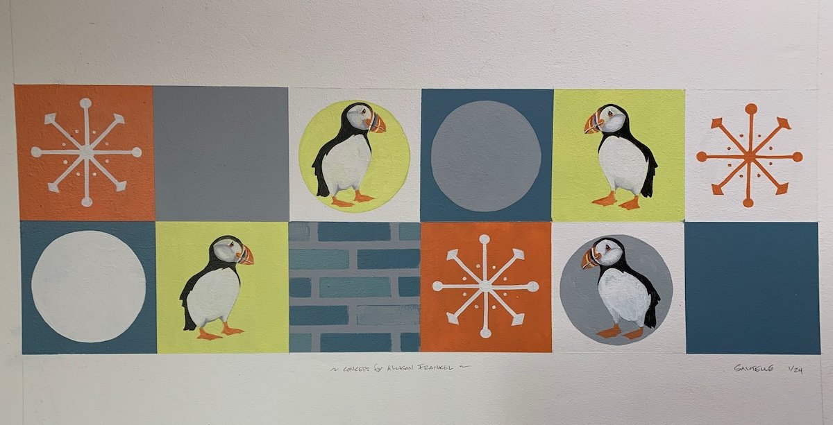
Working with interior designer Michael Forman of Forman Bespoke Interiors is always a treat – and this latest project is no exception!  Michael was charged with re-vamping a dentist office waiting room to make it feel updated, inviting and soothing.  He accepted the challenge and called me in to finish the look!

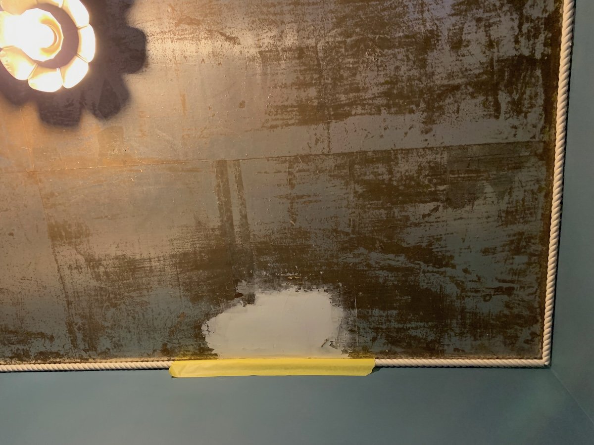
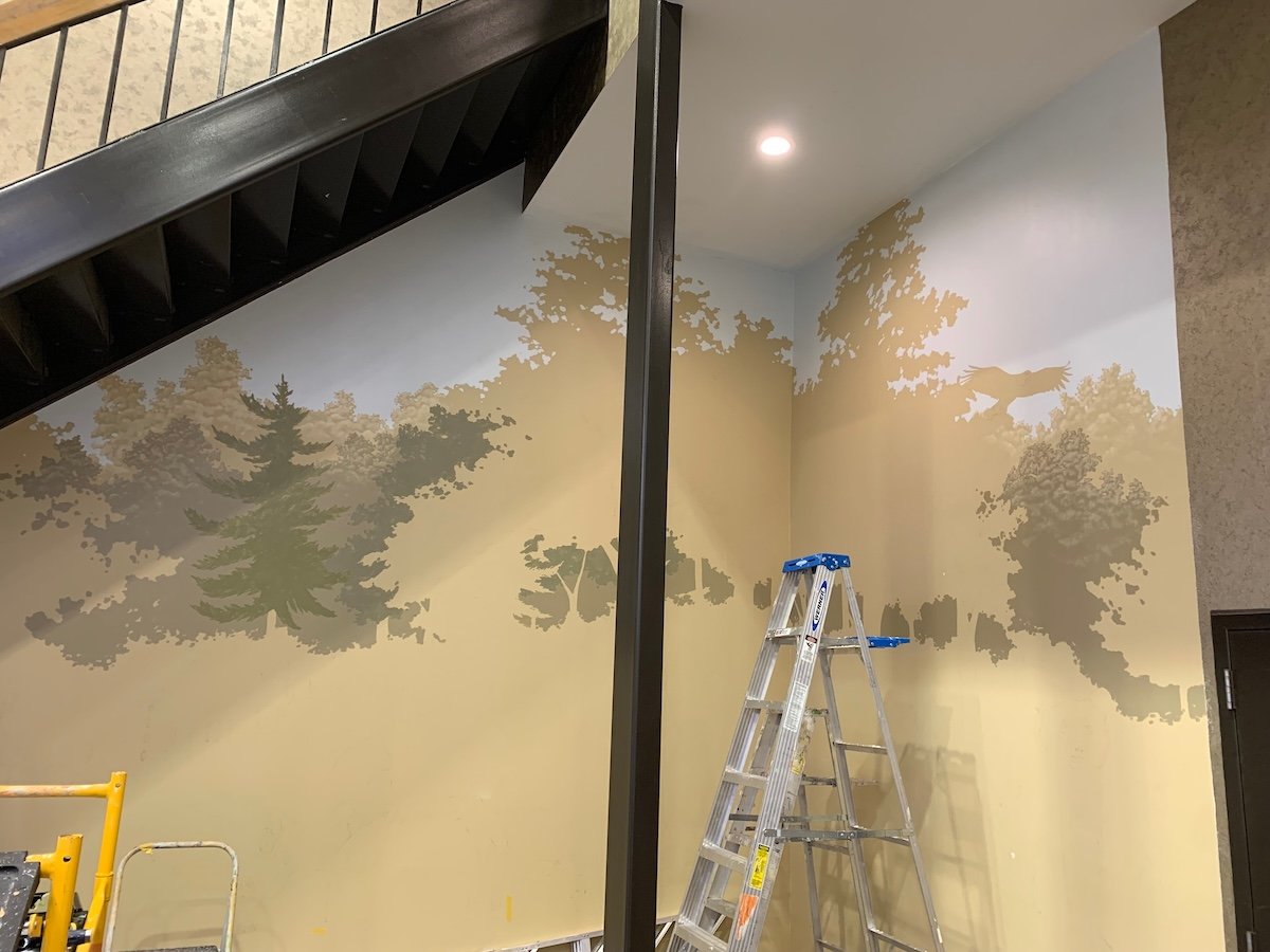
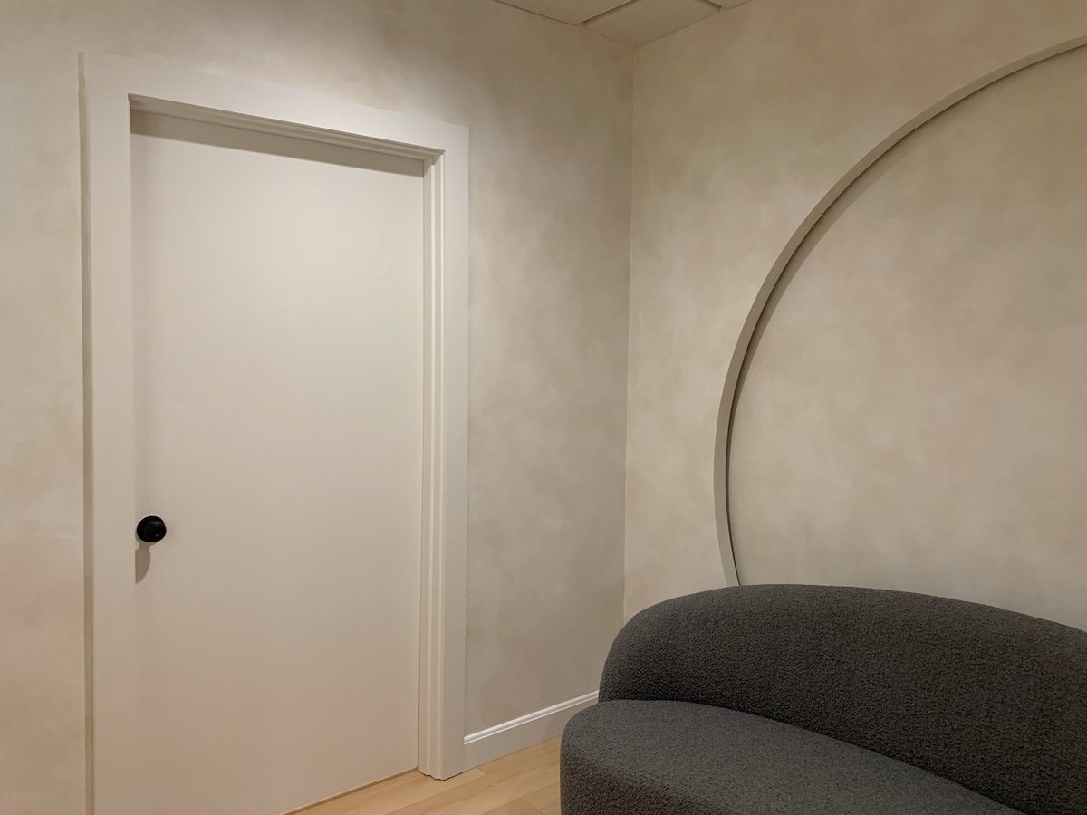
Michael had this fantastic, illuminated circle feature-wall installed, and came up with the idea of a soft, mottled paint finish to cap it off.  We looked at lime paint, but given the high-traffic nature of this space, I suggested creating the same look using polyurethane (making it super-durable!).

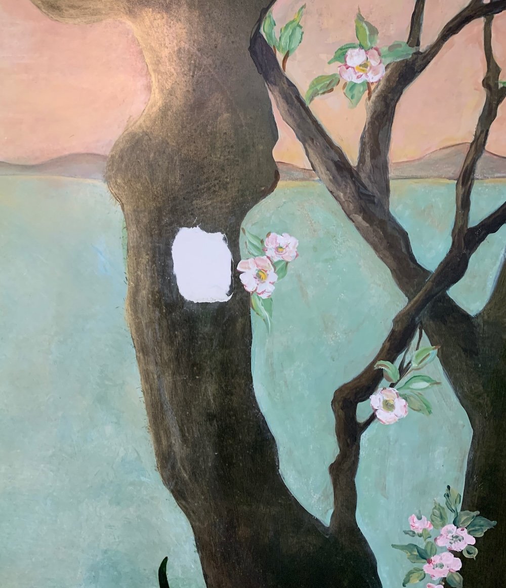
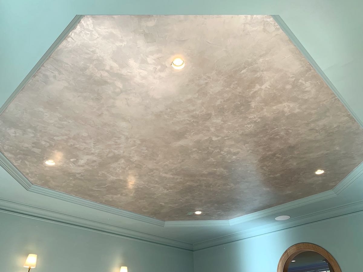
After creating a few test boards using Michael’s base color and his soft ceiling tiles as a guide, I came up with a look that fit Michael’s vision and the Dentist’s taste!

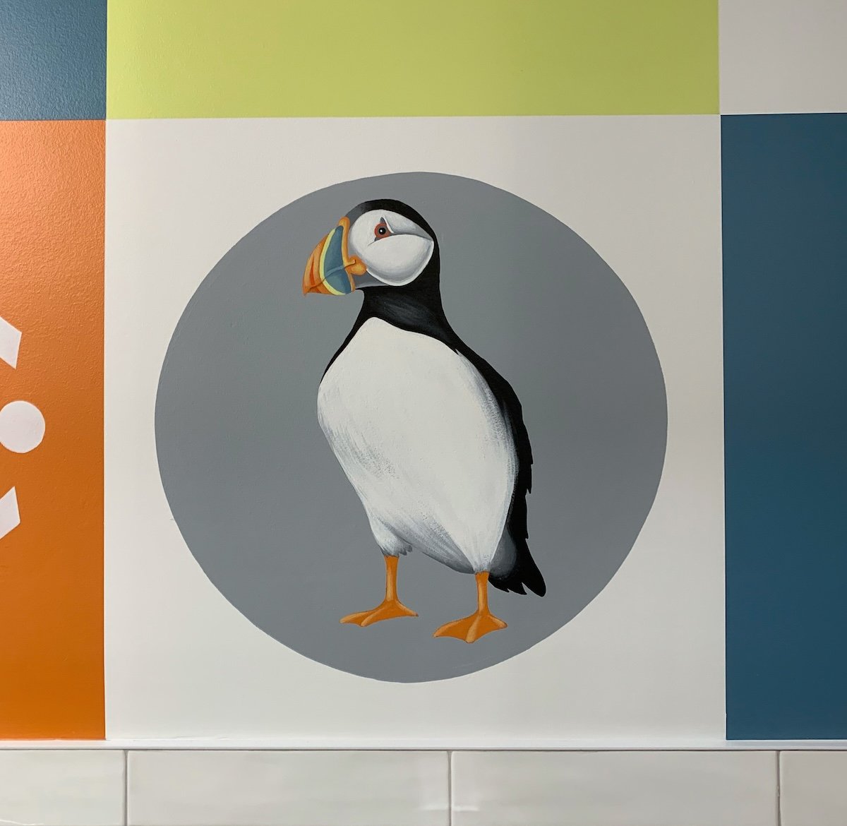
After the construction was complete – I was on to creating this finish, which I completed just in time for their open-house! One of the best compliments I heard while painting this was how much it made the waiting area feel like a high-end spa!

Enjoy!!

Jason

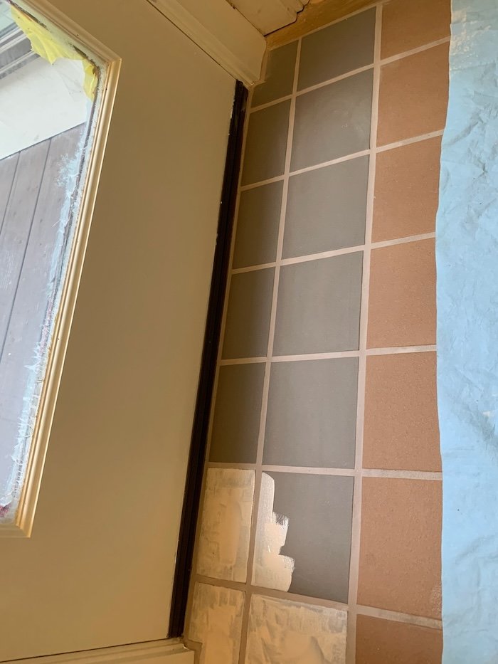
Before the circle light was working

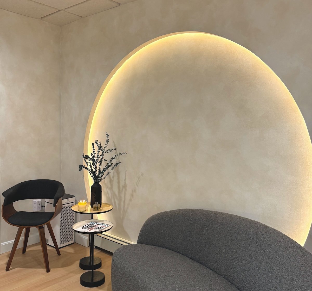
Thanks to Michael for sending tis one once the light was functional!

Custom-Designed Star-Painted Ceiling

In this recent project, I worked with Didi Interior Design and my colleague Joan to come up with a ceiling design that would be the centerpiece of this funeral home entry.

The business owner had an inspiration photo of a mosaic ceiling in an ancient Italian Abby, which featured a mosaic of gold stars on a field of dark blue.  Working with Didi and the funeral home, we came up with a pattern that captured the idea of the inspiration photo, but was more fitting to the building.  The star shape and ceiling layout we settled on had a traditional, colonial look that the funeral home director felt was perfect!

With the design settled, we were on to making it happen.  With a freshly painted dark blue ceiling ready for us, the first step was to measure out the grid pattern and snap lines all the way down the hall.  This helped insure that the pattern was consistent from side to side and from the front to the back of the building.  In the photos below, you can see the grid, and then the stars being painted according to this guide.

The grid guiding our layout

stars being painted on the grid

with the grid removed

When we were done, we were thrilled when our client shared that the ceiling “exceeded” his expectations!

Enjoy!!

Jason

Diamond-patterned “checkerboard” floor

As with many home projects, the success of a good specialty finish often hinges on the planning – which is rarely as true is it is with patterned floors!  This recent diamond patterned checkerboard floor we did in Sudbury is a great example.

My client Tracy originally had a similar diamond floor that unfortunately was damaged by a water leak from the bathroom above their kitchen.  The damage necessitated a brand-new floor be installed (!) – so we were starting from scratch with this finish.  Tracy wanted a “black and white” look – so the first step was for her floor company to stain the new, raw wood a white color.  With this step done – we were on to the pattern!

When I first visited Tracy’s house, I took a number of measurements to help with the planning.  We knew they wanted each diamond to be 18”x18” – so I cut a number of templates to lay out before getting started.  Since the fireplace was off-center, I decided to center my black diamonds with the room and the kitchen island – which also had the diamond corners landing directly on the radiators on both sides. Using this template, I got approval from Tracy on the pattern – and we were on to (a lot) of measuring and taping!!!

Setting down templates to show layout

Unfortunately, I forgot to take pictures of the measurement/taping step – but that is where the magic really happens with this pattern!  We took special care to keep the pattern consistent, the diamonds touching and the tape pressed VERY firmly to the floor.

This client wanted the diamonds to be solid black – so we used 2 coats of porch and floor paint.  With the paint dry, we could pull the massive amount of tape to reveal the final product!!

Fireplace view before final poly

Island view before final poly

Once our paint was dry enough, the floor company came back to put coats of poly over the entire floor to seal everything and keep it looking great for many years to come!

Enjoy!!

Jason

The final result (with special guest!)

The Magic of Faux Paint Repairs

As a spin-off of my decorative painting, I work with a few contractor partners who have me help them with unique repair problems. This work has given me the challenge of matching the colors, patterns, texture and sheen of everything from wood to tile to wallpaper. Some of these repairs would be difficult or expensive if I was not able to help — but due to the discontinuation of the original materials, some of them would have been impossible. Hitting the mark on these projects is incredibly rewarding!

The first example is damaged veneer on a kitchen drawer. The veneer had split and peeled off along a seam - and could not be reattached. The big challenge in this scenario is the veneer pattern continued not just on this on drawer - but also all 3 of the drawers above it. To repair this, the contractor would have needed to replace the veneer on all the drawers, while making sure the color was a match to the rest of the cabinets. Instead, they cut the veneer away and filled the void — ready for me to match the wood grain with paint and polyurethane!

Before

After

The next example involved specialty wallpaper on a ceiling that was damaged by a water leak. The paper was installed many years ago and was no longer available - so the only fix would have been to take down the paper and start over with a new option. The homeowner very much liked the look that was there, so their contractor called me in to patch and match the repair with paint - including the metallic silver of the original paper!

Before

After

For this next job, a new, large industrial door had been mis-drilled for the installation of the door closer. Certainly they could have replaced the door, but this particular example was very costly! Instead, they had me match the patches for a more cost-effective solution.

Before

After

In some cases, I hear directly from homeowners with their unique repair challenges - which was the story with this mural fix. During construction to the space above this, a chunk of the mural fell out. The mural had been painted many years before, and the original artists (who were students at the time) were no longer in the area - so I got the call to see if I could repair it. The main challenge with this project (which is hard to see in the photo) was that the glittering color is actually a metallic gold that is under the translucent darker brown color. I was able to get the match and save the client’s mural!

Before

After

In another wallpaper example, there were 2 spots of damage (one pictured) where the paper tore off the wall. Rather than re-papering the room, the contractor had me patch and match the colors and sheen to make the problem disappear.

Before

After

I can’t even begin to imagine the complications involved with building a new home — including damage that can happen in the transportation of materials. In this case, the wood casing of several of the high-end windows and doors were damaged when they arrived. Due to product shortage, the timing to get replacements would have been extraordinary - so they called me in to do the fixes! Below if just one example of many.

Before

After

This last example also helped deal with the lack of product availability. The contractor needed to cut out part of this entry floor to fix a rot problem - which necessitated replacing 2 rows of tiles. The problem was that the terracotta color of the original/surrounding floor was no longer available! To address this, the contractor used the same tile but in a different color (gray)- and then had me make them match. A couple of distinct challenges in this case was durability needs (for which I used a bonding primer and a floor paint) and the the very dull sheen.

Before

After

Now this is a custom painting!

When I create my murals, I usually start with an idea or a theme from the client and create an imaginary scene.  By contrast, most of my commissioned paintings are based on a photo or maybe a couple of photos to re-create an actual scene or subject.

My most recent commissioned painting project, however, was more like my mural work – and then some!  My client had spent time in Mexico years ago and remembered it fondly. To recapture his experience and add a little flair, he asked that I create a scene on a 5 foot by 3 foot canvas.  Some of the elements in the painting were from photos – specifically the San Cristobal cathedral, an old pickup truck and Mayan ruins.  The trick was to combine these along with many more subjects he requested in the painting… He wanted the characters to all be skeletons – with a truck driver smoking a cigar and flirting with a dancer, a guitar player with Pacifica beer bottles, a formal couple looking on, a zapatista soldier, a dachshund skeleton, a quetzal bird, a background street market, Mexican and zapatista flags and so on. 

Because of the complexity and number of things I needed to fit into the scene, I started with a pencil drawing that I sent to my client so I could make revisions of things he wanted to tweak or add. Below is an image of my drawing.

Once we had an approved drawing – I was on to the canvas!


As usual, I used oil paints – starting with the sky, mountains and cathedral -- and then moving my way forward to the foreground.  While doing this, I was careful choosing my colors to make sure everything was well balanced (knowing the whole painting would be very colorful!).

Below is the final result!  After weeks of painting, I was thrilled that my client was ecstatic when he saw the completed piece!

Enjoy!!

Jason

Textured Cement Finish for a Dining Room

The benefits of being adventurous!  My colleague Joan and I enjoyed working with our client in Westwood on this textured cement finish for their dining room.  What made it particularly fun for us that we had never worked with this material before, and our client was excited to be part of the adventure!!

The goal was to do something unique and distinctive, but to keep it in a neutral color.  Our client liked the idea of using texture, but we also wanted to make sure the feel of the end result was up-to-date.  We wanted to create a texture that did not read as “rustic” and would work well with the transitional style of the house.

To do this, we decided to try a cement product that lent itself well to texture, but still had the potential to feel fresh and contemporary.  After some testing, we came up with a technique to do strips of texture that are almost reminiscent of wood, but still distinctly different.

The best part is we were all thrilled with the result – especially our client!  And a s a fringe benefit, we now have a fantastic new material to add to our palette of options!

Enjoy!!

Jason

Under the chair rail is the same product, just with a smoother application

Business Lobby Mural

When I got the call to look at a potential 350 square-foot forest scene mural for the lobby of a local business, I was intrigued!  In the past, I had done work in the home of the owners of Dav Tech, a metal refinishing company in Southboro, MA – so when they embarked on a remodel of their lobby, they reached out to me.

Dav Tech is celebrating their 50th anniversary this year (!), so as part of their celebration they are transforming their lobby to bring the outdoors in! The plan includes building rock walls, growing live grass and building an actual indoor stream.  As the backdrop for all of this, they asked me to design a 2-wall mural of a forest scene. Specifically, the scene was to go in a corner sectioned off by the newly-built rock wall that would contain the grassy section and stream. They knew they wanted the scene to include a stream (that would “feed” into the actual stream!), a cabin, and some select animals (wood ducks, doe, and black bear).

With this information in hand, I was on to the design stage! Given the scale of the project, I did a 2-stage design process – starting with a pencil drawing.  Below are the drawings I presented – adding in the beaver, squirrel and crow:

Design drawing of wall 1

Design drawing of wall 2

With only a couple of tweaks to my design (they changed the angle of the bear and added the buck), I was on to the concept painting!

For my concept paintings, I do everything to scale with the actual colors I propose for the final mural.  Below are the images of these paintings:

Wall 1 concept painting

Wall 2 concept painting

Once I presented these, the only request was to change the crow to an eagle… so I was on to painting the final mural!

When I paint this kind of scene, I start with the most distant elements of the background and work my way forward – ending with the animals as the last step.  I included a few in-process photos to give an idea of this process.

beginning of painting process - starting with background

Moving “forward” in the scene as I paint more elements

The last step before adding the animals

The final mural was a hit!  I will also need to follow up with more photos when Dav Tech is done with building the stream – and they will be encasing the black column with an actual cedar tree!  In the meantime – following are images of the final result.


Enjoy!!

Jason

The final mural!

Closer view of corner and wall 2

Closer view of wall 1 under the stairs landing

And now the animal details!

And an update - here is the final version including a running stream, live grass and birch bark-wrapped column!

Painting Company Logo on a Brick Wall

I enjoyed working with the Zipcar team on this painted logo in their recently renovated café! While the space is freshly re-done, the wall they wanted their logo painted on is a lovely old Boston brick wall – so they felt that painting a perfect, crisp new logo would look out of place – and I agree!

After deciding on size, placement and color – we focused on how much ageing – or antiquing- would work for this project.  This was the best part of the project for me!  The goal was to make it look like it had been there forever – without over-doing it.  To make this happen, I focused on some paint techniques (there are actually several shades of black/gray and a few shades of white) as well as using sandpaper to replicate the kind of paint fading, soiling and wearing that would happen over time. At each step of antiquing, I would collaborate with the Zipcar team to make sure my approach was achieving their vision – and the end result accomplished exactly what they were looking for!

Enjoy!!

Jason

Venetian Plaster Fireplace Surround

Working with my colleague Joan, we recently transformed this fireplace surround with a beautiful Venetian Plaster finish! 

When we started, the 20-foot high fireplace had a plain drywall finish – painted in the same off-white as the surrounding walls.  Our client called us in to elevate the look of the fireplace, while still making sure it didn’t dominate the space.

After looking at some samples, the client decided a Venetian plaster finish would accomplish this goal – but we still needed to settle on a color.  To tie in with the surrounding elements in the room, we decided to go with a multi-color finish using varying shades of taupe.  After showing a sample board to make sure we had the colors right, we were on to creating the final finish!

Venetian Plaster is applied with metal trowels and takes multiple coats to build the depth and character of the final look.  Once each coat is dry, the next thin coat is applied, burnishing (polishing with the blade) as you go to bring out the variations in texture and color.  To accentuate this, we also used different shades applied together in the second coat – creating even more motion.

The final step was to burnish the entire fireplace surround once it was dry – which creates a very organic shine across the surfaces – making it look (and feel!) very much like polished stone.

In the end – this custom polished stone look is exactly what our client was looking for to elevate the fireplace and the entire room!

Below is a picture from across the room to show the scale of the surround.  The last photo is taken looking up at the fireplace to show a closer view of the motion of the plaster plus the reflection of the lights to give a sense of the shine.

Enjoy!!

Jason

The reflection of the lights at the top gives an idea of the shine

Mural in Library Children’s Room

It was SO great to be back working at the Attleboro Public Library on another mural!

Back in August, I finished the first of my “Magic Window” murals at the APL.  The concept was to extend the existing “real” window bank with “magic” windows looking out at something unexpected!  The first window mural was of an underwater scene, complete with a sea turtle, coral and exotic fish.

This time, we wanted another window (on the opposite side of the same “real” windows) looking out at a completely different (but still unexpected) scene.  After playing with some different ideas, I landed on doing a jungle scene – which Library Director Amy Rhilinger loved!

As always, my first step after agreeing on an idea is to paint a scale design to show what the final mural will look like.  Amy signed on as soon as she saw my concept painting – so I was on to painting the final thing!

It was fun hearing the excited conversations kids and their parents were having as I painted this – and it is rewarding to know my mural will be the source of fun conversations for many years to come!

Enjoy!

Jason

The jungle window mural!

Stepping back to see the real windows with both the underwater and jungle “magic” windows!

Antiqued Gold Trim for English Country Look

It was so great to go back to my client Cathy’s Jamaica Plain house 3 years after my last project with her!  Cathy and her husband are lovingly renovating their home room by room, replacing all of the English Country-style character that had been taken out over the many years of previous owners.  Cathy and her husband are doing a great deal of the work themselves (including amazing woodwork!), but are bringing in specialists for finishing touches --- which is where I come in!

I first worked with Cathy in 2021 to add gold to the relief of Lincrusta wallpaper in their sitting room.  This time, they wanted the trim on the wainscoting they installed in the living room to be more of a focal point and bring the overall look back in line with the original look of the house.  To do this, they wanted the trim to be an antiqued gold, using a mirror in the same room as inspiration.  After visiting Cathy and looking at the project, we collaborated on the gold paint that would give the best gold-leaf approximation, and I came up with a formula for the antiquing that would tie it in with the mirror and the colors in the room.

Once onsite, we fine-tuned the plan for which trim elements would be gold and were on our way!  To complete the look, we also painted the chandelier medallion gold.

Following are some pictures of the result.

Enjoy!!

Jason

The mirror pictured here was the inspiration for the finish

Detail of antiqued trim

Action shot courtesy of my colleague Joan!

And the gold medallion as the cherry on top!

Patchwork Gold Specialty Wall Finish

My client Ed recently called with a fun challenge.  Ed is the owner of Nirvana Tea House & Café (a fantastic café by the way!!), where I have done other mural and decorative finish projects.  Nirvana was adding seating in a room adjacent to the main café area, and Ed wanted to give this new space its own unique vibe.  He had a vision for the finish he wanted – describing it as something like gold leaf, but with bigger patches of textured shapes to reflect the light off the gold finish.  He didn’t have any images of something he had seen before – just the idea he had in his head… Which is exactly why this was so much fun! Creating a new finish or look is one of my favorite things to do. 

When Ed described what he wanted, I had a picture in my head – and describing this in more detail back to him helped us pin down that I was on the right track.  With a good understanding of Ed’s vision, I was on to figuring out how to produce this and creating a sample board.  With a light plaster product as the base, I used different tools to create overlapping shapes in multiple different textures, and then applied metallic gold over the surface to create the reflections.  I met with Ed in the new space to him my concept and he loved it!

With that, I was on to creating the final finish on a much larger scale.  To balance with the size of the walls, I used bigger shapes than I had on my concept board.  As I planned out the patterns, my goal was to keep the end effect looking balanced, while still having a random patchwork effect.  Once the texture was done and the gold applied, Ed and I talked about lighting to enhance the look created by the reflections – and Ed followed up by installing directional lights.  The effect is exactly what Ed was looking for.  Below is a picture of the final result – or better yet, you can go and check it out at Nirvana Tea House & Café in Millis, MA!

Enjoy!!

Jason

Roman Clay Specialty Wall Finish

While technique always plays a role, the beauty of some of our finishes comes largely from the unique materials we use – which was the case with this recent specialty finish in Concord, MA!

Our client wanted the living room in their new home to have a distinct look from the adjacent rooms.  Specifically- they were looking for a cozy feel with organic variation in the finish to contrast with the light neutral paint in the surrounding spaces.

To accomplish this, we used a material called Roman clay – which is applied with metal blades.  The product has a beautiful natural mottled look that is similar to lime paint and Venetian plaster.  Unlike lime paint, Roman clay has a smoother feel and has a slightly less rustic look. Compared to Venetian plaster on the other hand, Roman clay is not as glossy and has a less formal look.  This in-between was just perfect for this space and what the client was looking for!

Enjoy!!

Jason

Patterned Wood Floor

Unlike most of my decorative finishes, this diamond-stained floor in Wellesley, MA involved a lot of math!

It was a pleasure working with our client Annie, her designer and my colleague Joan Kingsbury to create this dramatic foyer floor. Annie and the designer knew they wanted a diamond-inside-a-diamond pattern in multiple stain colors to complement the other design elements in the space. It was then up to Joan and I to help figure out how to make this happen.

The first step was to meet at the house and start measuring.  The designer wanted the diamonds to be centered with the front door, so we started working from there.  Our goal was to create a shape/size that could fit full diamond shapes between the door and the stairs (without being cut off), while still fitting nicely side to side.  This is where the math started – and we used our figures to tape out shape sizes there on the spot so we could collaborate on the approach.  We also used this meeting to look at different stain colors and to sketch out the look of the pattern…. It was a very productive meeting!!

With these elements decided, our next step was to have stencils made to insure a clean, consistent pattern for the final product.

With our stencils and satins in hand, we were then on to creating the floor finish!  We started by creating a border that would work with our diamond layout (more math!):

With this complete, we were on to laying out the stencils:

And then on to the stain!  First we stained the darker “lattice” pattern and then the lighter, inside diamonds:

The end result is striking, and exactly what Annie was looking for!:

Enjoy!

Jason

View from the front door

Stain pattern continued through floor vents

A Truly Custom Mural

Of course, all of my murals are “custom”, but this recent bathroom mural project in Natick is a great example of what this means!

My client Allison reached out to have me help create a space her 11-year old son would be happy with again.  Allison’s challenges began when she had her son’s bathroom renovated – only to discover that he was despondent about the removal of all of the interesting old tiles he loved – so much so that he would only use their primary bath!

Allison initially thought about painting the tiles – which can be done – but I suggested doing a mural to add much more interest to the room.  The idea I presented was to paint a tile pattern on the portion of the wall without tiles and incorporate some of the patterns and colors form the old tile – while also including puffins (which her son loves!).  Below are pictures of the old tiles as well as the puffin shower curtain in the room.

Allison and her son loved the idea – so I was on to doing a concept painting.

While I wanted to incorporate the old, I also wanted to choose colors and design elements that would tie into the modern look and palette of the renovated space.  I used the medallion pattern of one of the tiles, but instead of the cream and gold colors, I used white and orange to tie in with the orange on the shower curtain.  The bright lime green is a nice clean color that also ties into the curtain and balances well with the orange and blues.  There were also small rectangle tiles in blues and grays (I didn’t get a photo of these) that I wanted to include.  I put all of these elements together for this design:

Allison and her son were completely on board after seeing me design and I was on to painting the mural!  When it was complete, the whole family was thrilled – sharing that it was better than they ever imagined it could be!!

Enjoy!

Jason

The final mural

Puffin detail

Medallion detail

More Ombre Painting!

The best kind of client is a return client!  This Cambridge-based firm has now called us back 3 times to paint ombre finishes in their various office spaces.

For this particular project, our orange, green and turquoise ombre finishes helped brighten the space and keep the office lively!

Enjoy!

Jason

Commissioned Painting – Summer all Year Long!

My recent client JJ is a boating enthusiast who wanted to enjoy summer all year long with a commissioned painting of his boat and yacht club.

JJ knew the angle he wanted, showing the city in the background.  We used the picture below as a basis for the angle, but JJ wanted the city a little larger and easier to see – and he wanted the painting to be much brighter while still keeping the vibe of sunset.  I also had a sample of the wallpaper in JJ’s newly renovated bedroom (where the painting was slated to hang) to make sure my color selections would go with the room while still standing out against the wallpaper.

The reference image for the club

In addition to altering the city and color scheme, I needed to make a couple more alterations.  Most importantly, JJ wanted to include his boat (see below for the picture I used).  This also necessitated that I show the club at high tide so I could include the boat in close to the club!

Picture of JJ’s boat

After doing a sketch to show JJ my ideas for composition – I was on to the painting!  Both JJ and his fiancé love the painting and are enjoying the summer as the cold weather rolls in

Enjoy!

Jason

The final paining

Specialty Plaster Tray Ceiling

In the planning stages of this decorative finish project, I worked exclusively with my associate Michael at design firm Eleven Interiors.  Michael was working with the client on multiple rooms of the home for a large-scale renovation and wanted something unique and special to elevate the dining room.  With the idea in hand to paint the walls and tray-ceiling surround the same color, Michael came to me with the goal of achieving something metallic and glossy in a champagne/silver color for the recessed tray ceiling.

With this direction, I suggested a specialty metallic plaster finished in gloss polyurethane to create motion, shimmer and shine.  Michael liked the idea, and I was on to creating sample boards!  I did a few examples showing variations in color and sheen, which Michael shared with the client for the final choice.

By the time I got to the house for my piece of the project, the larger renovation was wrapping up – so the client was at the home preparing to move back in. When she saw my finish completed in her dining room, she was thrilled!  In particular, she loved the hand-crafted, one-of-a kind look… As Michael was shooting for, it felt “special”. She told me “I never had any idea this was even an option.  I’m so happy my designer suggested it!!”.

Enjoy!

Jason

Venetian Plaster Fireplace Surround

With more people taking advantage of the new gas or electric fireplace inserts – we are getting more calls to do something special with the drywall fireplace encasements that used to be brick with traditional fireplaces.  The benefit with the new setup is that the sky is the limit for the finish options!

Working with my colleague Joan and Interior Designer Lulu Friedman of Didi interiors, we wanted to make this particular fireplace surround a focal point of the room!  Lulu and the client liked the upscale stone-like look of Venetian plaster, so they chose to have us use Venetian in shades of dark gray.  To elevate the look and make it a bit more special and eye-catching, Lulu had the idea to also add a bit of gold “character” to the finish.

As always, we started with a sample board to make sure we hit the mark in creating the finish Lulu and the client envisioned.  With the board approved – we were on to plastering the fireplace!

As we worked on the variation in the paster and gold, we collaborated with Lulu and the homeowner – resulting in a finish everyone was thrilled with!

Enjoy!

Jason

Art Ceiling!

It’s always good to work with my friend Jessica Tolman of Briar design – and this “art ceiling” project at a beautiful contemporary home in Newton was no exception!

Our client Rebecca was working with Jess to fine-tune some of the rooms in her home, and as they were working on the dining room, Rebecca had the idea to make a statement on the ceiling!  After looking through my website, they were inspired to do a graphic pattern of crossing lines and called me in to help make the idea come to life.

When we met, we talked about layout ideas and also chose a color based on the rug and seat cover they had already chosen (these are not in yet – so not in the photo!). I then took my notes back to my studio and created two sample boards – one to show the full-scale thickness and color of the stripes, and another scale layout of the stripes on the ceiling.  Rebecca and Jess loved the boards – so I was on to painting the ceiling!

The first step was to measure out the line placement to match my original design, and then plan thickness and opacity for each line (the lines are created with glaze mixed with paint and range from dark/opaque to light/translucent).  When I was done, Rebecca was thrilled – and asked me to sign the art I created on her ceiling!


Enjoy!

Jason