Hand-painted Graphic Feature Wall

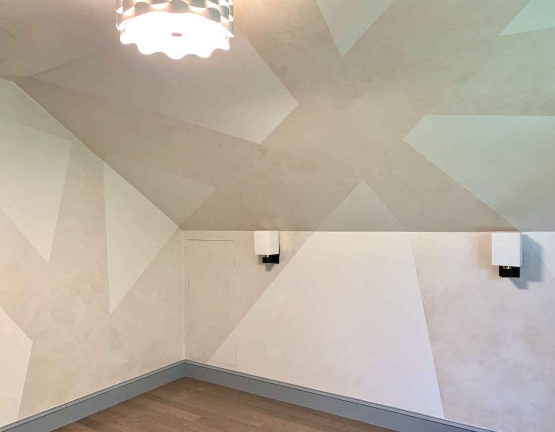
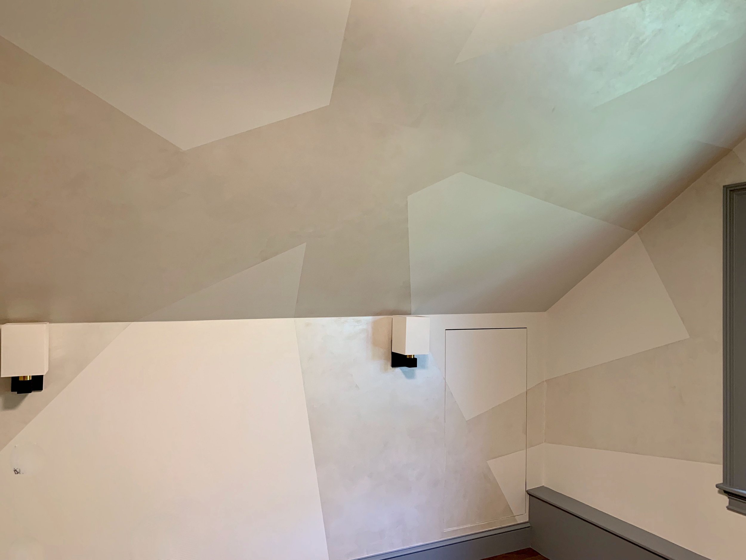
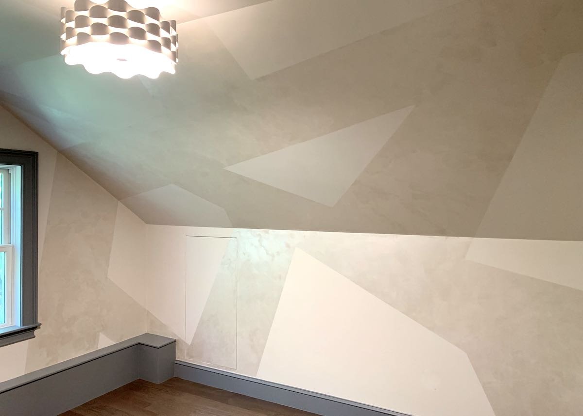
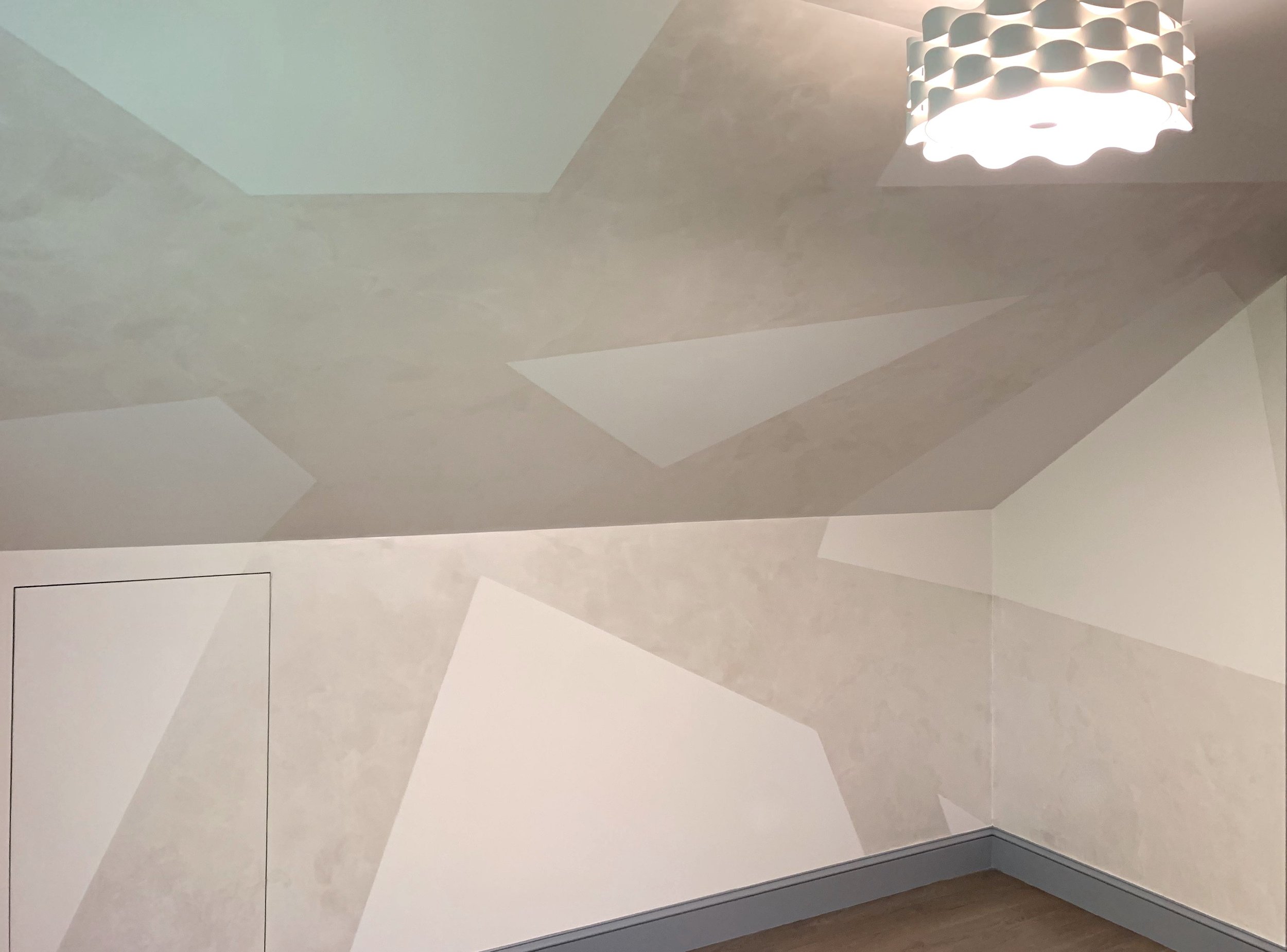
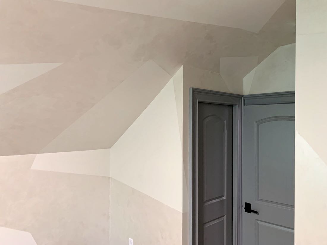
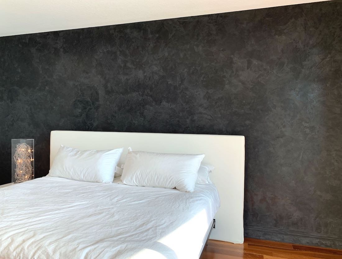
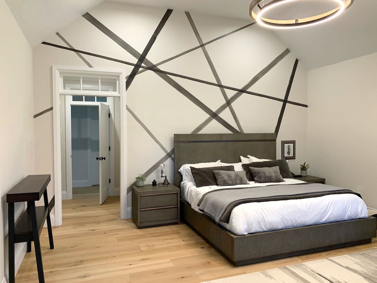
This recent client in Wellesley, MA was working with her designer to add some interest to her primary bedroom walls when they called us!  Most of the walls had paintings or mirrors, but the large wall (12’ high by 17’ wide) behind the bed looked too plain, and the scale of the wall was making it difficult to find a solution.

Designer Donna Hochman of Distinctive Interiors had the idea of using criss-crossing lines in tones of dark gray to complement the rest of the room and asked us to come up with a design.

After taking some measurements and drawing a to-scale framework of the wall, I worked with basic ideas of composition to lay out the lines on my smaller version painting.  The idea was to make it look random, but still balanced across the wall.  We also wanted to create interest and motion with multiple lines, but still keep it simple enough to prevent the wall from looking too busy.  Finally, we wanted the lines to look hand-painted with brush strokes and imperfections.

With a couple of tweaks to my design, we had a look everyone was excited about.  The next step was to choose the perfect charcoal color and come up with translucent versions so the stripes would have varying levels of darkness.  Making them translucent also created the opportunity for the darker overlap points of the lines to add another dimension to the overall design.

Once onsite, we measured out the lines to replicate my drawing and created a code to indicate which stripes would be darker or lighter.  With this all done – we were on to painting!

Below are some shots of the final result – which Donna and homeowner were thrilled with!

Enjoy,

Jason

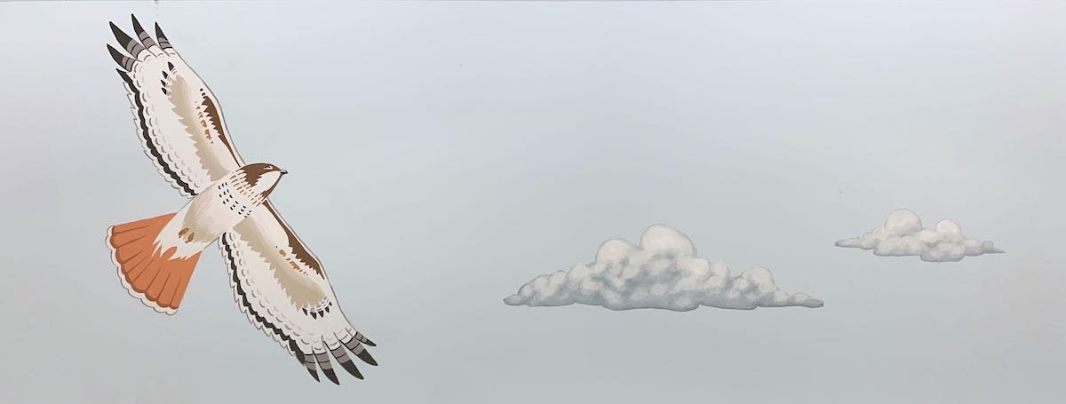
Close-up of intersecting line

Limewash Walls in Weston, MA

This lime wash project in Weston, MA was very rewarding! My client Nina has been gradually updating the rooms in her home, and recently focused her attention on the living room.  The room is a nice, open space that gets plenty of sunlight.  When we first met, the walls were a yellowish off-white which needed to be refreshed (and Nina never loved to begin with!)

Instead of re-painting with a flat color, Nina wanted something special that would highlight the warm, inviting feeling of the room and go with the look of the fabulous lights she had installed. After doing some research, Nina settled on lime wash – which creates an organic look, with subtle variation and movement that happens in the application of the paint.  A lime wash is done with lime paint - which is one of the oldest paints used, dating back to ancient Egypt. It is lime-based and has a consistency somewhere between paint and plaster. The resulting finish has a completely flat sheen (no shine at all) and a very subtle texture.

Nina knew she wanted a light, neutral look – so we investigated different color options and combinations (some lime wash finishes use 2 different colors) that would give the bright look she wanted while still showing the beautiful modulation of lime wash she liked (the variation tends to be much more apparent in darker colors and can often be difficult to see in very light colors).

After working with the lime paint manufacturer and doing a sample board, we settled on a 2-color approach.  Both colors are light neutrals, but you apply the darker of the colors first, and then apply the lighter wash over the top – which helps highlight the variation. 

I love the end result —- but much more important, it was exactly what Nina had envisioned and works perfectly in her re-imagined living room!

Enjoy!!

Jason

Roman Plaster Fireplace

I recently created this fireplace surround finish in collaboration with my partners at interior design firm Briar Design.   

Briar had selected the reclaimed wood mantle and the stone veneer that frames the fireplace – so they wanted a finish for the rest of the “chimney” surround that would complement this.  We wanted something with richness and character, but also something subtle enough that it would not be too busy or fight with the other finishes.

After looking at some options, we settled on Roman Plaster, which has a slight texture and organically creates subtle variation and movement.

Below is a shot of the final result, which complements this beautiful space perfectly!


Enjoy!!

Jason

Specialty Paint Repairs

Often, the work I do is referred to as “specialty painting”, which of course includes the decorative finishes I create – but also includes my use of paint to make repairs disappear!

 This first example is on stairs that were part of a renovation project.  The old spindles were removed and replaced with new ones, but the holes from the old spindles needed to be plugged.  The contractor used the same wood, but of course the grain and coloration could not line up perfectly --- which is where I came in!  I painted over all  these circle patches to match the surrounding wood grain of the stairs and make the patches disappear!

The next example is over four windows in a bedroom.  The contractor installed power shades, but unfortunately the process required creating holes in the existing wallpaper – wallpaper that is no longer available of course!  To match wallpaper without being able to use the same paper, they called me in to paint the patches so they blend away.

In this case, my client had brought this statue back from a trip to Bhutan – but unfortunately it was left outside, and the original finish largely shipped away.  It was my job to match what little was left of the original finish to paint the rest of the statue to look like it did originally.

Back to wood repairs with this one!  There used to be a lock in this section of the door that was removed.  The contractor filled the hole with this wood patch, but again, the color and grain could not line up perfectly.  I painted the woodgrain over this patch to blend in with the surrounding door and then clear-coated the entire door (the clear-coat is why the “after” picture is slightly darker)

Sometimes, my specialty paint work is to match older specialty paint! That was the situation for this job, where old curtain rods were taken down over 4 bedroom windows, leaving 8 sets of holes to patch.  After patching the, I was able to match the old decorative finish to make it look like there were never any holes!

In this last example, I used not only paint but a gel to match the pattern and texture (!) of the surrounding grasscloth to make this electrical panel blend in.

Enjoy!

Jason

Another Decorative Ceiling Finish

More than once I have been called in to help when a beautiful room is let down by a plain white ceiling – which was the case with this recent project!

My clients had partnered with designer Donna Hochman of Distinctive Interiors to create a fabulous dining room – complete with striking wallpaper, a beautiful area rug and a very cool chandelier.  To complete this amazing space, Donna wanted to do something to address the ceiling – which is when she called us in!

Through collaboration with Donna and my colleague Joan, the decision was made to use a cross-hatching technique with gold paint – which creates a shimmering linen-look.  The goal was to bring more warmth to the room, tie in with the gold of the wallpaper and make the ceiling an integral part of the overall impact of the room.

With the decision made – we were on to painting the ceiling!  Using a laser level, a steady hand and a lot of patience, we were able to create this look by dragging the gold glaze first in one direction and then in the opposite direction for each of the coffered sections.

The homeowner and Donna were thrilled with the end result!

Enjoy!!

Jason

Pom Pom Office Mural!

If you have spent any time reading my blog – you already know I love painting murals.  One aspect I enjoy most is clients who get creative with what a “mural” means and how it can be used – which was definitely the case with this pom pom mural in an office at MIT in Cambridge, MA!

A professor and Dean at MIT wanted to create a unique space in her office and reached out to a designer for help – who then brought me into the fold.  

They wanted to add a dynamic and fun pop of color on the wall, and had an image of a pink-and-purple fuzzy pom pom as inspiration.  The question was – could I paint a giant version of this and get the bright colors and “pop” they were looking for??

When we first met, I suggested not centering the pom pom for a more interesting composition --- which everyone liked.  We then looked through Benjamin Moore colors to make sure I could get the right tones of pink and purple to go with the décor – but also accomplish the vividness they were looking for. 

As always, I followed up with a scale concept painting to present for final approval.  When I presented the board, my client liked it, but wanted even more contrast and “pop”!

With this challenge in hand – I was on to the final project.  While I was painting, it was a blast to get a steady stream of complements from people passing by the office. My favorite comment was: “I know this is not for my office, but it will make me happy every time I walk pass!” Most importantly, the end result was exactly what my client was looking for!


Enjoy!!

Jason

Romantic portrait as a wedding gift

It is always an honor when a past client reaches out for a new project – which was the case with this recent portrait!

My client Jeanne and her husband reached out a few years ago to have me paint a 30”x40” portrait they hang right inside the entry of their home.  Fast-forward to today and Jeanne reached back out have me paint another 30”x40” portrait – but this one of her daughter and fiancé as a wedding gift!

Looking through engagement photographs the couple had taken, Jeanne chose this one for the drama and warmth:

Working with Jeanne, I suggested we crop in tight to make the focus on the couple and also crop out some of the shadowed land in the background. To show this crop, I did a sketch of my final proposed layout:

Jeanne loved this, and I was on to the painting!  In addition to the layout edits, I also wanted to lessen the level to which Jeanne’s daughter and her fiance were in shadow.  My goal was to maintain the dramatic sunset back-lighting, but also make sure that the people remained the focus. 

The end result was a hit!

Enjoy!!

Jason

Beautiful Venetian Plaster!

One of the most versatile decorative finishes I work with is Venetian plaster.  The beautiful variation in Venetian can be either bold or subtle and the finish can vary from high gloss to matte.  As a result, Venetian plaster can fit equally well with contemporary or traditional styles!

I recently did two different Venetian plaster projects in South Boston that are good examples of the different looks that can be achieved.

The first was on a fireplace surround and adjacent walls in a living room.  The fireplace was done in white and light gray Venetian, showing very subtle but pretty variation.  Offering a striking contrast, the walls on either side are done in a high-gloss black Venetian with beautiful, bold variation in the colors and motion visible in the finish.

The second project was for the walls of a primary bath working together with Eleven Interiors.  In this case, the goal was to create a more subdued look – so we went with a matte finish and more delicate variations in the finish.

Regardless of which approach is taken, using a Venetian plaster finish always elevates the space!


Enjoy!!

Jason

Faux marble brings interest and beauty to fireplace surround

My clients Stacy and Dan wanted to make the fireplace surround in their beautiful Hingham condo a highlight of the space – which is when they called us!

The starting point was just a drywall surround painted the same off-white as the rest of the room.  The style of the room was very clean and contemporary, so we had a lot a leeway in terms of doing something eye-catching, but we still needed to keep the look consistent with the modern, upscale aesthetic as the rest of the space.  Looking at the marble finishes in the nearby bathroom, we decided on making the surround look like a large slab of marble, keeping it clean and white with dramatic veining.

I started by painting a test board to show the style and colors I was considering for the faux marble.  When we reviewed this, Stacy and Dan liked what I proposed, but wanted the background even whiter than I suggested – which ended up being a great way to go!

With their approval in hand, we were on to painting the surround.  After prepping the surfaces, we started by painting a color called “super white” for the clean, bright background Stacy and Dan were looking for.  I then used some inspiration photos they gave me to lay out the patterns – and then I was on to painting the marble veins!  We finished with a couple of coats of glossy polyurethane to cap off this ultra-realistic marble look.

Enjoy!!

Jason

The fireplace before

And after!

With the TV re-installed

Epic 2-Wall Children’s Room Mural

I loved doing this recent kid’s room mural in Newton, MA!

Part of the joy of doing this job is in the back-story.  About 3 years ago, my clients David and Sarah reached out to have me design and paint a 2-wall mural in anticipation of the arrival of their first baby Lucy.  David and Sarah had just purchased a new house that they had not moved into yet and had me paint an “English countryside”-themed mural (complete with sheep) in time for them to move in with their new baby.

Fast-forward to this summer, David and Sarah are expecting their second baby, and they reached out to me to paint another mural!  As always, my first step was to meet with them to look at the space and talk about their ideas.  For this mural, David and Sarah wanted a forest theme, but they wanted to make sure it was not too dark.  They also wanted some pops of color to make sure the overall mural was more than just green and brown – and they requested I include an owl, a rabbit, a frog and a butterfly.  After listening taking my notes, I suggested designing around a clearing in the woods to keep it bright, and maybe include a stream to get more blues in (and make a logical place for the frog).  I also talked about the perspective of being in the woods, with some trees so close you could only see the large trunks.  They liked these ideas – and I was off to painting my designs!

As I usually do, I created paintings to scale of each of the walls (in the actual paints) to get their approval. I made sure to incorporate their requests in addition to adding a fox and cardinal to get more color in the mural (plus including the peeking squirrel for fun). When we looked at my designs, David and Sarah loved them just as they were – so I was off to painting the final murals!

When I returned to start the project, the highlight was finally meeting Lucy for the first time! Lucy loves her English countryside mural, and was VERY excited about the mural I was painting for her soon-to-be little brother… One of the highlights of this project was the visits I got from Lucy who would peek into the room with her mom to see the progress.

To create this scene, I started by painting the background first and them working my way forward to the stream, the foreground trees and finally the animals. Below is an early in-progress shot.

The mural is now complete and ready for the arrival of baby #2! 

Enjoy!!

Jason

Wall 1

Turning the corner to wall 2

Wall 2

Fox detail

Owl detail

Frog, butterfly and stream detail

Bunny detail

Squirrel and cardinal detail

Pink Ombre Wall for Little Girl’s Room

Sometimes a special paint treatment to just one wall can completely change the feel of a room – which was definitely the case with my recent ombre painted wall in a girl’s bedroom!

If you are not aware, an ombre is just a fade between colors – usually dark to light (or vice-versa) in the same color family, but sometimes the fade includes multiple colors.  In this case, my client’s 7-year-old daughter wanted a fade from dark to light pink – but with aa additional fade to pale yellow at the top.

As a first step, I met with my client Kim to look at the room and to help pick colors.  Kim had decided to use the yellow at the top of the ombre for all of the other walls – so I helped with this choice as well.

With the colors chosen, I was on to the ombre painting!  Having painted a number of ombre projects in the past, I was aware of the challenges.  The first thing that helps is a number of colors to help with gradual gradation (the colors need to be close to each other so there is not a big jump from dark to light).  In this case, I mixed 7 different colors to gradate up the 8 foot-high wall.  From there, I planned the measurements for each color and began the painting and blending.  Even with blending the colors while wet (for each of 2 coats), the blend can look striped rather than a smooth blend – so I have developed a few techniques that I do on top of the first 2 coats to make the blend as soft as possible.

In the end, Kim and her daughter were thrilled with the result!

Enjoy!!

Jason

Linen-Look Painted Ceiling

I love being able to provide unique decorative painting solutions for my interior design partners!  Decorative painting, or “faux” painting has been around for a long time – and as a result can sometimes be perceived as out-of-date.  However, decorative painting techniques, materials and tools can be used to create beautiful contemporary finishes limited only by the imagination of the designer!

On a recent project, an interior designer I have worked with previously reached out with a vision she hoped I could produce with paint!  Emily Lacouture of Lacouture Design was re-vamping several rooms in a beautiful Concord, MA home and asked me to help with the dining room ceiling.  Emily had a vision for a linen-look done in a taupe tone with metallic gold and light silver to provide some depth and shimmer.

As a first step, we met in the home to look at the space and discuss her vision, along with specific colors.  As usual, my next step in the process was to create a concept board to show Emily and her client what my solution would look like before starting on their actual ceiling.  After seeing the board, my concept was approved with just minor tweaks -- so I was off to painting the ceiling!

An important part of this finish is the depth.  To create this, I first painted the ceiling a base taupe color and then started with a strie (thin stripes) of champagne gold across the ceiling in one direction.  With this done, I then did a strie of the base taupe color mixed with glaze (which makes the paint translucent) applied in the opposite direction.  This gave me my first layer of the cross-hatching, or linen look.  To add depth and shimmer, I then did a strie of translucent light silver in both directions on top this.

The result creates a different look from different angles!  When looking straight up, you can see through all 4 layers – with the taupe/champagne as the dominant color.  When looking across the ceiling, you see the shimmer of light off of the final cross-hatching – with the light silver as the dominant color.  The result is a dynamic finish that adds a level of drama, interest and beauty that put this dining room over the top! 

The room is not yet complete in these pictures, with wallpaper and chandelier yet to come – but these images give a sense of the ceiling at different angles.

Enjoy!!

Jason

Portrait on a Favorite Chair

Many of my commissioned art projects are about remembrance, which was the case with my recent portrait project.

I have worked with my clients Steve and Michelle in the past, and when Michelle’s father sadly passed away recently, they reached out to me to help create a special remembrance of Michelle’s father as a gift for her mother.

Michelle’s father had a favorite rocking chair, and Michelle wanted to preserve this chair and make it a special tribute to her dad.  First, I touched up the chair to address some of the wear and bring back some of its original sparkle.  Then I was on to the big difference-maker.

Michelle had a picture of her father that both she and her mother treasure, where he is smiling broadly and wearing his tartan plaid.  They asked that I use this picture as the basis for a portrait to be painted on the back of the chair! He was also an avid golfer, so they asked that I show him holding a golf club.

Below is the picture I worked from, along with the final result!

Enjoy!!

Jason

The original photo I worked from

The final chair portrait

Contemporary B&W Mural adds Impact to Wellesley Home

I so enjoy the challenge of adapting my mural painting to fit the vision of the designer and/or homeowner!  This was definitely the case with this recent mural I did with my colleague Joan in a home in Wellesley, MA. 

In this case, the homeowners have a decidedly contemporary style, and designer Stephanie Rossi of Spazio Rosso Interior Design had a clear vision for transforming this space.

The wall is in a small recess at the landing of a set of stairs, and includes a bench seat.  Stephanie wanted a bold, abstract pattern of white on black.  She wanted a randomness to the pattern that would not have identifiable shapes, and directed that the pattern be sparse enough that there is plenty of empty space.

Running with this, I presented a scale painting to show my solutions and found a match with what Stephanie and the homeowner were looking for!

With that, we were on to painting the final wall.  Below are pictures of the “final” result from a couple of angles.  I say ”final” because Stephanie is not done yet, as she will be adding seat cushions and neon!


Enjoy!!

Jason

Kids’ Room Mural in Brookline, MA

My recent kids’ room mural brief was to use a lemon tree theme and make it fun, whimsical and playful!  As usual, my first step was to collaborate with my clients (who are expecting a baby girl in just weeks!) to generate ideas on how to accomplish their vision.  Our discussions lead to the ideas of including pink birds and a swing – in addition to smaller details like a chipmunk in one of the tree and kissing hummingbirds.

 After collaboration, the next step in my process is always to do a concept drawing and painting to show my clients exactly what the final result will look like.  At this step, I also included a fun detail by “hiding” a heart in each of the trees (which was a hit!)

 With the concept approved, I was on to painting the wall – including  a wrap-around through one corner to a small adjacent wall.  Mom, dad and big brother are thrilled with the final mural – which I got done just in time for them to set up the baby’s room!

 Enjoy!!

Jason

The full mural

Hearts hidden in the trees!

Metallic Plaster Walls and Silver Leaf Ceiling Elevate Living Space

A client who has used me in the past to do a mural in her playroom and specialty finishes her retail shop had me back in her house to elevate the living room and dining room!

Starting with the dining room, we wanted to do something special with the large, coffered ceiling.  Factoring in the existing color scheme and décor, silver leaf was the perfect fit!  By hand-applying individual sheets of imitation silver leaf in each of the 9 coffered sections of the ceiling, we got just the hand-crafted look of elegance my client was looking for!

In the adjacent living room, my client wanted something subtle done with the walls that would be more special and decorative than straight paint, but not so busy that it would dominate the space.  To create this look, we used metallic plaster in a color I mixed to tie together the slightly warm off-white trim color with the silver leaf of the dining room ceiling.  The slight mottling and soft motion of the plaster worked perfectly with the color scheme and offset the grid of the ceiling beautifully!

Enjoy!!

Jason

The metallic plaster living room looking into the dining room

Metalliv plaster wall

Looking up at the silver leaf ceiling!

Portrait of Beagles

It has been a little while since I have done a dog portrait, so it was fun to do this painting of 2 adorable beagles!

My client Judy had me do this painting as a birthday gift for her husband.  The beagles featured are their first beagle (“Starbuck” on the left) and the beagle that started their breeding business! (“Gracie” on the right).  Sadly, both Starbuck and Gracie have since passed – making the painting all the more special as a way to remember these 2 precious family members.

Judy, her husband, and both Starbuck and Gracie loved Rockport – so Judy asked to set the painting there.  The only challenge is that they had no photos of the 2 dogs together in this favorite location – so it was my task to combine an image of the 2 dogs with an image of Rockport.  The reference images I had to work with are below:

The reference photo for Starbuck and Gracie

The reference photo for Rockport background

My first step was to do a sketch of the dogs set on the rocks in front of the ocean to make sure my vision of the final image was indeed what Judy wanted (see below).  Judy loved it!  Her only revision was to make sure Gracie was looking straight out at the viewer in the final painting.

The initial sketch

With this small edit in mind, I was on to the final painting!  Below is the result – which was a huge hit with both Judy and her husband!!

The final painting!

Graphic Pattern Walls

“Now that’s cool”… We often step back and admire our specialty finish projects when they are complete, and this one was no exception!

Starting with the inspiration provided by one of our interior design partners, my colleague Joan and I were tasked with transforming this top-story vaulted-ceiling room into one big, graphic, contemporary work of art.

The idea was to start with the idea of very thick stripes intersecting at various angles.  We wanted the shapes created in negative space between the stripes to be as important to the design as the striped themselves – so a big part of this project was the design step.  We began with a full day just figuring out where the stripes and shapes should fall to make the room interesting and beautiful from every angle.

To elevate the level of interest, we then used metallic plaster instead of paint to create the pattern.  This gave us beautiful reflections and variation within the stripes that make the colors shift as you walk through the room.

In the end, the client and the designer loved the result --- as did we!!


Enjoy!

Jason

Decorative Finishes Will Travel!

As a fun change of pace, a client we worked with in Westwood, MA recently flew me and my colleague Joan to Miami (FL) to do some decorative finishes to her condo down there!

There were a few smaller projects, but the main points of focus were finishes on feature walls in the two bedrooms.  In the primary bedroom, our client wanted us to do a high gloss black venetian plaster to add drama and richness to the room.  Below are 2 shots of this – you can see the shine and subtle texture in the second shot.  This finish is amazing to touch!

In the guest bedroom, our client wanted us to elevate an existing finish.  When we started, the wall had a treatment that looked like aged, unfinished cinder block.  Our goal was to instead make it look like decorative stone – and they were thrilled with the result!

Enjoy!!

Jason

More Library Murals!

The Dedication Ceremony for the renovated Children’s Room at the Winchester Library (featuring my murals!) was this past Sunday – and it was fantastic to see the reactions of the visitors!!!

When this process began, the Director of Children’s Services called me in to look at the space in preparation for a renovation project.  In place of the old purple, gold and off-white color scheme, they wanted to bring the “outside in” and create a whimsical nature-based space that would bring joy and inspiration to the kids who visit.

In this first meeting, we brainstormed the different places we could put murals, while also discussing different subjects I could paint and choosing colors for the entire space.  Central to the overall space is 4 large columns in the main room.  My proposal was to change the gold flutes at the top of the columns into colorful flowers and have the stems of the flowers spiral up the columns – which they loved!

With the Winchester team on board with the concept – I was on to painting my designs.  This included of course the columns, but also animals, insects, trees and flowers that would make up the 15 mural vignettes that I ended up painting in the 2 rooms that make up the children’s area.

With the designs approved – I was on to painting the final murals!!  It was great to visit once the project was complete, and to hear stories of children playing “find the chipmunk” and  giving the bunny kisses. 

Following are pictures of the final result:

Enjoy!

Jason

4 flower columns

Birch tree lally columns

Column with ladybug

Hiding mouse

Doorway into the second room