
As a sponsor partner of n2 Publishing's "Chestnut Hill Living" I was featured in this article for the June edition. It is great to have the opportunity to get involved in this community!

A Special Portrait Project
When I am doing commissioned projects, I often feel a responsibility to honor the memories people entrust me with – which was very much the case with my most recent portrait project.
My client Matt approached me to do a painting of his grandparents, which is reason enough to make sure I cherish the image with my painting – but in talking with Matt, I also learned that his grandfather is in poor health. Matt’s goal with the painting was to honor his grandparents and create something that will bring joy to them and will be treasured by the whole family.
I like to learn about the people I am painting, and Matt shared how warm and loving his grandparents are - adding that they are the type of people who accept and appreciate their family no matter what. He talked about how they are always happy and excited just to see their children and grandchildren, and nothing ever gets in the way of that. They are also warm and loving with each other, so the photo Matt chose to have me work from was perfect.
Starting with the image below, we talked about things that Matt’s grandparents would appreciate, like the fact that his grandmother loves purple and that his grandfather has worn the same silver watch since he was in the military. Using the notes I took from my conversation with Matt, I tweaked the composition and colors of the photo to focus the attention on his grandparents and their embrace while highlighting the things they will appreciate and enjoy. I also wanted the painting to have a joyful and hopeful feeling.


Matt just gave the painting to his grandparents yesterday. Unfortunately, his grandfather was having a difficult day - but Matt shared that when he saw the portrait he just glowed. Both of his grandparents were shocked, thrilled and touched by this incredibly thoughtful gift from one of their grandchildren who wanted to give back just a little of the love and joy he and the whole family has received from two amazing people.
An Epic Dog Portrait
One of the biggest benefits of commissioning a mural or a painting is the ability to customize the image to make it truly unique and special. My latest client David decided to take advantage of this when he asked me to do a 24”x18” painting of his 11 year-old labradoodle Ollie.
Of course, when it comes to portraits of people or pets – the most important thing is to capture the subject. As the basis of the painting, David wanted to start with the image below, as he loved the fun, almost regal pose Ollie is striking in this particular shot:

Original shot of Ollie
Because it is an older photo and does not completely capture Ollie’s face, though, David also shared some additional images – including this one:

Then came the setting for the image. The shot of Ollie on the couch is from an old apartment and did not quite go with the pose or the objective of creating a special keepsake. David is an architect who also does interior design, but he has not yet designed his own home – so we instead decided to create an entirely new space from scratch.
David’s original direction was to replace the couch with a black Barcelona daybed and place it in a room that he described as “California modern” with large windows and wood trim. To start, I sourced several images that gave me elements of what David was looking for (below) and proposed how I would combine these different elements in the final piece.


David liked where we were going, so I did the following sketch and sent it to him to confirm the direction for the painting. David loved the sketch – so we then talked about colors, and David gave me direction to use dark trim and neutrals for the tile, chimney and carpet.

After this step, I usually like to wait to show the final piece for a dramatic reveal – but because David had a specific look in mind, I sent him a picture of the painting in progress to show the colors in the room (before I had Ollie painted) to make sure he liked it.
I was able to deliver the painting today, and David is thrilled with it! His business partner was also there - and commenting on how much the painting captured Ollie, she is already lobbying to have the painting hang in their office instead of David’s living room. Either way, I couldn’t be happier that it will be enjoyed and cherished.
Enjoy,
Jason

Italian Restaurant Faux Painting
When you think about the north end of Boston, you think about great Italian restaurants. There are actually over 70 restaurants in the area – and soon there will be one more opening! To get the space ready, the owner is having a full renovation done, and I was happy to be a part of it. Like most north-end restaurants, the space is small, but filled with charm. This particular space features an exposed brick wall, a scalloped ceiling and a dark wood bar to give a rustic but modern feel.
To further enhance this look, the owner worked with the painter on a paint scheme for the non-brick walls that uses a light yellow as the dominant color, which is offset by a prominent but appropriately rustic orange color. To take this a step further, they decided to go with a textured look for these accent walls – which is where I came in. Using a glazing technique, I was able to create this old-world plaster look, while still keeping it sharp and contemporary looking.
Below are a couple of pictures showing the before and after of these walls
Enjoy!
Jason
Back wall before faux painting

Back wall after faux painting

Front wall before faux painting

Front wall after faux painting
Wine Label Illustration
As I have mentioned in this blog before, I love the diversity of doing different types of projects – so I was excited to get started on this illustration for a wine label!
I was contacted by two couples who had worked with an outfit to make their own wine. They are now getting close to the bottling part of the process and needed to come up with a label for their creation. Rather than taking the usual path of using stock images for their label, however, they wanted to do something to reflect the fact that their wine was hand-crafted by friends. They were looking for something distinctive and special that would make the fruits of their labor more enjoyable from the moment they pull each bottle off the rack.
As a first step, they needed a name…
The group made their wine through the winter, so they wanted the name to reference the historic weather this year. Being from Connecticut, however, they decided to go more tongue-in-cheek with the name and reference the fact that in their area, they saw more hype and warnings than actual blizzards!
After talking with them about the wine and what they wanted, I came back with 2 concepts. The first was all about the hype they reference with the wine name, while with the second I wanted to create a much quieter image and focus on the look and feel of a winter day before a storm hits.


After looking at the different ideas, the couples chose to go with the second concept. To complement their wine, they liked the quiet beauty of the scene with the hint of something stronger in the background. With this decision in hand, I created the final piece below and will be working with a local printer to deliver the final touch for this wine project!

Decorative painting projects
If you are looking decorating ideas to add some character to a space, decorative painting is a great option. The term “decorative painting” can cover a lot of ground – but here are some recent projects that give some idea of what can be done.
The first example is a painted kitchen backsplash. The goal with this project was to add more interest to the counter area and create a better visual flow between this open kitchen and the adjacent rooms. To do this, we worked with the colors of the kitchen itself, but we also pulled in some of the warmer reds and a touch of mustard yellow from the dining room and living room on either end of this space. The pattern also ties to the graphic feel of the living room carpet, and the staggering of the colors is purposely random to give it a looser, less formal look. Working with paint saves money vs. tile, but also gives all the flexibility to do whatever you need to get the exact look you are going for – like we were able to do with this project. Below are the before and after shots:

Before

After
Decorative painting can also be used with furniture or even an accent piece. For another recent project, I applied a painted and antiqued look to a small wooden stand. The original stand was not in great shape and was finished in a standard mahogany-color stain that blended into the background of the room. To transition this piece from bland to dynamic, we decided on this paint finish. We wanted the end result to be a brighter color for some pop, so we went with a lighter blue color with a touch of grey to tone it down just a bit. Part of the antique look was to do a “crackle” finish, which shows the color under the final coat. To maximize this , we used an antique yellow color to contrast with blue while enhancing the aged effect. I also did a little surface standing at the end to show some wear, so there is a coat of off-white under the yellow for a little more depth in those few places where this color shows through. Finally, I used some stain that I quickly buffed off to replicate the affect of age and use. The end result now adds the pop to the room that we were looking for, and is just a fun piece to look at!

Finally, decorative painting can be a great way to add some texture, depth and even color variation to a room. The first example below is a wall opposite the backsplash. Our goal was to keep the overall color in the same family as the other walls which we did not faux finish, but to also bring in some of the blue from the counter as well as some of the warm dark tan from the living room. Adding texture enhances the warm feel of this nook and goes perfectly with the distressed look of the chairs.

I also used similar finish technique for this bathroom project. In this case, we wanted make this small, previously dull bathroom feel like a special place. To do this, we pulled in some of the gray of the tiles together with two shades of green to create this rich but fun feel:

The last project was another bathroom, but in this case we were going for a different look. Here, we went with a glazing technique to add texture and give the room a subtle old-world feel:

Happy painting!
Commissioned 3'x4' Tuscan window scene
When I first met with Cathie, it was to look at a challenging space in her home that she wanted to do something with, but she was not sure exactly what.
Cathie’s house has an addition with a vaulted roof, and the area where the addition meets the original house features a large triangle shape wall that starts at ceiling height and continues up the peak of the roof. The result is a big blank wall that is 17’ wide at the bottom and about 15’ high at the point of the triangle. Below is a snapshot of the wall:

In looking through the room and the rest of the house, I was able to get a sense of Cathie’s tastes color scheme. From other paintings, I could see that Cathie prefers realism, but also paintings with a looser, almost impressionist style. The color scheme includes yellows, gold, reds, browns and sage/olive green. I also talked to Cathie about her interests, and things she might like in a painting. In this conversation, we talked about Italian/Tuscan scenes, the French countryside, vines/flowers, adobe buildings and the painter Pino.
We then traded pictures and talked about different ideas for images that would work. We both looked at Italian landscapes, but ultimately decided that a landscape might look out of place at the height at which the painting would be hung. In these exchanges, Cathie shared the idea of doing a window – which was the perfect approach for the space while also capturing all of the colors and interests we had discussed.
Once we settled on the idea of a window, we looked at various source images to get a sense of exactly what the painting should look like. In the end, we found a few different images and I compiled different elements (plus a few from my imagination) to come up with the final composition.
Before starting work on the final 3 foot by 4 foot canvas, I did a painting sketch to review with Cathie and get her input. Below is a picture of this sketch:

Cathie was happy with it, but wanted to do only one background window to clean up the composition a bit, and she wanted a little more color in the foreground flowers. Below is the final painting and a picture of it hanging in the challenging spot where our conversations started:

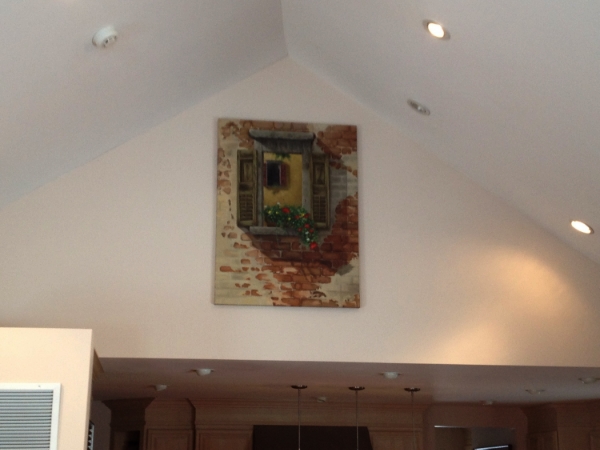
Best of all, Cathie was thrilled with the painting, how it looked in her house and how it ended up being exactly what she needed for this previously big blank space!
Commissioned Dog Portrait
A little while back in this blog, I talked about how much I love the diversity of projects I get to work on – and my most recent project is another great example!
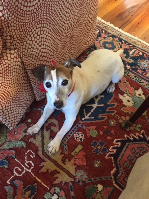
Pam has a portrait of her own dog and had the idea to have me paint her sister’s dog Gus as a birthday gift. The process started with the picture below, but I also met with Pam to talk about what she wanted to see in the painting. Her sister likes this particular picture, so including the rug and the chair were going to be important, but we also wanted to make sure Gus was the hero of the final piece. In addition to capturing the appearance of Gus, we also talked about his personality to make sure I could show that as much as possible – so understanding Gus is a sweet, feisty, playful and mischievous dog was essential.
Pam did not want to include the red kerchief, and we talked about cropping out the hardwood floor and pillow and deleting the chair leg to clean up the composition. I also simplified the chair and pulled it in closer to overlap with Gus so that were not too many lines to pull the viewer’s eye away from the dog.
Finally, I shifted Gus’ gaze slightly upward to make him look more at the viewer. I also accentuated his crouch slightly to make it look like he is ready to spring into action!
The best part is when I delivered the painting to Pam and her first words were “You nailed it! That’s Gus!!”
Enjoy,
Jason

A Collaborative Mural Panel Landscape
Adam is a contractor who had the unique idea to turn a reclaimed 52” x 50” window into an unforgettable Christmas gift for his wife Sarah. When Adam first reached out, his thought was to have me paint a scene on the 35 glass panes to give the effect of looking at the scene through the window. After our initial collaboration, we decided instead to paint a mural panel to attach to the window in order to create the same effect, but avoid the challenges of how easily paint chips off of glass.
The first step was to meet with Adam and Sarah to see the space where this mural panel would be installed and to get their thoughts on what they would like to see in the final scene. Sarah started with the idea of a field of red poppies. As we talked further, she shared that she liked the bold patterns of Marimekko and also the paintings of Karen Tusinski. In looking through my work, she also enjoyed to the folk-style I used on some of the furniture and fine art pieces. She talked about how she was drawn to the pattern-like approach of Marimekko and Tusinski, but also liked the detail of my work. In the end, she felt the best approach for this piece would to be somewhere between these two looks, with a focus on colors and textures. For the color palette, we had the reds of the poppies to work with, but also looked at the colors in their house and decided to incorporate the wall color this piece would hang on (a pale grey-purple) as well as an adjacent hallway (pale grey-green) and room (grey-blue). When we talked about the feel of the scene, she liked the idea of staying away from an overly bright/cheery mid-day scene and instead focus on the colors and light of a sunset. As a final element, Sarah wanted to include her mother’s barn, for which both she and Adam have a sentimental attachment.
After this meeting, I put together 3 different concepts – which are basically painting “sketches”- to show different approaches to how we could look at combining these elements. I also created a template of the window to lay over these concepts to show how the final installation would look. When I did the first 2 concepts, I did not yet have pictures of the actual barn, so I used a “generic” structure as a placeholder. In the first sketch, I leaned more in the direction of the folk style, while in the second, I went more in the bold/pattern-like direction. With the third concept, I tried to incorporate both – with the clean look of folk but keeping with Sarah’s idea of focusing patterns, colors and textures.

Concept #1

Concept #2

Concept #3

Concept #3 with window template
The next meeting was to review these concepts with Sarah, and number 3 was a clear winner for her. To make sure I transferred what Sarah liked about the concept to the final piece, I asked for specifics of what she liked. She shared that she liked the asymmetry of the poppies on the left, the “blotchy” painting style, the accentuated highlights on the petals, the consistency of the red between the poppies and the small accents in the barn and the combination of the patterned/Marimekko look with the folk style.
With that, I was back to my studio with a 52”x50” piece of plywood. I started by laying a grid over the concept to proportionally correspond with a grid I drew on the prepped final board. Since Sarah liked the concept, this approach helped insure that the sized-up version has the same layout. In painting this panel, I used a lot of layers to build depth, richness and interest. For example, the poppy petals use 4 different colors of red. The first layers used smooth blending of the darkest and next lighter shade to create shape, while the last 2 layers of lighter shades were applied in looser and more abstract patterns to create the final look. The background uses the same approach, with 13 different shades of green making up the field.
The final result was a hit and captured exactly what Sarah and Adam were looking for! They are excited to mount it with the window so they can start to enjoy the new view.

The final panel
Putting a Home Under the Christmas Tree
When Meg began thinking of Christmas presents for her husband Dan, she decided she wanted to do something that he would cherish for years to come.
Both Meg and Dan had seen my paintings online and in person, and when Meg saw my painting of Martha’s backyard shed she got the idea to have me do a painting of their home. The key word here is “home” instead of “house”. What makes the house special to Meg and Dan is the life they have built together there with their two sons. When Meg saw the final painting, she thought about not only how special it would be for Dan, but also how it would be something that her sons would always have and cherish as well.
One of the challenges in this painting is the season. Taking pictures now gave me a lot of the information I needed, but in talking with Meg, we decided that showing the house in spring would be the best way to capture the picture she was looking for. Below is the picture I worked from and the final painting, showing the educated guesses I needed to make on the surrounding landscape!
As we looked at pictures and walked around the house, Meg wanted to make sure the lawn in the painting was a lush green to honor all the work Dan puts into it. She also wanted to make sure I captured the flag out front.
We then talked about the painting style she preferred and what would work best to achieve her goals. We looked at my primitive trunk, the folk-style Nantucket sailboat and the painting of Martha’s shed. Ultimately, we decided something between the clean and precise look of the Nantucket sailboat and the feel of Martha’s shed would fit the bill.
Meg can’t wait to give the painting to Dan and to hang it in the front hallway as people enter the door so their family and friends can enjoy it right as they enter the house.


Painting a Memory
Coming up with the perfect Christmas gift is often a challenge, and when it comes to that perfect gift for dads – it seems like it is always a challenge. The process of pondering this dilemma is how my most recent client came to me. Matt had seen my other paintings online and got the idea for making this year’s gift a memorable one.
Rather than getting something his dad may be able to use, Matt decided to go with something he definitely would cherish. Digging back into the photo archives, Matt found this special shot of he and his father from over 20 years ago when Matt was about 9 years old. Matt’s dad loved his boat and loved his times on this boat with family even more.
As I have the opportunity to work with more clients, I am struck by the precious memories I am trusted to capture in a painting. I always want people to love the paintings I do for them, but in cases like this painting for my client Matt, I also feel a responsibility to honor that trust. I also love the picture and could immediately see why it is special to Matt and his father.
Since this is a portrait, my first goal was to make sure I captured the faces. Beyond that, it was important to keep a little of the “old” look to the picture to maintain some of the charm while still brightening it a bit to bring out the details and the summer-day feeling. In talking with Matt, the only other enhancements we wanted to make were to subdue the trees a bit to push them further into the background and of course drop the date stamp. Finally, I wanted to balance the importance of being accurate to the photo while still having a touch of the paintbrush apparent to add a little something to the final piece that is more than the photo itself.
I delivered the painting to Matt this morning and am looking forward to hearing his father’s reaction!


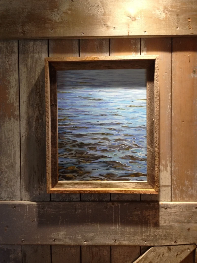
“Thanksgiving Sky”
George Winston’s album “December” is a long-time favorite of mine. There is a somber but still joyful feeling about this collection of songs that makes me pull it back out every year as the holidays approach.
There was something about this scene that had the same kind of appeal for me. I love patterns, so a big part of the draw was the shapes these trees make. What made it a subject worthy of painting, though, was more the mood of the view. It has a peaceful feel that, together with the obvious ‘November in the Northeast’ look, brought me to the same quiet but joyful place that George Winston’s album does.
Painting this made me think about the drive to see family on Thanksgiving, which inspired the title “Thanksgiving Sky”. I hope you enjoy some of the same feelings looking at it here!
It is now on display at the New England Artisan Gallery on Route 1A in Wrentham, MA for anyone local who is interested in checking it out.
Happy Thanksgiving!

A View Back
Sometimes a painting is about a feeling as much as it is about the subject - which is what I tried to capture with my latest painting.
Martha wanted to refresh her kitchen with a special painting, and asked me to capture the view out of the back of her house. The spot itself is beautiful, but I know it means much more to Martha than a nice vista. It is also about family and memories and the peaceful, quiet feeling of the place. It is this peaceful, quiet feeling that I focused on.
When painting a scene like this, picking the right composition is key. I wanted to get the full view but also wanted to make it so that no one part of the painting overwhelms everything else. Certainly, the shed should stand out, but setting it off to the side and subduing the colors helps it blend more into the whole painting and allows your eye to move around to the other elements of the scene. Editing is also important. While a painting like this needs to be accurate, there are things like a corner of a fence and another much larger wood pile that I omitted because they would have detracted from the overall composition.
Another key focus of this painting was the colors. To create the quiet mood, I needed to avoid vivid colors. Using an overcast fall day helped, but I greyed back the colors even further than the original photo to make a final piece that doesn’t reach out and grab the viewer so much as it subtlety pulls the viewer in.
The small, digital version I have here doesn’t quite have the same impact as the 18”x24” original, but I hope you enjoy spending some time taking in the feeling of the painting as much as I enjoyed painting it.

The original photo

The final painting
Completed Illustrations and Story for Children’s Book!
As I had mentioned in an earlier blog post, my wife Gwynne had written a children’s book a while back that has been waiting for illustrations – which are now complete!
As you can hopefully see from the story and pictures below, this book is meant to be interactive. We want each of these little mini-stories to be a jumping off place for the reader to make up different possibilities of where the story can go from there. This was inspired by our experience reading to our own kids, and the endless number of nights we could read books like this and have fun telling stories every time.
With these illustrations, my goal was to capture the scene and the mood of the story, but also give the tools and inspiration for kids to be engaged. In the scenes with the little girl, you will see hints of images that then appear in the next “story” image. And with these “story” images, I wanted to give just enough to spark kids’ imaginations without limiting options for where the story can go.
Our next step is to try to get this published – but in the meantime, enjoy!
"And So Our Story Goes..."
In the quite light of a Saturday spring morning, you sit on the stone front stoop to have a simple picnic.
"Daddy, bring your coffee." You say, and we look out at the brown and muddy garden waking up.

"Once upon a time there was a butterfly and a balloon and a flower as fragile as glass," you begin. And so our story goes...

Under the hazy heat of a midday summer sun, you dangle all ten toes in our pintsized plastic pool.
"Daddy, bring your towel." You say, and we look at the ripples our dancing cold toes make.

"Once upon a time there was a white perch and a willow and a shell as black as night," you begin. And so our story goes...

Wrapped inside a blanket keeping out the late day wind of fall, you sit on our back porch while a pumpkin waits for carving.
"Daddy, bring your scooping spoon." You say, and we try to hold the slimy seeds as they slip between our fingers.

"Once upon a time there was a crow and a candle and a leaf as bright as gold," you begin. And so our story goes...

Beside a hungry fire, while snow falls beneath cold stars, you snuggle under blankets and curl your toes inside wool socks.
"Daddy, bring your coco." You say, and we stare at the wild flames as they snap against red brick.

"Once upon a time there was a deer and a drum and a tree as brave as you", you begin. And so our story goes...

Watching by your bedside as the moonlight bathes your skin, I think of the fine stories your once upon a times always make.
"Good night sweet heart, I love you." I say, and I notice your quiet shape hidden happily beneath the sheets.

"Once upon a time there was a girl and her father and a world as wide as wonder," I begin. And so our story goes.
Masking a Cell Tower with Faux Brick Painting
Have you ever seen those not-so-convincing cell towers made to look like pine trees? I recently learned there is an entire industry of companies who provide ways to hide cell towers – and unlike the pine trees, the results can be extremely convincing.
My experience in this space started when an old colleague from the print world forwarded me an email from a friend of hers who was looking for scenic painters. While my actual “scenic” work is limited to a few small projects I did for the drama group in college, I reached out to see if my mural/artist/house-painter skills would be applicable.
After an introductory phone-call, I made a trip up to visit Atlantic Concealment in Maine where they produce many different styles of enclosures. The project they were working on at the time was a brick enclosure that was going on the roof of a building in Connecticut. They do this by creating panels out of special dense foam and then stamp a brick pattern on the surface that gets painted uniform “mortar” and “brick” colors. In this case, the building was older and had a lot of variation in the brick colors, so the uniform brick color was not a natural enough match to blend with the existing structure.
My task was to go on-site in Connecticut so I could see the existing brick first hand and mix colors to match. After some challenges with rain (of course), I was able to dig in. It turned out to be a fun challenge not only to match all of the colors, but also to figure out how to replicate the patterns of color variation, stains and wear that were on the building itself.
Following are some pictures from the job – including the “before” shot of the pre-painted panels, an “after” shot of a panel, and the final installed result. For more on this – Google images for “cell tower concealment” to see some of the ways cell towers all around you are hidden!

An example of the panels before my retouching

After the matching process!

The panels installed
Sneak Peak at Illustrations for Up-Coming Children’s Book
A while ago, my wife Gwynne wrote a children’s book that has been waiting for me to do the illustrations. I was able to get a start this week, and I have been thoroughly enjoying it!
At this point, I have about half of them done – so I will follow up in my blog with the full text of the story along with the illustrations when it is all complete. For now, I have posted the illustrations I have done below. The basic story is about a girl and her father experiencing everyday life while the girl starts to tell fanciful stories. For example, in the first illustration, the father and daughter are having a picnic on their front stone stoop looking at the garden when the little girl starts her story with: “Once upon a time there was a butterfly, and a balloon, and a flower as fragile as glass”. The idea of the book is to open up the rest of each story for the readers to make up on their own.
Enjoy!


A Painting of a Special Place
In addition to finding new people to collaborate with through BlackBeak studios, I have also been fortunate enough to do some work with friends and family.
My latest piece is for my brother Matt, who asked me to honor a special place with a painting. As I had mentioned in a previous post, my brothers and I do an annual camping trip in the Adirondacks. Every year we camp on a little lake called Huntley Pond and every year we hike to a spot on the Hudson River called the Blue Ledge. Depending on the time of year and weather, we may jump in – but usually, we just enjoy the beauty of the place and throw sticks for Matt and/or Ian’s dogs to fetch.
This tradition started 20 years ago with my father and my older brother Matt (my younger brothers Danny and Ian were too young to join back then). 20 years ago we camped on Huntley Pond and hiked to the Blue Ledge. The first time we made the trek to the Blue Ledge, we didn’t come prepared for the swim – but it was a hot day and the river was calling us in. Since nobody was around (we were in the middle of nowhere, after all), we stripped down to our underwear and started to head in to the water with our dad in the lead.
Which leads us to the first of many memories of this trip and this spot. As our dad waded in to his waist, a raft full of about 15 people came around the bend. Matt and I had not jumped into the water yet, so we quickly retrieved our shorts. Our dad was in deep though, and – all while giggling – he made for the shore, soaking wet in his underwear. Making it a funnier scene (particularly for Matt and me), the raft turned to pull up on our beach and unintentionally chased our dad all the way up where his shorts were!
This year was overcast and much colder than that first trip, so there were no swimming antics. Instead, I took some photos and talked with my brothers about our memories of the place. In this painting, I wanted to capture the bend in the river (around which the raft came), the rocks we often play on, a bit of the beach we hang out on – and of course the ledge itself.

Four New Pieces for Gallery Open House
On October 18th, I will be one of about 25 local artists participating in an open house at the New England Artisan Gallery on Route 1A in Wrentham, MA. I just dropped of my pieces today and they will be there for a month – but I will be there on the 18th to join the Open House from noon to 8:00pm. If you are not familiar with the New England Artisan Gallery, it is where Stephen Staples shows his (amazing) furniture crafted from reclaimed wood. Check them out at http://www.staplescabinetmakers.com/
To prepare for this, I put together four new pieces that I am showing along with two older ones. The last piece I finished is this 16”x20” oil painting of a small lake in the Adirondacks called Huntley Pond. I do a camping trip there every year with my brothers, and this is from a photo I took on the last day of our trip at the end of September. The weather was amazing, and we were basking in the beauty of the place before we had to pack up. I have done paintings of the surface of water before, but I couldn’t resist capturing this one in paint.

Also new and at the show is this 9”x12” painting, which is a view from the Olson house in Port Clyde, Maine. You may remember from an earlier post that the Olson house was made famous by Andrew Wyeth (this is where he painted “Christina’s World”). The path in the background actually leads to Wyeth’s grave. In addition to the power of the place (I am a huge Wyeth fan), I loved this tree and the patterns of light through the branches together with the “V” pattern of the trees and ocean in the background.

Finally, I painted 2 antique sleds that are also at the Artisan Gallery. The sleds themselves are great, and they gave me the idea for these 2 scenes.

Also at the show is an 8”x10” oil painting I did on Monhegan Island and the primitive trunk I painted back in August. Below are some shots of these pieces at the gallery.

"Night Sledding" sled and trunk - with Huntley Pond painting in the background


I hope to see you at the Open House!
A Painting as a Christmas Gift - Bringing Summer Vacation to the Mantlepiece
I have come to thoroughly enjoy the challenges of working in different styles and painting on everything from walls to furniture to canvas. Even more than this though, some of the most fun I have had painting is from working with client’s ideas.
Deb is a recent client who saw my mural panel at The Sweatshop gym in Medfield and then checked out my website. When she saw my primitive trunk, she got the idea to have me do a primitive-style oil painting of a photo she took on her family’s vacation this past August. This is going to be a Christmas present for her husband (since her husband is not yet aware of BlackBeak studios, it is safe to write this post without ruining the surprise!). Deb and her husband love the shot, feeling that it captures the magic of their Nantucket vacation while also having a great patriotic feel to it.
When Deb sent the photo (see below), I did a little research to get ideas of how I could work a little more realistic than my previous primitive painting to address the challenges of this image. This is when I discovered James Bard, who was a painter in the 1800’s. James Bard is known for his paintings of boats, which are beautiful – and a perfect fit for what I wanted to accomplish with this painting! To make sure I was on the right track, I had Deb look at James Bard’s works and her response was that it was “spot on!”

My first focus was the drawing itself. Often times, my pre-painting drawings are loose sketches that really just map out the subject on the canvas. For this painting, though – I knew I needed to be precise. If anything in my drawing wasn’t exactly right, the painting would look off.
As soon as I had the drawing done, I was excited to jump into painting the water – as Bard’s treatment of water is a big part of what drew me to his work. I then worked on the sky, focusing on making the clouds more dramatic and picturesque than realistic (as with James Bard’s work). With the need to be precise on the boats, I also needed the sky and water to dry before I could start creating all the details of the boats.
With a lot of referencing the photo for accuracy and some deep breaths while painting the many straight lines, I got the boats complete and let Deb know her painting was ready. I always like to know what the final recipient thinks of their painting – and with Deb’s excitement to hang the final piece, she shared that I may not have to wait until Christmas to find out!

The gift of a painting… Bringing a piece of “old home” into a new home
Kelley is an avid outdoorsman who grew up in Dover, MA. After college and a few years in Washington DC, Kelley and his wife Amy settled back in Massachusetts in nearby Needham. Together with their 2 daughters, they lived in Needham for many years – until Kelley was offered a fantastic career opportunity in Georgia.
Always up for an adventure, Amy and the girls were in full support and off to Georgia they went! They have been in Georgia for about a year now and are settled in a beautiful home in Augusta.
Fast-forward to today, Kelley’s birthday is just around the corner and Amy wanted something special for Kelley and their new home – which is when she reached out to me. This was a fantastic project. Knowing Kelley, I was thrilled to come up with the perfect painting for him!
Starting with direction from Amy – who likes my outdoors paintings of water and trees – it didn’t take long to come up with my subject. I started with a trip to Kelley’s hometown of Dover with my camera. Knowing that Kelley is an outdoorsman, I decided to focus on the Charles River, which winds right through the heart of Dover. My goal was to create something beautiful for Kelley and Amy’s home, but also to give Kelley a little piece of “home”. After taking my study photos (making sure to incorporate some fall foliage), I was off to the studio.
The composition I chose was aimed at giving the feel of the Charles. The lily pads and the stream of floating moss are common sites on this section of the Charles, and I also wanted to get the full view of the river – from rocky bottom to the growth and foliage on the other side. Finally, Amy had shared pictures of rooms in their home, so I also made sure to pick a scene that would work well to the colors in their house.
The painting arrived in Georgia earlier this week. While Kelley’s birthday is not for another 2 weeks, it is already on the wall – giving both Kelley and Amy a little bit of Massachusetts for their Georgia home.
