Is it real or is it faux painted wood? That is the question my recent client ended up asking!!
I was called in to a home in Brookline to make the edges of stairs transform from a worn white paint that didn’t match the steps to a realistic faux wood grain that needed to look just like the heart pine of the stair treads. Because you see the second level of the steps at eye level when climbing the first level, I knew that it would need to be an excellent match for this client to be happy!
My first step was to visit the house to look at the stairs with my paint swatch book and camera. I needed to get good notes on the paint colors I would need to buy as well as some pictures to reference as I planned for the project. When you look closely at wood, you can see that there are actually many different colors that make up the overall look – so I ended up buying 3 colors of latex paint, plus I brought my fine-art acrylic paints to mix additional hues to blend in.
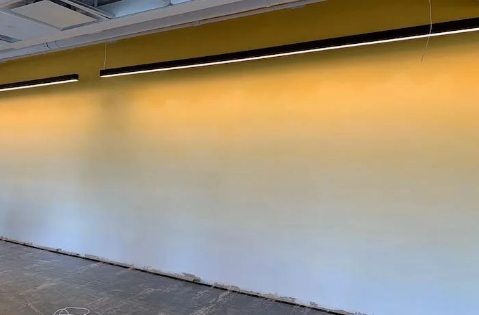
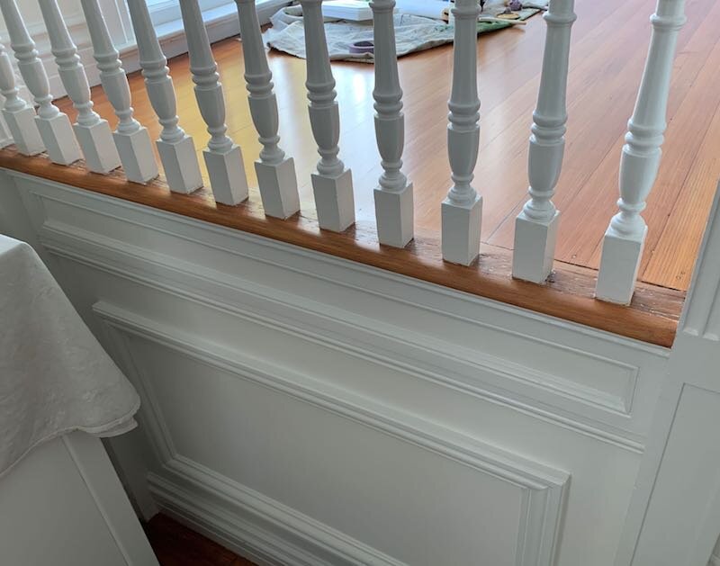
When on site, the first step was to paint all of the stair edges with the “base” color – which is what looks like the background color behind or underneath all the grain. In this case, the background color was a gold – which you can see on the second step in this before shot. With this complete, the second step was to “grain” the dominant secondary color. To do this, I used one of the latex paints I brought, mixed with glaze, and dragged with the best tool to make the grain look.

BEFORE #1 — the lower one (painted gold) is after my “step one”
Once this was complete on all of the stairs, I was on to the best part – which was treating each stair edge like it’s own little painting. Using my additional latex paint and many colors I mixed with my acrylics, I then painted grain, light areas and dark areas to match each individual step. To add to the realism, I also painted in wear and worn-in dirt in areas that had wear and worn-in dirt on the treads Below are some pictures showing the “before” and “after”.
AFTER #1

BEFORE #2

AFTER #2

BEFORE #3
AFTER #3

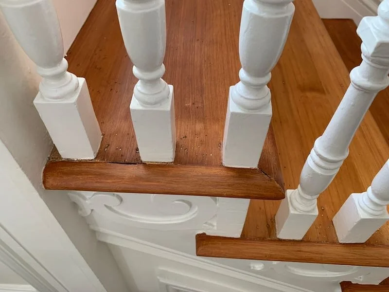
AFTER close-up
As a fun detail, I also painted in the mitered corner on each step for an added touch of realism!

After close-up of “mitered” corners
When it was done, the client lifted his glasses, brought his face right up to the stairs and said “WOW!… I can’t tell it’s not wood!
Enjoy!
Jason