Kids’ Room Mural in Brookline, MA

My recent kids’ room mural brief was to use a lemon tree theme and make it fun, whimsical and playful!  As usual, my first step was to collaborate with my clients (who are expecting a baby girl in just weeks!) to generate ideas on how to accomplish their vision.  Our discussions lead to the ideas of including pink birds and a swing – in addition to smaller details like a chipmunk in one of the tree and kissing hummingbirds.

 After collaboration, the next step in my process is always to do a concept drawing and painting to show my clients exactly what the final result will look like.  At this step, I also included a fun detail by “hiding” a heart in each of the trees (which was a hit!)

 With the concept approved, I was on to painting the wall – including  a wrap-around through one corner to a small adjacent wall.  Mom, dad and big brother are thrilled with the final mural – which I got done just in time for them to set up the baby’s room!

 Enjoy!!

Jason

The full mural

Hearts hidden in the trees!

Metallic Plaster Walls and Silver Leaf Ceiling Elevate Living Space

A client who has used me in the past to do a mural in her playroom and specialty finishes her retail shop had me back in her house to elevate the living room and dining room!

Starting with the dining room, we wanted to do something special with the large, coffered ceiling.  Factoring in the existing color scheme and décor, silver leaf was the perfect fit!  By hand-applying individual sheets of imitation silver leaf in each of the 9 coffered sections of the ceiling, we got just the hand-crafted look of elegance my client was looking for!

In the adjacent living room, my client wanted something subtle done with the walls that would be more special and decorative than straight paint, but not so busy that it would dominate the space.  To create this look, we used metallic plaster in a color I mixed to tie together the slightly warm off-white trim color with the silver leaf of the dining room ceiling.  The slight mottling and soft motion of the plaster worked perfectly with the color scheme and offset the grid of the ceiling beautifully!

Enjoy!!

Jason

The metallic plaster living room looking into the dining room

Metalliv plaster wall

Looking up at the silver leaf ceiling!

Portrait of Beagles

It has been a little while since I have done a dog portrait, so it was fun to do this painting of 2 adorable beagles!

My client Judy had me do this painting as a birthday gift for her husband.  The beagles featured are their first beagle (“Starbuck” on the left) and the beagle that started their breeding business! (“Gracie” on the right).  Sadly, both Starbuck and Gracie have since passed – making the painting all the more special as a way to remember these 2 precious family members.

Judy, her husband, and both Starbuck and Gracie loved Rockport – so Judy asked to set the painting there.  The only challenge is that they had no photos of the 2 dogs together in this favorite location – so it was my task to combine an image of the 2 dogs with an image of Rockport.  The reference images I had to work with are below:

The reference photo for Starbuck and Gracie

The reference photo for Rockport background

My first step was to do a sketch of the dogs set on the rocks in front of the ocean to make sure my vision of the final image was indeed what Judy wanted (see below).  Judy loved it!  Her only revision was to make sure Gracie was looking straight out at the viewer in the final painting.

The initial sketch

With this small edit in mind, I was on to the final painting!  Below is the result – which was a huge hit with both Judy and her husband!!

The final painting!

Graphic Pattern Walls

“Now that’s cool”… We often step back and admire our specialty finish projects when they are complete, and this one was no exception!

Starting with the inspiration provided by one of our interior design partners, my colleague Joan and I were tasked with transforming this top-story vaulted-ceiling room into one big, graphic, contemporary work of art.

The idea was to start with the idea of very thick stripes intersecting at various angles.  We wanted the shapes created in negative space between the stripes to be as important to the design as the striped themselves – so a big part of this project was the design step.  We began with a full day just figuring out where the stripes and shapes should fall to make the room interesting and beautiful from every angle.

To elevate the level of interest, we then used metallic plaster instead of paint to create the pattern.  This gave us beautiful reflections and variation within the stripes that make the colors shift as you walk through the room.

In the end, the client and the designer loved the result --- as did we!!


Enjoy!

Jason

Decorative Finishes Will Travel!

As a fun change of pace, a client we worked with in Westwood, MA recently flew me and my colleague Joan to Miami (FL) to do some decorative finishes to her condo down there!

There were a few smaller projects, but the main points of focus were finishes on feature walls in the two bedrooms.  In the primary bedroom, our client wanted us to do a high gloss black venetian plaster to add drama and richness to the room.  Below are 2 shots of this – you can see the shine and subtle texture in the second shot.  This finish is amazing to touch!

In the guest bedroom, our client wanted us to elevate an existing finish.  When we started, the wall had a treatment that looked like aged, unfinished cinder block.  Our goal was to instead make it look like decorative stone – and they were thrilled with the result!

Enjoy!!

Jason

More Library Murals!

The Dedication Ceremony for the renovated Children’s Room at the Winchester Library (featuring my murals!) was this past Sunday – and it was fantastic to see the reactions of the visitors!!!

When this process began, the Director of Children’s Services called me in to look at the space in preparation for a renovation project.  In place of the old purple, gold and off-white color scheme, they wanted to bring the “outside in” and create a whimsical nature-based space that would bring joy and inspiration to the kids who visit.

In this first meeting, we brainstormed the different places we could put murals, while also discussing different subjects I could paint and choosing colors for the entire space.  Central to the overall space is 4 large columns in the main room.  My proposal was to change the gold flutes at the top of the columns into colorful flowers and have the stems of the flowers spiral up the columns – which they loved!

With the Winchester team on board with the concept – I was on to painting my designs.  This included of course the columns, but also animals, insects, trees and flowers that would make up the 15 mural vignettes that I ended up painting in the 2 rooms that make up the children’s area.

With the designs approved – I was on to painting the final murals!!  It was great to visit once the project was complete, and to hear stories of children playing “find the chipmunk” and  giving the bunny kisses. 

Following are pictures of the final result:

Enjoy!

Jason

4 flower columns

Birch tree lally columns

Column with ladybug

Hiding mouse

Doorway into the second room

Painted “wallpaper”, specialty painted ceilings and copper patina wall

I had the pleasure recently to work with a client who started with one decorative paint job, and was then inspired to do many more!

My first project at this beautiful home in Westwood was faux painting the railings, newel posts and columns in the entry foyer to look like marble.  For more on this project, scroll back a couple of blog entries!

With this complete, we then moved on to the walls in the balcony hallway that are framed by the faux marble bannisters.  My client wanted to add some interest to the plain-painted walls without the result being to dominate, as she wanted to still hang pictures.  The design also needed to tie in to the faux marble and the wallpaper mural in the stairwell.

As always, my first step was to create a concept board.  Starting the existing wall color as the background, I wanted to pick up on the shapes in the sconce lighting and corner accents by using a vine/leaf pattern.  To keep the look subtle, the colors I chose for the design were slight variations of the wall color, which were also colors in the faux marble.  Finally, I chose a high-gloss sheen so the shine of the patterns would add another element to the design.

My client loved the idea, so we were on to painting the walls.  At this step, my first job was to layout the design on each wall.  I used a cut-up stencil for about half of the elements and then hand-painted the rest – resulting in a one-of-a-kind pattern for my client.  The end result delivered exactly what we were looking for! 

The next projects were in the client’s “saloon” room.  The walls had been painted copper already – and my client wanted to play with this, making an aged patina around the TV/above the fireplace.  Using a reactive copper paint and acid, I was able to get a natural coper patina and apply it in a way that also accomplished the client’s goal of keeping it “soft and pretty”.  Keeping with the “aged” theme, the client also wanted me to antique the shiny white bead-board ceiling in the same room.

Copper patina wall with antiqued ceiling

Antiqued ceiling

Keeping with the spirit of the faux marble, my client also wanted us to create a specialty finish for the columns in her primary bathroom.  For these, we wanted them to have the natural feel of a veined stone, but also wanted to give them a special, elevated feel.  To accomplish this look, we used metallic plaster, incorporating colors from the stone of the tub surround and the walls.

Finally, the last project was a tray ceiling in the kitchen that was also a glossy white bead-board.  My client liked the idea of picking up on the copper in the nearby saloon, but we also wanted to tie in the blue of the island directly below the ceiling.  Knowing that the client likes things to look aged, our solution was to paint it copper first, and then do an aged finish in the blue – leaving some of the copper underneath to peek through.  This idea hit the mark!

Kitchen tray ceiling

Tray ceiling with blue island below

Enjoy!

Jason

Kids’ Room Constellation Mural

Lately I have done a number of murals in public kids’ spaces – but it had been a while since I had done a kids’ bedroom mural… at least until I did this constellation mural in Weston, MA!

Collaborating with the fabulous interior designers at Briar Design, the goal was to pick up on the theme of constellation wallpaper in the same room (picture below).  The wallpaper is on one accent wall, so the idea was to follow the same theme with the mural, but keep with the light background of the existing wall color (basically making my mural the “negative” of the wallpaper).

The wallpaper on the wall opposite the mural

When putting the design together, I was obviously working with constellations – but I wanted to make sure my colors pulled in tones from the rug, curtains and wallpaper on the opposing wall.  When looking at the starts themselves, I wanted it to be fun while also giving a nod to the mid-century modern style in the rest of the house.

After presenting my design concept, my partners at Briar and the client felt I hit the mark – so I was on to painting the final mural!

It was gratifying that my client was happy with the results – but even more fun to experience the joy of their 7 year-old son, who ran in after school every day sharing his enthusiasm with the progress!

Enjoy!

Jason

The final mural!

A close-up with the astronauts Briar Design selected

Miles of Faux painted Marble

OK – maybe not “miles” – but this was a lot of faux painted marble!

My client Francesca brought me in to transform her “normal” woodwork into something special!  The main focal point was the bannisters and newel posts leading up a grand staircase in the home’s foyer and around the balcony – but it also included 4 columns and 2 decorative niches.  To go with the grandeur of the space, Francesca’s vision was to transform all of these elements from painted wood to elegant marble!

The first step was to determine the colors that would go into the faux marble.  Working with Francesca, we found colors from her carpet, the walls, the floor and the wallpaper murals that would work together well to make a marble look, while also tying the final result together with the rest of the space.  With these colors in hand, I was then on to creating sample boards to get Francesca’s approval.  Working with my colleague Joan, we created 2 different options to present – and ultimately, together with Francesca we decided on a final version that used elements from both concepts.

Once we knew the colors, patterning and process – we were on to painting!!  The key to making a believable faux marble is painting multiple layers.  This builds the depth and creates overlap of elements – much like natural marble.  In the end, we painted 7 different layers to get this look!

The extensive process was worth it, as Francesca was thrilled with the result of creating a realistic marble look with colors that work perfectly in her space.

Here are pictures of the final product -

Enjoy!

Jason

Looking across the balcony

Looking down from the balcony

Modern Art Textured Plaster Walls

The term “decorative painting” can be misleading – since often the finishes I do (gold leaf, metallic plaster, Venetian plaster, etc.) are not created with paint!

This was the case with a recent project.  Collaborating with interior designer Nicole Hirsch and my colleague Joan Kingsbury, the goal was to create a wall texture that was unique and contemporary.  With this brief in mind, we were on to the design process, starting with a sample board. Using a drag technique in plaster, the board showed how we could create bold geometric shapes and patterns in the plaster.

Nicole liked the board and we were on to the final room! The first step here was to draw out the pattern on the wall – looking at each wall as a piece of abstract art. When doing the drawings, we focused on the composition to make sure the design was balanced and kept the viewer’s eyes moving around (rather than focusing on one area).  Joan and I did one wall to get Nicole’s approval and then were off to the races with the rest of the space!

The end result was both striking and soothing at the same time – perfect for this bedroom!  The final walls were painted in a light grayish off-white, which capped off the clean, contemporary look.

It turned out that capturing the texture with a photograph was difficult (the camera couldn’t capture what you could see in person) – but these photos give a sense of the end product.

Enjoy!

Jason

Fantasy Mural sets the scene for Playroom at Therapeutic Center for Children!

The Lark Center is a new facility in Norwood, MA that provides therapeutic play and learning for children.  As they were building out the space, the Lark team (Becca and Michelle) had an area dedicated to play and a vision to make it magical – which is where I came in!

The first piece of the puzzle was a play structure – which the Lark team planned to have custom-built by Gavin Lynn of The Creative Carpentry Company.  To accompany the play structure, Becca wanted a mural to create a “playful, whimsical and magical” environment for the kids.

Sometimes when I meet with a client, it takes a little while of collaboration to come up with the theme for a mural – but when I first met with Becca and Gavin, this mural theme came to me within minutes.  When I proposed to Becca that I do a sunset scene with giant mushrooms, a frog and a ladybug – she immediately was on board!  Taking this idea to the next level, Gavin proposed to make his play structure look like a mushroom – and we were off to the races.

As always, I started with a scale concept painting to make sure my idea is exactly what my clients want.  Allowing for the space of the play structure, I did this concept painting (below) for Becca’s approval – and again, she was quick to approve!  With the design ready to go, I was also good to share with Gavin, so he could design his structure and plan for colors that would tie in with my mural.

The design concept

Once the space was ready for me, I was on to painting the mural.  At this point, the Lark Center was just getting started, so it was a blast to be a part of all the excitement and energy of the Lark team as they watched the progress.  Once the mural was complete, Gavin came in and worked his magic with the play center.

It was amazing to go back to the Lark center when they had their grand opening to watch kids gasp and squeal with glee when they saw the room and jumped in to play!

Enjoy!

The space, including Gavin’s mushroom play house!

The ladybug in the crawl space/nook under the play house

Peeking out from the crawl space!

Origami-Inspired Murals at the Wellesley Free Library

I don’t get the opportunity to collaborate with other artists too often – so it was a thrill to work with the Origami team at Origamido Studio on a large mural and installation project at the Wellesley Free Library!

The Wellesley Library completed a large renovation project this fall, and I was thrilled to be asked back (after I worked with then at the Fells Branch) to be a part of the project. During the planning process, The library team knew they would be doing a origami-influenced installation of butterflies in the Children’s Room, and they knew they also wanted murals in the space, but the concept was left open.  The one direction I had was that the space is also used by adults, so my designs needed to be appealing to both children and adults

My first instinct was to work with the origami theme.  To make my designs child-friendly but also more sophisticated, I decided to paint origami subjects as if they were a fine-art still life painting.  I wanted to use bright colors for kids, but also play with the compositions and shadows to elevate the paintings.  As a proof-of-concept, I did a quick watercolor sketch to present to the team:

My concept sketch for the library team

The idea was a hit!  My next challenge was figuring out how to find the origami I would be painting in order to do many of these compositions – so I reached out to Michael LaFosse and Richard Alexander at Origamido Studio.  To tie my paintings to their installation, I asked if they would be willing to create origami subjects for me that I could then arrange and paint – and they were more than happy to help!  What they delivered far exceeded my expectations – with boxes of amazing paper animals and plants for me to work from (I had requested animals for the walls and plants for the columns).  I asked that all of the origami be made with gray paper so I could arrange all of my compositions and then make my decisions on colors.  Below is an example of one of my studies of these origami creations:

My photo of 2 Origamido creations as models for my paintings

As usual, my next step was to do my concept paintings.  To add to the depth of the painting, I first painted them in all sepia tones and them painting the colors over the top.  Below are examples of the sepia painting and the final color version:

The first step in the design painting

Final color version of design painting

With all 10 of my concept paintings done and approved, I was on to the final walls!  As I did with my designs, I painted the final murals first in sepia tones and then in color – below is an example:

The sepia under-painting on the final wall

The final mural (photo by Dan Nystedt)

To give a sense of scale, here is the largest of the murals in the process of being painted:

A candid shot of me in the process of painting one of the murals

In the end, the murals and the butterfly installation worked great together!  Below are all of the murals, plus some shots of the installation. A special shout-out to Dan Nystedt of Nystedt Photography for his beautiful photos. Enjoy!!

Faux painted Tile

In the category of unique solutions – this recent project had me faux-painting board to look just like the surrounding tile.

The contractor who called me in had a tough challenge.  To make the required updates and repairs meant ripping out the existing tile – but when he ordered the replacement tile it did not match!  The client liked the existing tile and did not want to switch out the tile in the rest of the bathroom – so the contractor had to figure out how to make his repaired area blend in – which is when he called me!

I was able to paint and seal the board he installed to look exactly like the surrounding/existing tile – and the client was thrilled! 

I only took one “before” photo before I painted the first coat.  The other “before” photos show my first coat of paint (the color of the grout) and my tape for the grout lines before I painted the tile colors.

 Enjoy!

Jason

Before #1 (raw surface and the beginning of the base-painting

After #1

Before #2 (showing beginnings of establishing the grout lines)

After #2

Before #3 (showing the other end of the tub surround)

After #3

After #3a

Train Table Mural

I was honored to be a part of this custom train table mural project for the Burlington Library.  The table was funded by the Jackson Walsh Memorial Fund, and is dedicated to Jackson Walsh, a one-and-a-half-year-old boy who unexpectedly passed away.

Working with the Jackson family and Library Director Michael Wick, our goal in the mural design was to acknowledge and honor Jackson and his love of trains, while also creating an experience for Burlington area families that would be engaging and pay homage to the area.

 We decided to use bright colors depicting Burlington landmarks, while also including the Walsh family and a cardinal, which is meaningful to the family.

Working with Michael and the builder, Jonathan Ota of Gunner Grey Furniture, we were on to configuring the table top – complete with the track layout and a hole for kids to be able to pop in the middle if the train. With this in hand, I was on to designing the mural.


Below are pictures of the end result – which has already been enjoyed by many children visiting the Burlington Library!

The train table in place at the Burlington Library

Depiction of the Walsh family

Depiction of the library and cardinal in honor of Jackson

Depiction of Burlington Town Hall and Mill Pond

Depiction of Burlington town green gazebo, the Francis Wyman House and Mary Cummings Park

Abstract Mural in a Stairwell!

One my favorite things about what I do is the variety of projects I get to work on – and my recent abstract mural in a stairwell is a perfect example!

In the process of re-imagining their downstairs space, my client and her designer envisioned something fun, colorful and contemporary on the stairwell wall to brighten the space and make a dynamic impact… which is when I got called in!

After talking through ideas, I decided to show a concept painting using bold blocks of color painted to look like a large postmodern work of art – which they loved!

With everyone on the same page, I was on to painting the mural in the final space with my colleague Joan – which accomplished all of the client’s goals!

Enjoy!

Jason

View from the bottom of the stairs

View from the top of the stairs

Westwood Library Murals

The goals of each of my mural projects are different – and in the case of the Westwood Library, it was fun to do a 2-part mural that tells a story!

The Westwood Library is re-opening its Islington branch in a brand-new location, and they called me in to add a special touch to the children’s section.  One unique challenge in this case is that the space I had to work with was broken onto 2 distinct sections – one smaller section of wall is to the left of a bank of windows, and the other is to the right.  When brainstorming with the Library team about content, they wanted something bright and fun, and suggested it include a book, a ladybug and a butterfly.

With all of this in hand, I was on to the design process!

 Since I had 2 spaces, I wanted to tie them together somehow – so I decided to use them as 2 “pages” of a story.  Since they wanted me to include a book, I wanted the book to play a key role in my story that would unfold from the left from top the right.  When I started thinking of my design in this light, I came up with the idea of growth – and quickly decided on using the “baby” ladybug (nymph) and butterfly (caterpillar) of the left – and them the “adults” on the right.  I then used the title and content of the book to tie the images together with each other, as well as the library – with this design:

My design for left of the windows

My design for right of the windows

I presented this to the library team and they loved it!  With their approval in hand, I was off to painting the final mural!

The final mural - left of windows

The final mural - right of windows

Enjoy!

Jason

High-End Finishes for a High-End Showroom

It’s not too often that I get to do metallic plaster, silver leaf, Venetian plaster, gold paint and a mural all in the same location – but I recently did just that at the SDI showroom in Needham!  SDI is a provider of high-end home automation, theater, lighting and sound.  Their products are amazing and their team is even better – and I was honored that they chose me to add the dazzle to their new showroom on Highland Ave!!

The project started with a brainstorming session with owners Alexa and Angel before the walls were even up in their new space.  They knew they wanted the finishes to give the space an elevated feel, and they had the beginnings of a color scheme in mind – but from there, it was all about coming up with ideas as a team. 

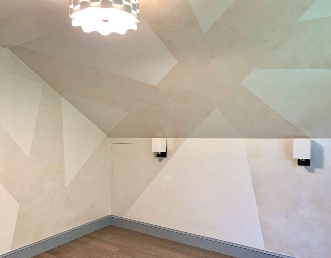
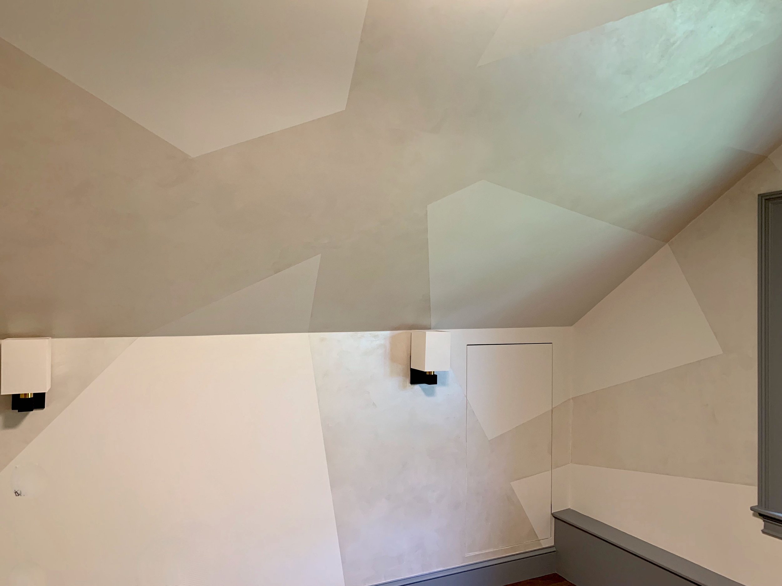
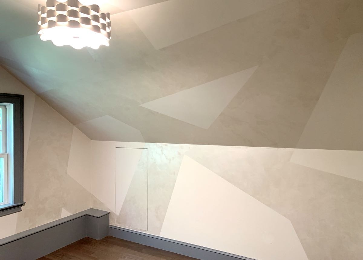
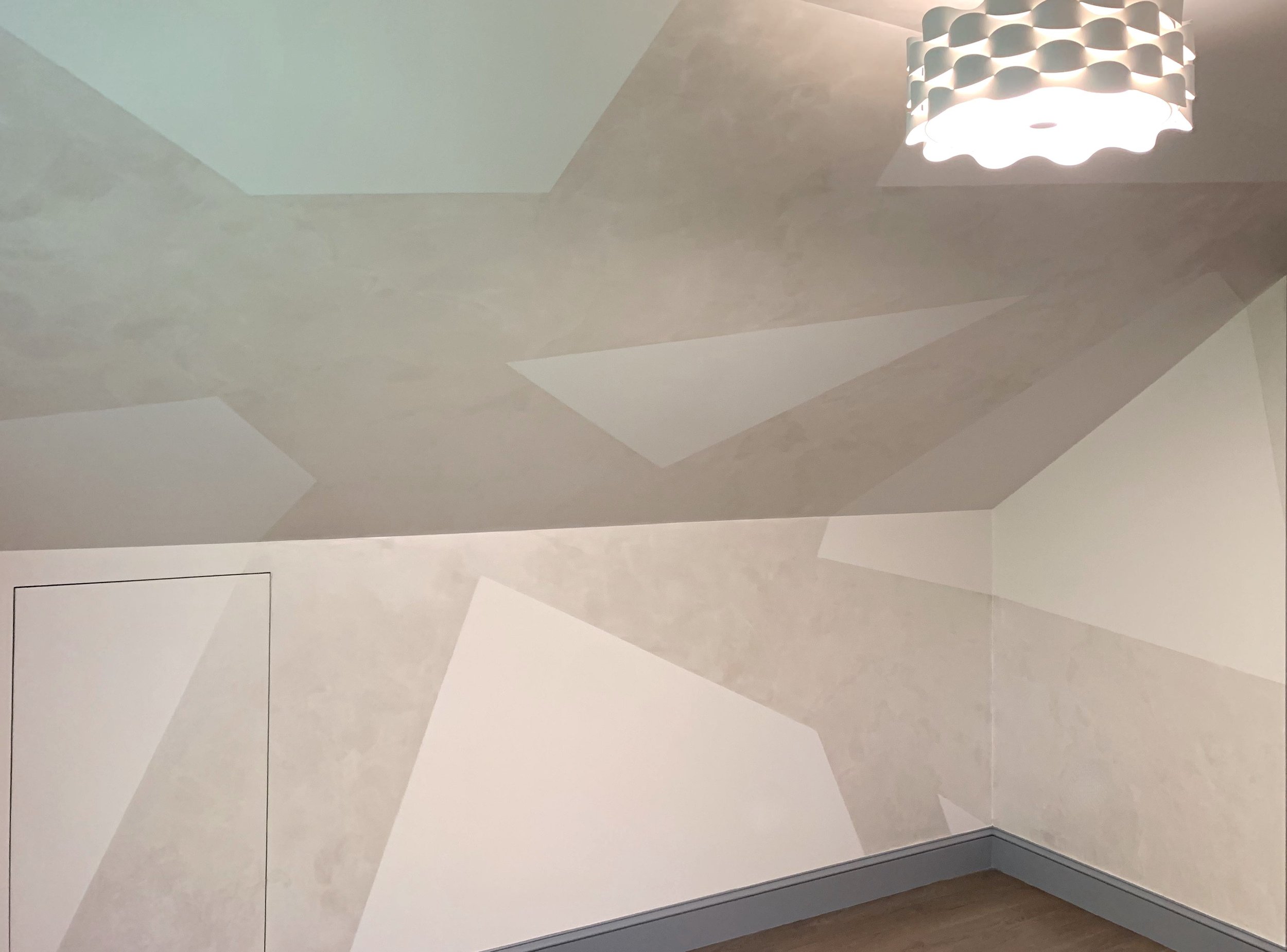
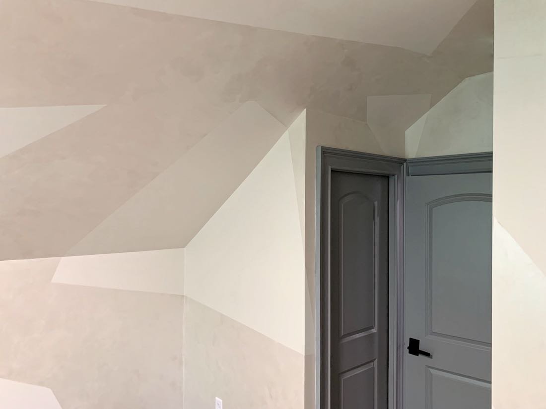
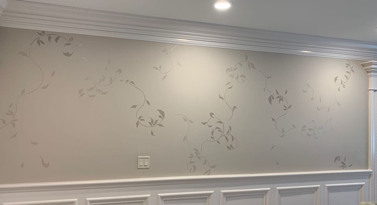
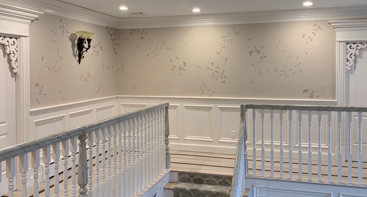
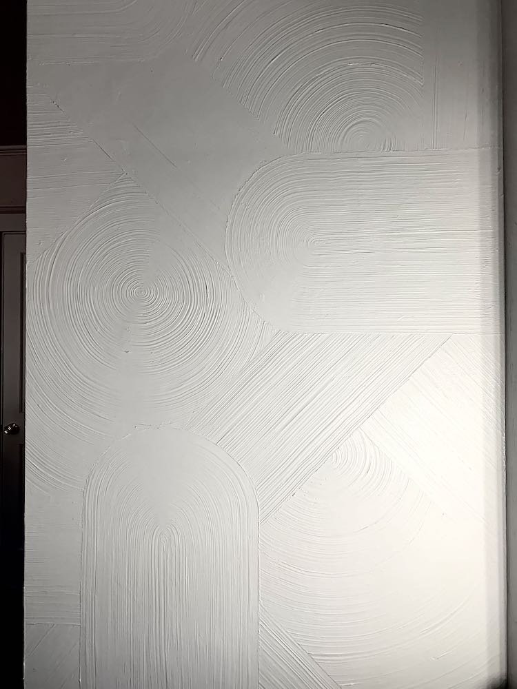
For the walls in the main space, we settled on metallic plaster as a way to add some interest and dazzle as customers walked in the door – without being too busy or overwhelming.  For the color, we looked at available colors and decided to do some testing with a mix of colors to get the champagne tone they wanted, but to make it a lighter than the stock colors.

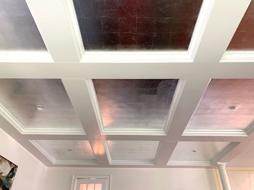
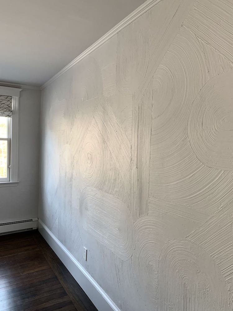
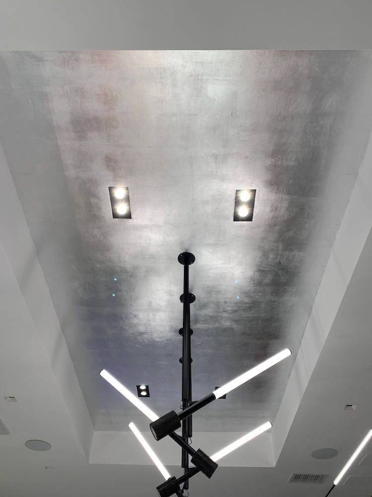
In the main space, there are also two tray ceilings that they wanted treated with special finishes.  For the smaller of the 2 ceilings toward the back of the showroom, we settled on silver leaf to complement the wall colors and also call attention to the lights displayed in the recessed area.  For the larger ceiling right inside the door, we took an idea from my website where I used directional gold paint (meaning the paint shows the direction of the brush strokes due to the actual metal in the paint).  For my past project, I did swirls – but to keep things a bit cleaner and more formal, we decided to try to do “tiles” – square of paint with the brush strokes going in alternating directions.

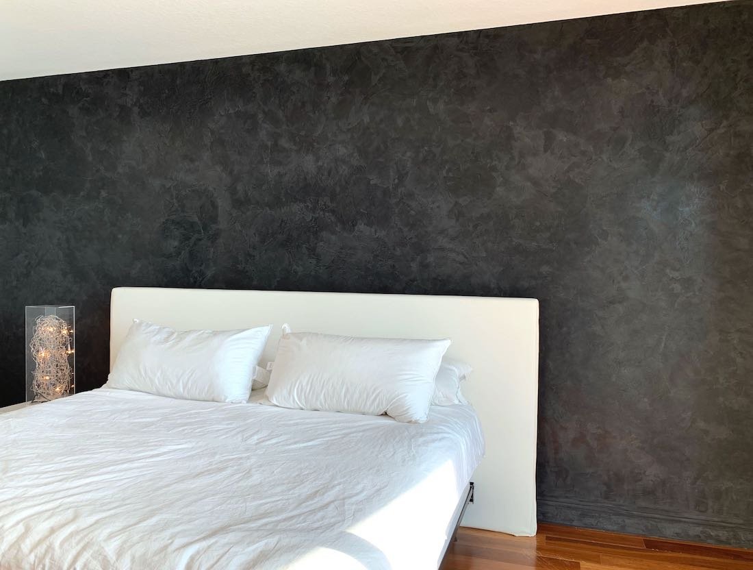
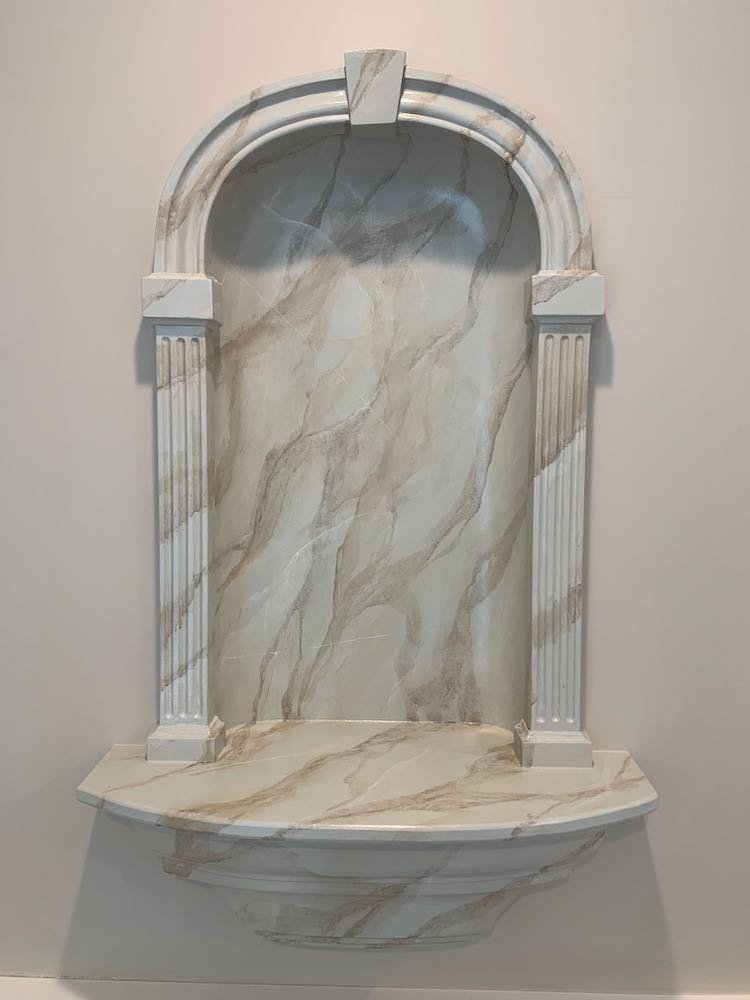
As an additional accent, there was a column being built to display a particular product that they wanted highlighted.  We wanted to create some drama with this finish and also tie in with the other colors around it (including a large custom display case they were having built). To accomplish these goals, we decided to use a high-gloss Venetian plaster finish in black.

In a separate listening room, we decided to continue with the metallic plaster to make it flow with the main room, but we went with a lighter silver color to brighten and differentiate the space.

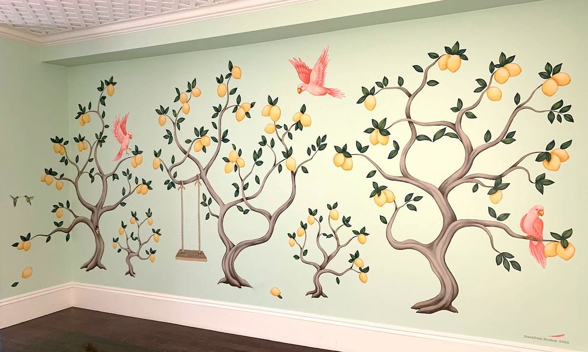
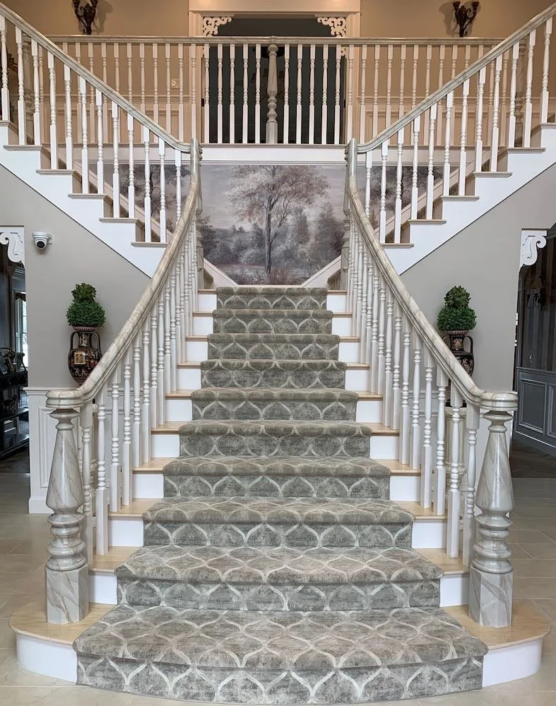
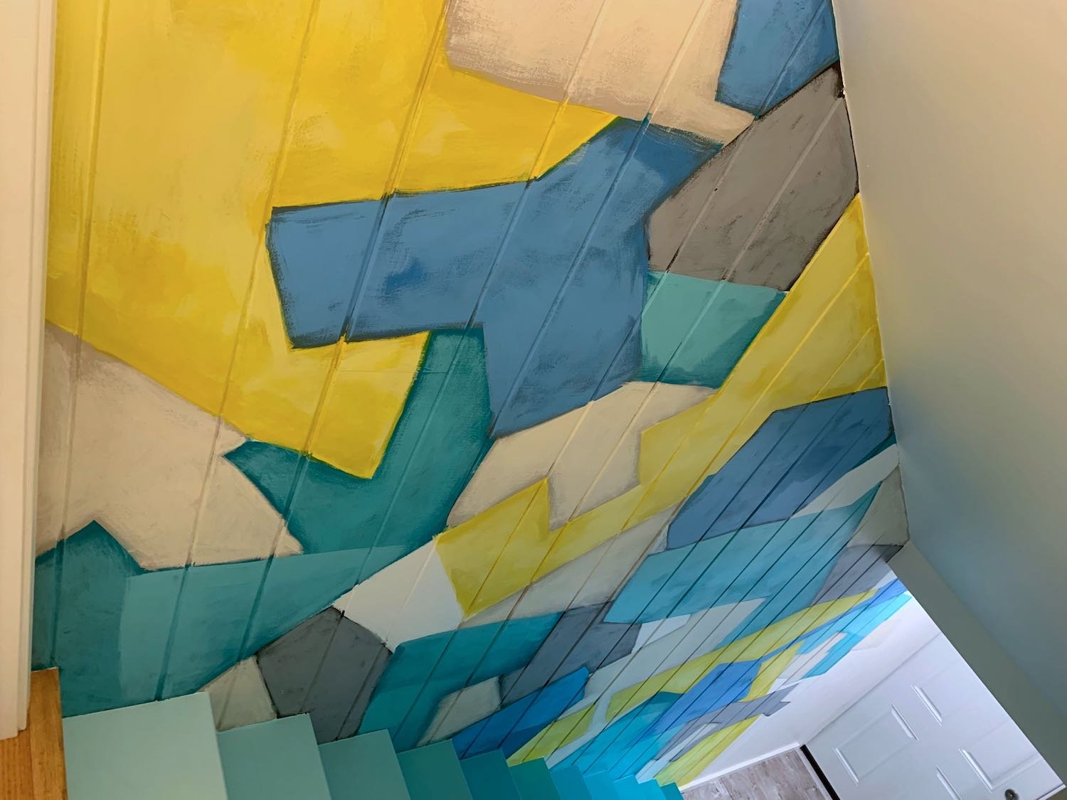
Finally, in the back of the showroom, Alexa and Angel wanted me to do a “paint drip” mural similar to something I did a while back in their home!  In this case, we went with silver paint to keep with the overall look of the showroom.

As usual, I was off to creating test boards!  For the metallic plaster colors, I did a few boards showing different mixes to make sure we had some options to choose from for the perfect fit.  Showing what the “tiled” gold paint ceiling would look like was also important – so I did a scaled-down version for everyone to see.  With these, along with the silver leaf and black venetian samples – we laid them all out and saw that the overall scheme was just what they wanted!

Once construction was done and the walls were ready, I was on to making all of these plans a reality.

The project is done and the showroom is now open!  Feel free to stop by to meet the SDI team, look at their amazing products and enjoy the beautiful showroom!

Enjoy!

Jason

Metallic plater in main space

Directional gold paint “tiled” ceiling

Venetian plaster column

Close-up on Venetian plaster

Silver leaf ceiling

Silver paint drip mural

Faux Finish Repairs

One of the trickiest things I do is matching an old faux finish that was originally created by someone else.  The final look of a glazed faux finish appears to be one color – but it is made up of a base color and then a translucent glaze of a second color – creating the appearance of a mottled 3rd color that is very difficult to reverse engineer!

In this case, I had actually already done the heavy lifting of matching these colors about 2 years ago, when I did repairs for the same client due to some water damage.  Unfortunately, they had more water damage that took out another wall! 

While I knew the colors I needed, the challenge was not over.  After mixing and painting the base color, I had to experiment with the application of the glaze to get it just right (having the right color is not enough!).  Additionally, because the damage extended to the adjacent 2 walls, I had seams between the old finish and my repair to contend with.  When this happens, you can’t overlap the glaze – because it just makes the old finish darker.  Instead, I had to make a sharp seam between new and old – and then blend those seams with 2 additional paint colors to make them disappear!

With this part done – I was on to the fun bit of matching up the mural vine that started to the left of this wall and originally extended just a little to the right of the wall.

In the end, there was no way to tell there was ever any damage!

Enjoy!

Jason

The wall before my faux repairs

And after!

Camouflage Mural on Electric Box

“You painted what?”  “Where?!” Are often responses I hear when explaining some of my projects… and my recent job is no exception!

Adding to the list of interesting things I have painted, my challenge on this job was to make an electrical box blend into nature but be beautiful at the same time… an “attractive camo” mural if you will. 

The conversations with my client began with her vision to do a mottled faux finish - but when I did a test board, she decided it didn’t blend enough. As we discussed options, I proposed more of a mural approach, using overlapping tree patterns.  My client liked this idea and wanted me to dance a fine line between traditional camouflage and an attractive mural of trees.  As always, I did a test board of the pattern I proposed (below), and my client was on board (no pun intended)!

From there, it was on to painting the panel.  The biggest challenge was working with all of the shapes in the panel while still keeping a logical flow of the trees/branches – which also made this a lot of fun to paint!  The ¾ front view is how you see the box from the parking spaces and the back view is what you see from the road – so these angles were a particular focus (although all views are completely muraled).

In the end, my client was thrilled with how well the panel blended and how it transformed a utilitarian box into a work of art on her property.

 Enjoy!

Jason

Front of the box - view from the parking area

Back of the box - view from the street

Faux Brick Painting Hides HVAC!

So much of the work I do is about making a space beautiful with a mural, decorative paint finish or specialty surface treatment --  but I also enjoy the challenge that comes when I need to make things blend in with faux painting!

This was the case on a recent project where I needed to make an HVAC unit and the surrounding pipes disappear into the background of the surrounding bricks.  In addition to matching the various colors of the bricks and mortar, I also needed to replicate the aged look and the distressed whitewashing.

First, I needed to prime the unit (my “before” picture is partially primed) to insure the adhesion of the paint.  With this complete, I painted everything the colors of the mortar – which I achieved with 4 colors to get the textured and speckled look.  Once this was dry, I needed to tape off the brick pattern, leaving the mortar covered.  I then painted each brick – making sure to match the colors and also include the variation of the original bricks.  Each brick was individually painted with multiple colors to make them look authentic.

Once my brick colors were complete, I was able to create the look of the distressed whitewashing as well as some of the staining of the area around the unit.

In the end, my client was thrilled!  These shots were taken up close from the surrounding garden.  When viewed from the driveway (another 6 feet back), the pipes and HVAC unit blend right in!


Enjoy!

Jason

The HVAC unit and pipes before faux painting (partially primed)

The HVAC unit and pipes before faux painting (partially primed)

Starting the painting of the bricks!

Starting the painting of the bricks!

The final result!

The final result!