
I recently had the challenge and pleasure of creating a piece that was as dynamic as the business owner I was working with – which in this case was a tall order!
The project was an 8.5 foot by 4 foot mural on a panel that is hanging on a wall facing customers when they first walk in the door of The Sweatshop gym in Medfield, MA (www.thesweatshop.fitness). The gym is owned by Robin Shean, who is a dynamic 54 year-old instructor who makes her students work extremely hard and feel good doing it. Robin is incredibly fit (that is her back featured in the mural), but the most important thing about Robin’s approach is her focus on overall strength. To Robin, strength isn’t just about the physical part, but also the emotional component as well. Her classes will make your muscles ache and leave you gasping for breath (I have experienced this first-hand!), but they also build confidence and determination.
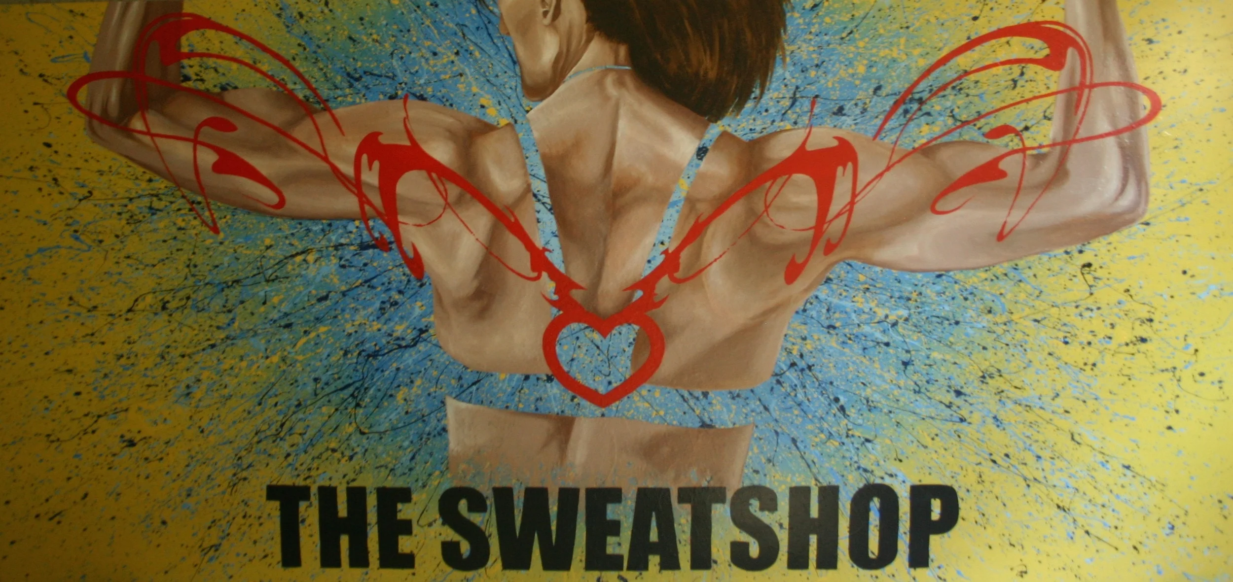
My goal was to capture all of this in an image while maintaining The Sweatshop’s branding. I met with Robin and talked through a couple of concepts I had put together (pictured below). The physical strength I thought was captured well in the image of Robin’s back – which is also featured on her homepage. To create a feeling of dynamic energy, I chose to use an “exploding” look of fading and splattering colors out from the core of the torso. In the first concept, I used one of Robin’s key messages of “Strength”, where in the second concept I focused more on Robin’s heart logo (which is also a tattoo on her back). Both of these were intended to represent the concept of overall strength that is so central to Robin’s approach.
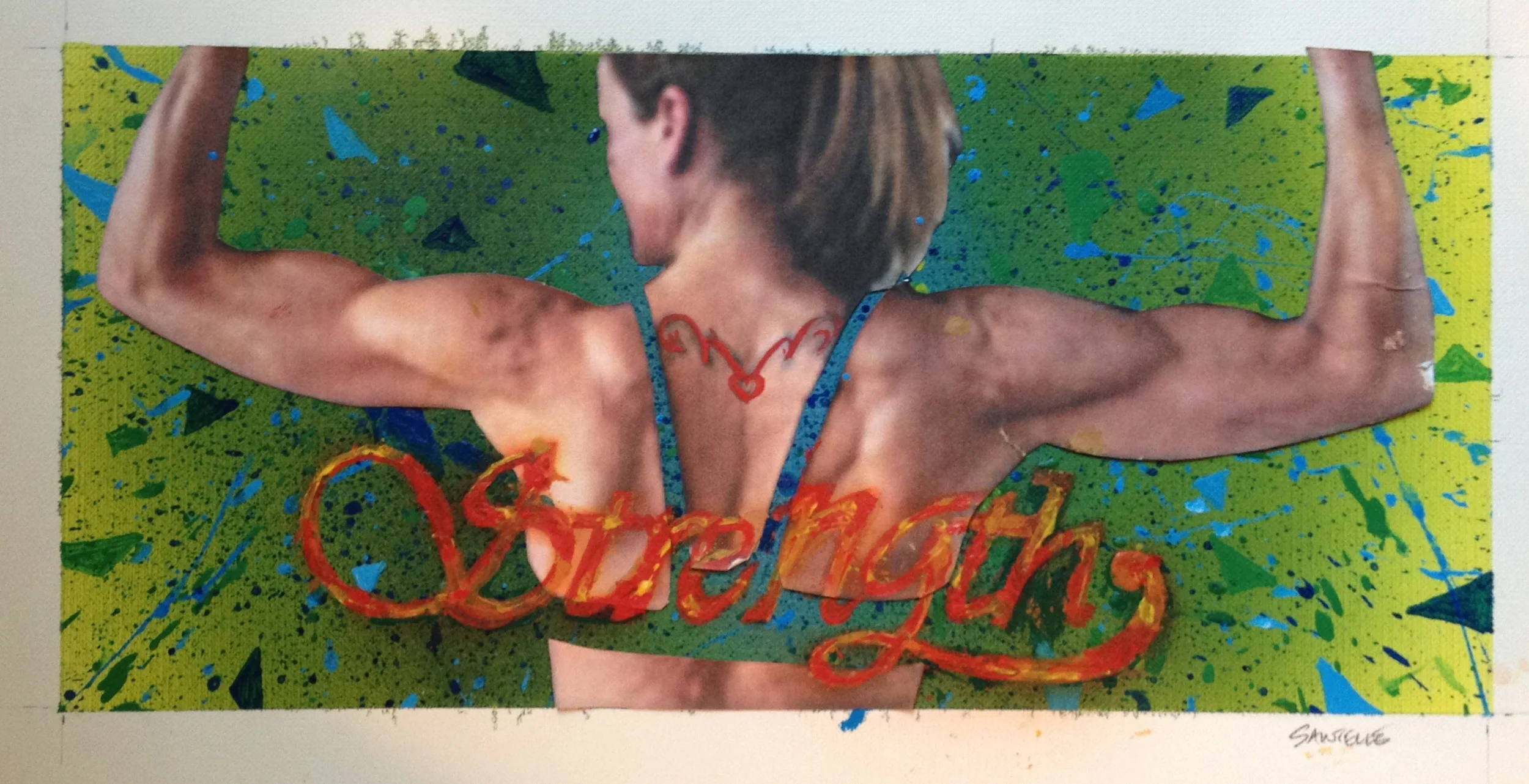

In discussing these two concepts, Robin liked the approach with the logo because it is consistently used in all of her materials and it is a great way of portraying the “heart” behind what she does. We decided to emphasize the yellow more since that is one of her main colors (used in her marketing but also one of the walls in the gym) and Robin suggested we include “THE SWEATSHOP” at the bottom. In looking around her space, I also decided to eliminate the greens and use more of the blues as they better matched her space and worked better to contrast with the flesh tones and red of the heart logo. We really wanted the mural to have a strong visual impact as people come in to work out.
Following are some pictures showing the process of painting this mural. Starting with the yellow, I then painted the expanding/fading blue using an airbrush:

Using this expanding/fading blue as my base, I then did the exploding/splatter look using various blues and some black (to tie in with the black lettering) spraying out from the center, while also splashing yellow to make the blend work better and create more drama:

Once this background was done, I could focus on painting Robin’s back. My goal here was to make it realistic and detailed, but to not make it too detailed or with too much contrast so that it would still work with the logo over the top of it:

With this complete, I then put in the logo and lettering:
While I don’t know if it is possible to capture all of Robin’s dynamism and heart in one image, she did e-mail me with my favorite reaction to date: “OMG. It is bad ass!”
Happy painting,
Jason