When I met with my client Marla, she was looking for a way to transform a large, blank wall in her living room. The wall is at a slight angle to the adjacent wall where the television is installed, so hanging pictures in this space never quite looked right, or worse – the pictures reflected in the television and made it hard to see what was on TV. Since the wall is front and center in the living room, however, leaving it blank left the room feeling unfinished.
Marla was interested in some sort of mural, but she wanted something that would go with her modern décor and would make a statement without dominating the room. She was also interested in enhancing the “New York City loft” look her condo has. This led us to a conversation about doing a faux brick wall – which Marla was very interested in. It was important that the brick look real and aged, and that the colors would work in her space. Marla also had the idea to continue the brick look on one wall in her kitchen – which is visible up a small set of stairs from the living room.
After looking through colors in my swatch book, we settled on a basic palette and made plans for me to come back and transform her plain walls into NYC-loft-style faux brick walls.
To create this look, I painted the walls in stages. After basic prep of the walls, the first step was to paint the walls the warm grey color of the concrete between the bricks. Once this was dry, the next step was to paint the brick pattern in one base color. With the brick pattern established, I could go back and paint the variation that occurs in many brick walls to make it look more real. Below are pictures of the process.

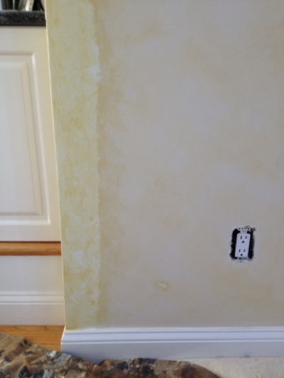
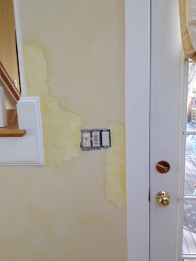
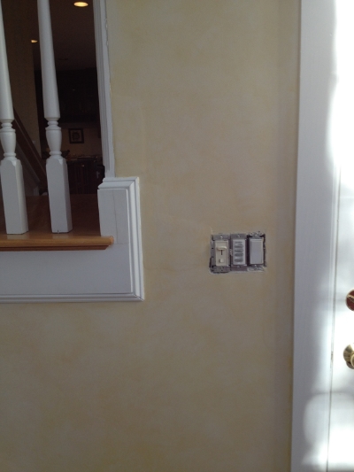
The living room wall before painting

The grey base color painted and the beginning of painting the brick

The "base" brick painting complete

The final result in the living room

The completed kitchen wall

Kitchen wall close-up
Marla and her family were thrilled with the results! As I finished parts of the process, Marla’s son Max sent out pictures to his friends over Instagram. All were surprised it wasn’t real brick – and one friend of his in New York said it looked just like a New York City loft! (which Marla thought was perfect)
Enjoy!
Jason