A Bold New Approach to the "Feature Wall" or "Statement Wall"

As people look to freshen up their interior spaces, it can be a great idea to highlight one wall in a room as an “accent” wall by adding a different color, wallpaper or even different materials.  Taking this approach can add interest to a space or draw attention to an area where you want the focus to be.

Taking this to the next level is the “feature wall” or “statement wall”. Rather than just an accent, the goal with a statement wall is to add an entirely different level of “pop” or even “wow!” to a room.  There are some great wallpapers available that are being used to create just such a “wow” affect – but paper has its limitations. With paper, you have to work with patterns and colors that are already available – meaning you often need to make the room work around your choice of paper, rather than vice-versa.  Paper is also problematic in bathrooms due to moisture.

To address this, I set out to create a mural concept that would be bold and graphic – with an eye on modern decor.  I also wanted to play with the "outside in" trend of bringing outdoor elements into interior decor (which is also right up the alley of what I do in my fine art).

The concept is to take patterns from nature (wood, leaves, agate, marble, water, etc) and magnify them to the point where it becomes almost abstract, but still recognizable.  I am also separating the colors and values in these patterns into distinct breaks to create a cleaner final look.

The result accomplishes that desired “wow!” affect with a clean, bold presence - while also being tailored to fit the space.  For each Statement Wall mural, everything is customized – from the pattern, to the colors, to the placement and orientation!

Below are three recent examples (one added 1/24).  The wood pattern/ bedroom statement wall is 15 feet by 16 feet, the metallic silver marble pattern/ bathroom statement wall is 5 feet by 8 feet and the agate pattern/stairwell statement wall is 3 feet by 9 feet.  While these show a glimpse into the concept, the sky (and your imagination) is the limit for how it could look in your space!

Wood-grain pattern Statement Wall

Wood-grain pattern Statement Wall

Marble pattern Statement Wall (with metallic silver)

Marble pattern Statement Wall (with metallic silver)

Agate pattern statement wall

Agate pattern statement wall

Enjoy!

Jason

A Portrait as a Christmas Gift

After years of gift-giving, the challenge of coming up with a memorable Christmas gift for his wife is what brought my client Bob to reach out to me.

Bob and his wife have a 5”x4” photo from a wedding that is a favorite of theirs, but the small size, dark setting and cluttered background limited its display to a small table-top frame among other family snapshots.

Bob's snapshot

Bob's snapshot

To elevate the picture to the level of a special gift, Bob asked if I could transform the picture into a 20”x16” painted portrait.  To make it look more like a formal portrait, Bob wanted me to remove the clutter from the background and brighten the entire image.  To help with this, Bob shared pictures of the room where it would hang to help decide on the color of the background.  I also made some subtle edits to make the pose and composition fit Bob’s goal of being a traditional portrait. 

Initially, Bob was skeptical that I could produce what he was looking for, but he was thrilled when he saw the final painting!  To help finish it off perfectly, I joined Bob at the framers to help pick out a frame that nicely complements that painting and fits with the décor of the room where the painting will hang.

With a few weeks yet to go, Bob is ready and excited to present this special present!

The final painting

The final painting

Enjoy!

-Jason


Paint Restoration of a Patio

Some of my favorite projects to work on are paint restoration jobs – where I use paint to “patch” everything from wallpaper to bricks to pre-existing paint finishes… and now to outdoor patio pavers!

One of my clients is a painting contractor who unfortunately had some white paint splatter on their client’s backyard patio of grey pavers.  The splatters themselves were not too large, but there were a couple of places where they tried to wipe them out – making the blemish even larger!  Because the paint could not be removed, the painters were concerned their only option would be to replace the pavers…. until they called me.

By matching paint to the many varied colors and patterns in the pavers, I was able to re-create the existing look over the top of both the smaller splatters and the larger, wiped areas.  When the painting foreman cam back to see my work, he could no longer find the spots – saying “You saved the day!”.  Most importantly, the homeowner was happy with the results and could enjoy their freshly painted house (and patio!).

Below are some before and after pictures from this project.

Before shot of wiped area #1

Before shot of wiped area #1

After shot of wiped area #1

After shot of wiped area #1

Before shot of wiped area #2

Before shot of wiped area #2

After shot of wiped area #2

After shot of wiped area #2


A Commissioned Painting as a Special Birthday Gift

When I met my client Aubrey this past July, she was already planning a special gift for her boyfriend Vito’s birthday in December!   Aubrey and Vito had a trip to Italy planned for September, where they would be visiting Vito’s hometown of Cirigliano.  Because Vito has a special attachment to Cirigiano and is an art enthusiast, Aubrey decided to have a commissioned painting done of the town to give Vito a present he would cherish.

After returning from Italy, Aubrey shared her pictures from the trip, and we met to review the different images and talk about what she was looking for in her painting for Vito.  We settled on the picture below because it shows the entire town while also capturing the incredible vista surrounding it.  

I did research online to look at other pictures of the town, but I found that the beautiful afternoon light in Aubrey’s picture made it the best source to work from.  In translating the photo to a painting, we decided to eliminate the vegetation in the foreground and to lighten up the image to make the town more visible and emphasize the warm light.

Below is the final 24”x12” painting!  The painting is at the framer and Aubrey is counting the days until she can share this special gift!

Enjoy!

Jason

Beautiful Faux Paint Finishes in Wellesley

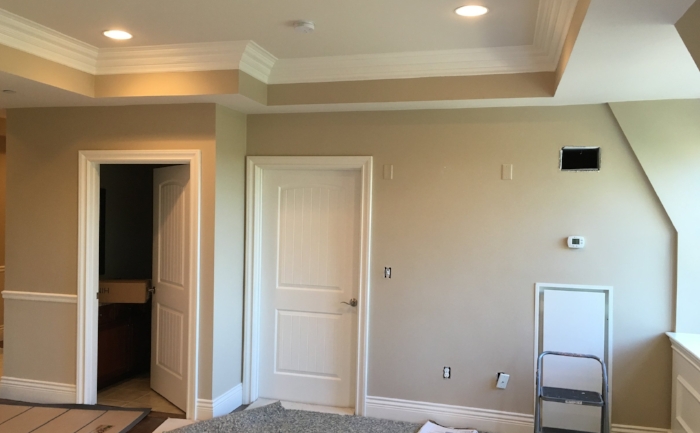
My client Louise was in the process of renovating her new condo in Wellesley when she reached out to me.  She and her husband are downsizing from their house and wanted to put some personal touches to their beautiful new condo to make it feel like home.

When we first began to look at the space, Louise envisioned a faux marble finish for the entry hallway and great room/kitchen (all of which was painted a medium tan color).  While I agreed that this finish could make for a pretty room, I was concerned about it being too much in such a large space.  Also, the kitchen counter and backsplash already had patterns and textures that would look busy with faux marble.

Understanding that Louise wanted something ornate, but that the room called for something a bit more subtle than the faux marble, we began to look through pictures of past projects I have done.  When Louise saw the “Polished Patina” library I did in Lexington, she was sold!  This finish has a soft brushed look to it – like venetian plaster crossed with suede. To work with the rest of her décor, we chose a lighter finish called “Rock Crystal”, which has just a touch of gold fleck in it. 

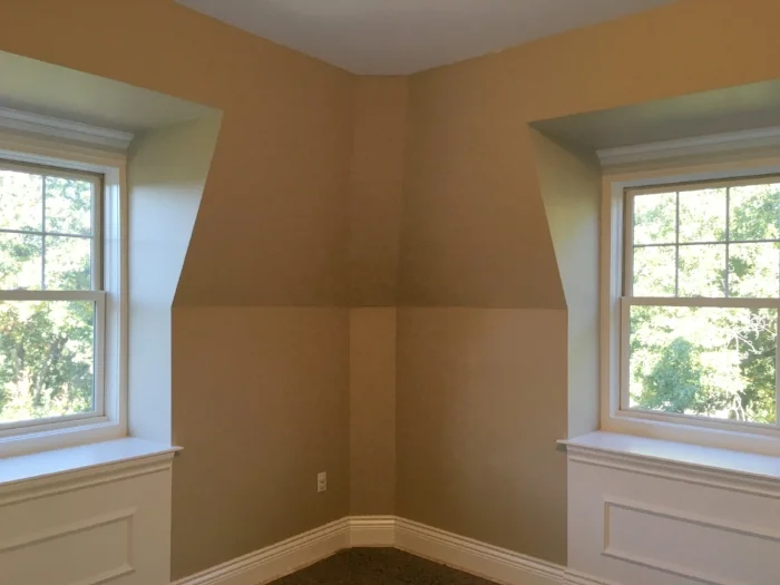
When we looked at the master bedroom, Louise had envisioned doing vertical stripes.  I agreed that the stripes could look fantastic – but, the room has gabled ceilings that create complex angles where they intersect.  Doing stripes on these surfaces would have created odd shapes no matter how they were painted – making an unintentional “fun house” look.  While brainstorming, Louise suggested a strie finish – which I agreed would look great!

Finally, Louise’s designer Cathy suggested another custom finish for the tray ceiling in the entry hall.  To pick up on the slight shimmer of the Polished Patina, Cathy suggested a mottled gold and silver finish.

All 3 finishes are complete, and Louise is thrilled!  She now doesn’t want to hang anything on the walls to cover up what she says is now her favorite part of her new home!!

Below are before and after shots of the room…

Enjoy!

Jason

Great room before

Great room before

Great room after

Great room after

Great room after

Great room after

Bedroom before

Bedroom before

Bedroom after

Bedroom after

Bedroom after

Bedroom after

Hall ceiling before

Hall ceiling before

Hall ceiling after

Hall ceiling after

Triptych Mural Panels

How do you follow up on a 48”x32” mural panel?  With 3 more 21”x30” mural panels making up a “triptych”!  (As Wikipedia explains, a triptych is “a work of art (usually a panel painting) that is divided into three sections”)

The Seaman Engineering mural panel triptych

The Seaman Engineering mural panel triptych

Back in May, I finished my 48”x32” mural panel (pictured below) for Seaman Engineering in Auburn, MA.  The team at Seaman Engineering is in the process of redesigning their office - and after hanging this centerpiece in their conference room, they wanted more paintings for the main room of the office.  I was introduced to Seaman by Linda Sbrogna of Sbrogna’s Artistic Promotions, and she suggested a triptych to fill a larger space while keeping a common theme across the office.

The first mural panel, displayed in Seaman Engineering's conference room

The first mural panel, displayed in Seaman Engineering's conference room

Since Seaman’s engineering business conveniently covers three main areas of expertise (HVAC, fire protection and plumbing), I suggested we start with the concept of having each mural panel focus on one of these areas, while tying them together with themes of engineering and the Seaman brand. 

To make sure my ideas aligned with my client’s vision, I met with my contact Debra at Seaman to start collaborating on images for the murals.  Deb shared that she wanted the panels to depict the ocean and to have their logo across all 3 paintings.  For more ideas of images we could use, Deb suggested the logos for trade associations (ASHRAE for HVAC, NFPA for fire protection and ASPE for plumbing) as well as things like air handlers for HVAC, sprinkler systems for fire protection and drinking fountains and bathroom fixtures for plumbing.  We also talked about possibly incorporating elements from their engineering plans. Finally, I suggested including the human touch of the actual engineers with traditional tools of the trade to represent the Seaman team.

With all of this in mind, I set off to design the final panels.  One of my primary goals was to make sure that the composition of each individual painting worked as a stand-alone, but also worked as part of a larger composition with all 3 panels!  Similar to my original mural in the conference room, I also wanted these new murals to invite people to look at them over and over and find new details with each viewing.

Some of the more obvious elements are the big, sweeping Seaman logo in the background and the hands with the pencil and compass.  Each panel also uses a more subtle representation of the appropriate trade association logo as well as the equipment used in HVAC, fire protection and plumbing.  I also wanted to bring in elements of nature to add to the beauty of the pieces while tying in to the subject – with wind and water for HVAC, rain for fire protection and water for plumbing. Finally, I also used symbols from the keys of Seaman’s engineering drawings, representing elements from their HVAC, fire protection and plumbing plans.  For the color scheme, I decided to keep it consistent with the conference room piece to keep all of the pieces congruous while also helping to keep them soothing and relaxing to look at.

Below are some of the images I worked with and pictures of the final panels.

Final panel - 1 of 3; "HVAC"

Final panel - 1 of 3; "HVAC"

Final panel - 2 of 3; "Fire Protection"

Final panel - 2 of 3; "Fire Protection"

Final panel - 3 of 3; "Plumbing"

Final panel - 3 of 3; "Plumbing"

The final 3 panels next to each other

The final 3 panels next to each other

Enjoy,

Jason

Painted Furniture

Painted furniture is a hot trend in interior decorating, and it is a great way to refresh tired, old furniture!

I recently did a project with interior designer Anne Meuller of Briar Design.  She was staging a house for sale, but also working with her clients on their next home. Anything she did with the furniture would need to work for the staging, but also fit with the client’s tastes for their new space. 

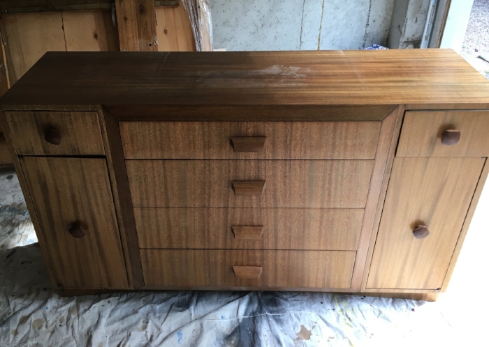
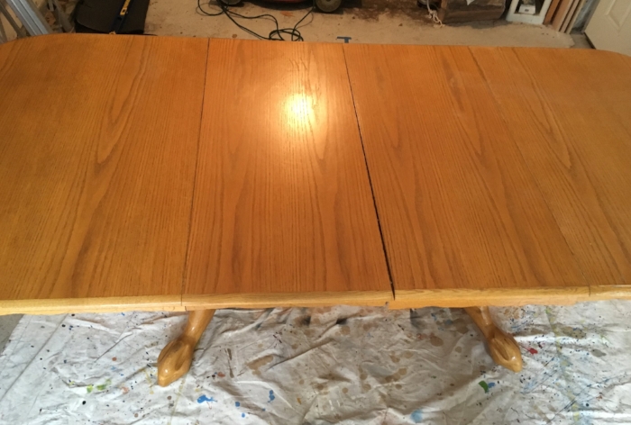
There were 2 pieces in particular that were a challenge.  The client wanted their décor to have a rustic sea-side look, but their dining room table had a dated yellowish oak finish, and their buffet was a dated medium walnut.  Replacing these pieces did not fit the budget, so Anne called me with her ideas for new painted finishes.

For the buffet, Anne chose a medium grey-blue with a matte varnish finish, to be topped off with new hardware.  For the table, Anne had me use the same gray-blue for the base, but she also had me do a translucent “pickled” finish on the top, using a lighter grayish blue.

 Below are some pictures of the project.

Enjoy, Jason

Dining table finish before

Dining table finish before

Refinished table

Refinished table

Close-up of table-top translucent "pickled" finish

Close-up of table-top translucent "pickled" finish

Buffet before refinishing

Buffet before refinishing

Painted buffet

Painted buffet

Decorative Painting on Furniture

Back in May, I wrote a post about repairing the decorative painting on an old Italian chair for my client Pam.  She has since called me back to tackle repairs on the other 4 chairs in the set!

Similar to the first project, Pam wanted me to re-paint the decorative elements where they have been damaged or chipped away, but to replicate the old patina of the rest of the chair to keep the charm and authenticity of these pieces.

While these chairs were not as damaged as the first project, I did encounter a new challenge!  Many of these pieces – and one in particular – had previous “repair” work done to them that was unfortunately not done well.  In these cases, I had less of a reference point to start with as the repairs were not accurate and my only option was to paint over the work that been previously done.  Fortunately, there are some repeating elements form one chair to the next, so I was able to re-create full sections of this decorative painting work.  In the end, this was my favorite part of the project!

Below are some before and after shots of this work.

Enjoy!

Jason

Before

Before

After

After

Before

Before

After

After

Before

Before

After

After

Before

Before

After

After

Decorating with Faux Brick Painting

When I met with my client Marla, she was looking for a way to transform a large, blank wall in her living room. The wall is at a slight angle to the adjacent wall where the television is installed, so hanging pictures in this space never quite looked right, or worse – the pictures reflected in the television and made it hard to see what was on TV.  Since the wall is front and center in the living room, however, leaving it blank left the room feeling unfinished.

Marla was interested in some sort of mural, but she wanted something that would go with her modern décor and would make a statement without dominating the room.  She was also interested in enhancing the “New York City loft” look her condo has.  This led us to a conversation about doing a faux brick wall – which Marla was very interested in.  It was important that the brick look real and aged, and that the colors would work in her space.  Marla also had the idea to continue the brick look on one wall in her kitchen – which is visible up a small set of stairs from the living room.

After looking through colors in my swatch book, we settled on a basic palette and made plans for me to come back and transform her plain walls into NYC-loft-style faux brick walls.

To create this look, I painted the walls in stages.  After basic prep of the walls, the first step was to paint the walls the warm grey color of the concrete between the bricks.  Once this was dry, the next step was to paint the brick pattern in one base color.  With the brick pattern established, I could go back and paint the variation that occurs in many brick walls to make it look more real.  Below are pictures of the process.

The living room wall before painting

The living room wall before painting

The grey base color painted and the beginning of painting the brick

The grey base color painted and the beginning of painting the brick

The "base" brick painting complete

The "base" brick painting complete

The final result in the living room

The final result in the living room

The completed kitchen wall

The completed kitchen wall

Kitchen wall close-up

Kitchen wall close-up


Marla and her family were thrilled with the results!  As I finished parts of the process, Marla’s son Max sent out pictures to his friends over Instagram.  All were surprised it wasn’t real brick – and one friend of his in New York said it looked just like a New York City loft! (which Marla thought was perfect)


Enjoy!

Jason

Skywriter Kids' Room Mural

A few weeks ago, I got a great call from my latest client Jake, who wanted to do something special for his sister.  She is expecting her third child (and first son) soon, and Jake wanted to surprise her by completely re-doing the nursery.  As part of this nursery makeover, Jake had an airplane/sky theme in mind and wanted a mural to really make the space something mom and baby would both love.

Being close to my own sisters, I was excited to help Jake make his vision come together – and to make his gift to his sister as special as he wanted.

When we met at his sister’s house to check out the space, Jake had loose ideas of incorporating clouds, an airplane and the baby’s name (“Jamian”), but nothing specific.  With his thoughts, I did a quick sketch on the spot showing the basic layout we ended up using – and he loved it.

The next step was to do my usual “concept sketch” – where I do a scale version of the final mural in the actual colors I will be using.  We went through a couple of iterations with different colors, but ended up going back to my first version, below:

With the plan in hand, I was ready to start in the room – but not until Jake installed a lock to keep his sister out and the surprise safe.  Of course, she was fully aware that some guy was coming every day with boxes full of paint – so I guessed she had some idea of what was going on.  Once I had the mural almost finished, I realized the large scale left too much empty space in the middle, so I added and extra plane.

The day I finished up, Jake stopped by that night and was so thrilled with the end result, he had to share it with his sister – who was so happy with it she cried!

Below is the final result and some detail shots

 Enjoy!

Jason

The final mural

The final mural

Mountains/trees detail

Mountains/trees detail

Small plane detail

Small plane detail

Big plane detail

Big plane detail

Painting and Glazing Kitchen Cabinets

It’s amazing how much of a difference it can make to paint old cabinets!  My most recent project of painting and glazing oak kitchen cabinets definitely demonstrated this.

My clients Suzy and Dave were faced with a common kitchen remodel challenge… Their cabinets were in perfectly good shape, but the honey-colored finish looked dated, particularly in contrast to their new marble counter-tops.  They knew they didn’t want to invest in all new cabinets, but they weren’t sure about painting them a flat color either – which is why they called me.

After looking at the colors in the kitchen, the counter tops and the adjacent rooms, we settled on a dark brown for their bar/island and a warm light grey for the remainder of the kitchen. Using the different colors adds some contrast and interest to the room, while also making the island stand out almost as a piece of furniture.

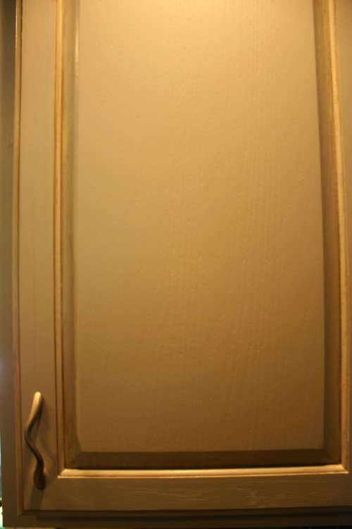
To give the cabinets more depth and interest, we also decided to glaze, or “antique” them. Suzy loved the look of the glaze, but also preferred it to be more subtle, so we went with a medium grey-brown for the glaze color.

The end result transformed the kitchen and looked great with the new counter tops! We unfortunately didn't get many "before" pictures, but the couple we do have give a good idea of the contrast with the "after" (below).

Enjoy,


Jason

Cabinets before painting and glazing 

Cabinets before painting and glazing 

After

After

An older "before" shot

An older "before" shot

After

After

Close-up of glazing

Close-up of glazing

Bontrasting brown bar cabinets

Bontrasting brown bar cabinets


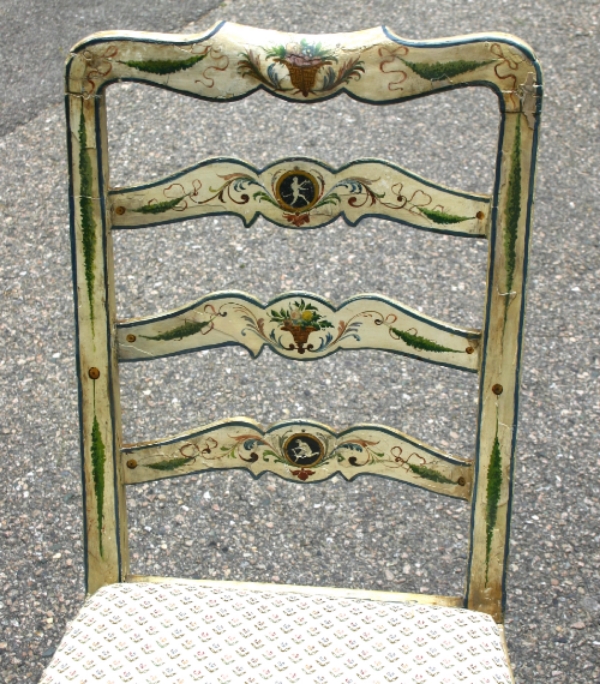
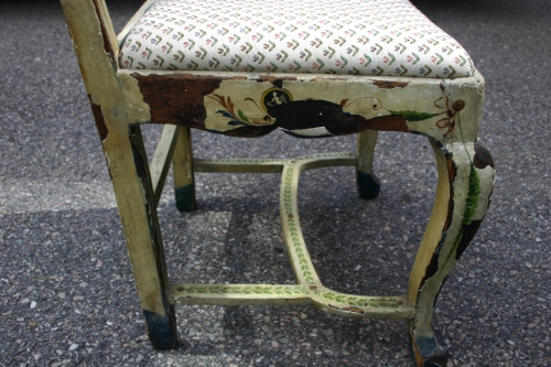
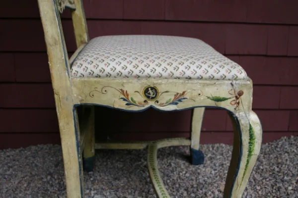
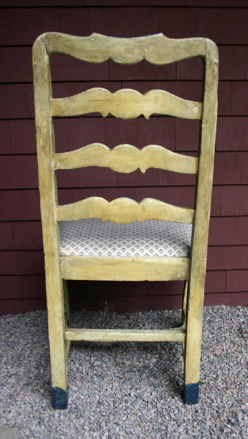
Repairing Decorative Painting on an Italian Chair

I thoroughly enjoy unique painting challenges, and my client Pam recently presented one to me in the form of an antique Italian painted chair.

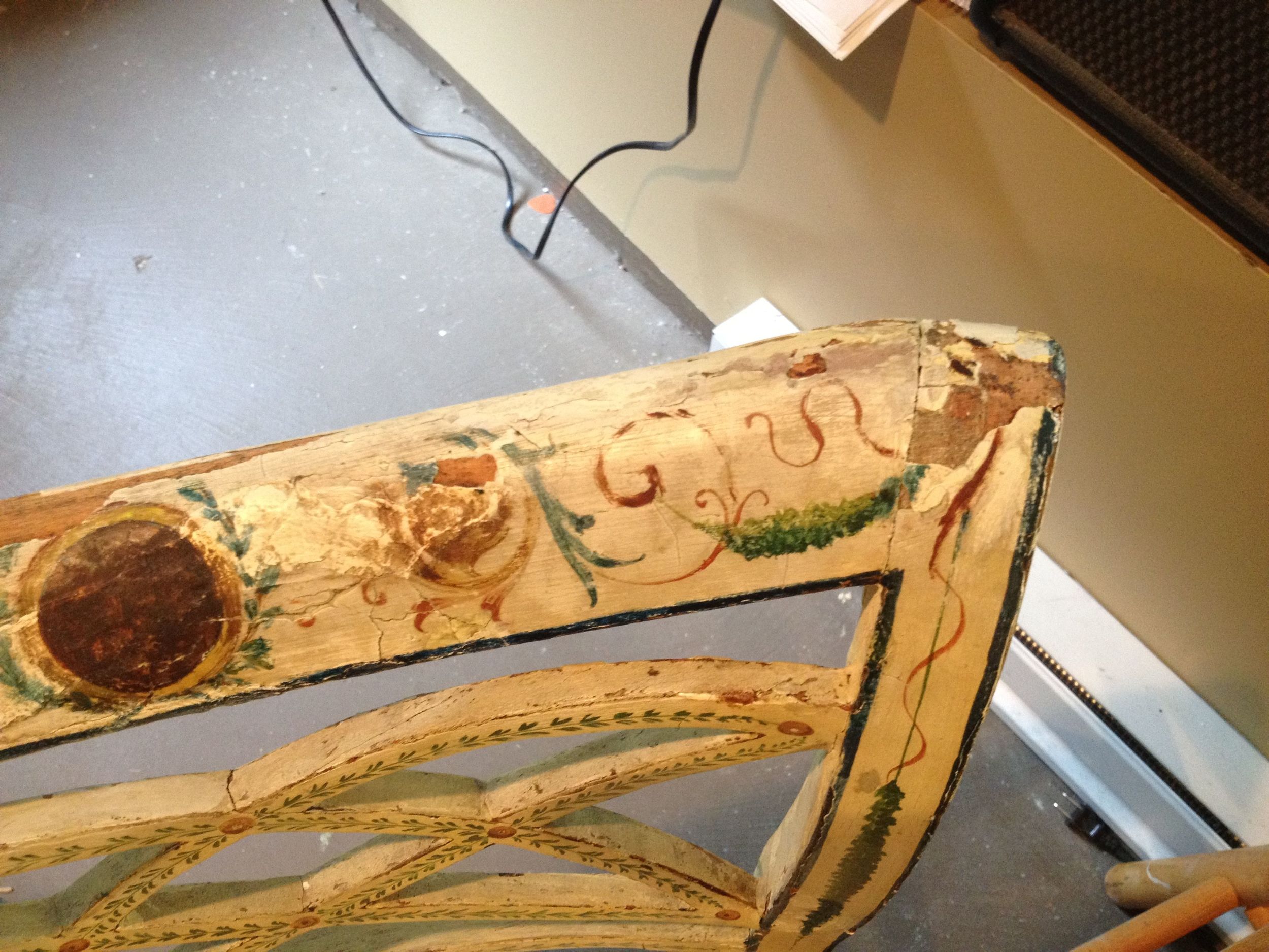
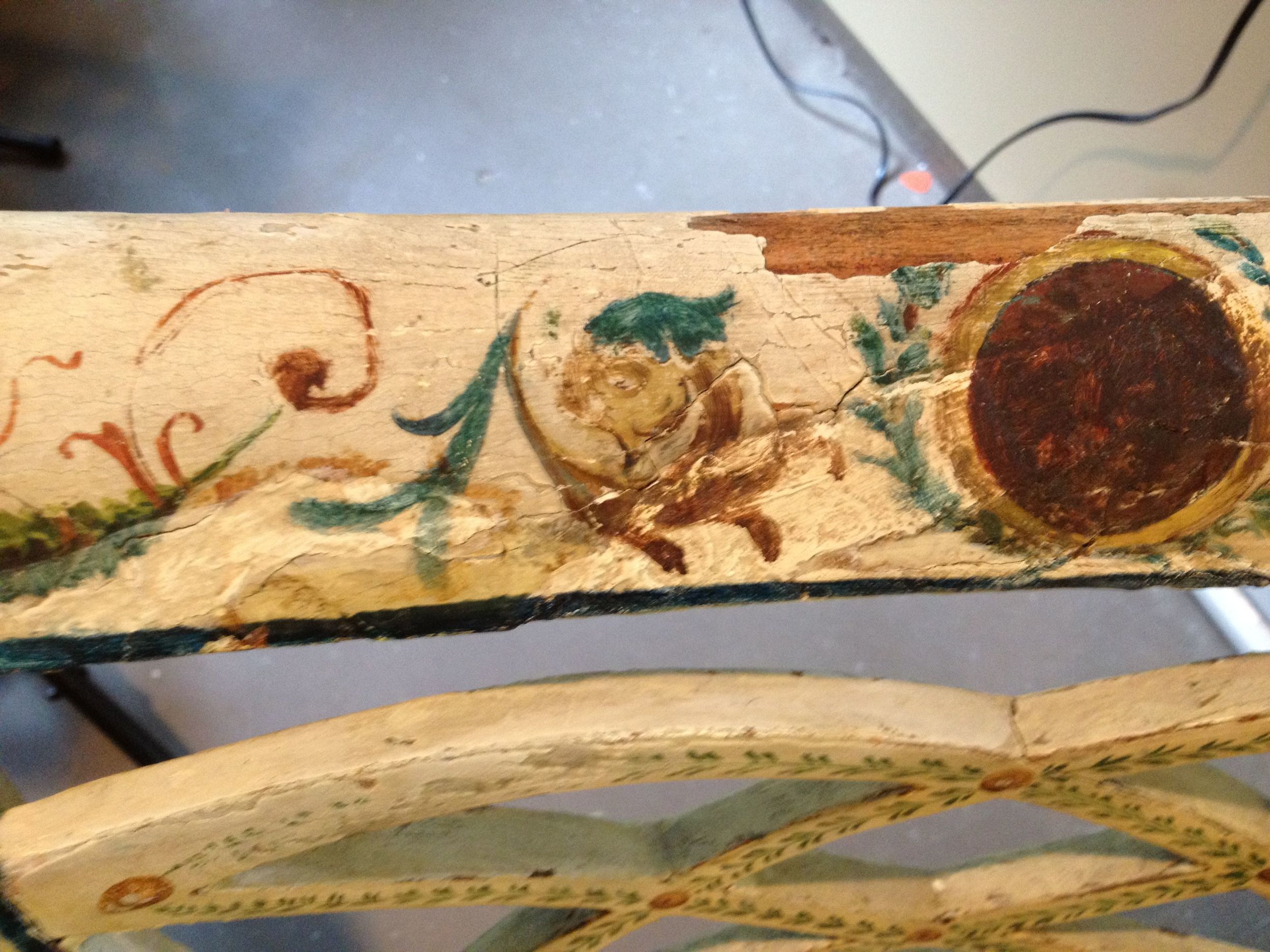
The chair is part of a set that Pam loves, but this particular chair was significantly damaged.  Covering the wood frame is a thin layer of plaster that features fantastic decorative painting on all of the forward-facing surfaces.  Over the years, the chair has developed a great patina that Pam very much likes, but unfortunately the years have also caused a good amount of the plaster (and as a result, the beautiful decorative painting) to chip off.  With the large chunks of old, dark wood interrupting the ivory colored chair and decorations, the effect degraded the charm of the patina to make the chair look damaged.  Below is one shot of the chair before I started working on it:


One of my biggest concerns was the fragility of much of the plaster that was still in tact – in fact, large chips came off just when we picked the chair up.  To address this, my first step was to actually chip off all of the loose pieces I could find and then glue them back down.  This gave me a more stable starting point.

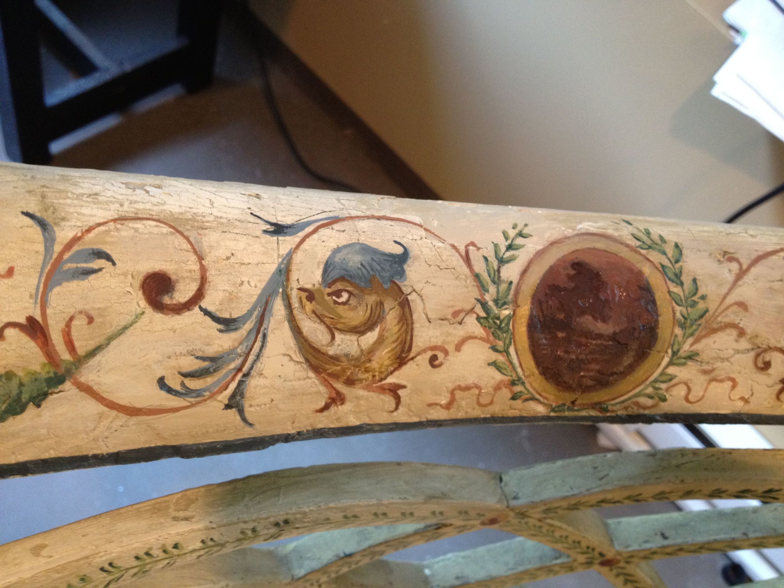
After cleaning, sanding and priming the bare spots, I then proceeded to mix paints to match the background ivory color.  With many years of wear and sun exposure, different parts of the chair were actually very different colors of ivory – so I ended up mixing 4 different base colors.  I then applied these and in some cases did more mixing to make the break between the “old” color and the “new” color imperceptible.  To really tie these painted sections in with the original surfaces, I then used 2 different glaze colors that I strategically wiped into the surface to match the patina color and patterns from the wear on the old sections of the chair.

With this done, it was on to the decorative patterns.  In most cases, I was able to find the design that belonged in the blank section from another area on the chair.  In other cases, there was no design to work with, so I had to make my best guess to interpret what should be in the missing areas.  Like with the ivory background, I also needed to be sure to match all of the original colors!

The project ended up being a fun challenge – but most importantly, Pam was thrilled with the result.

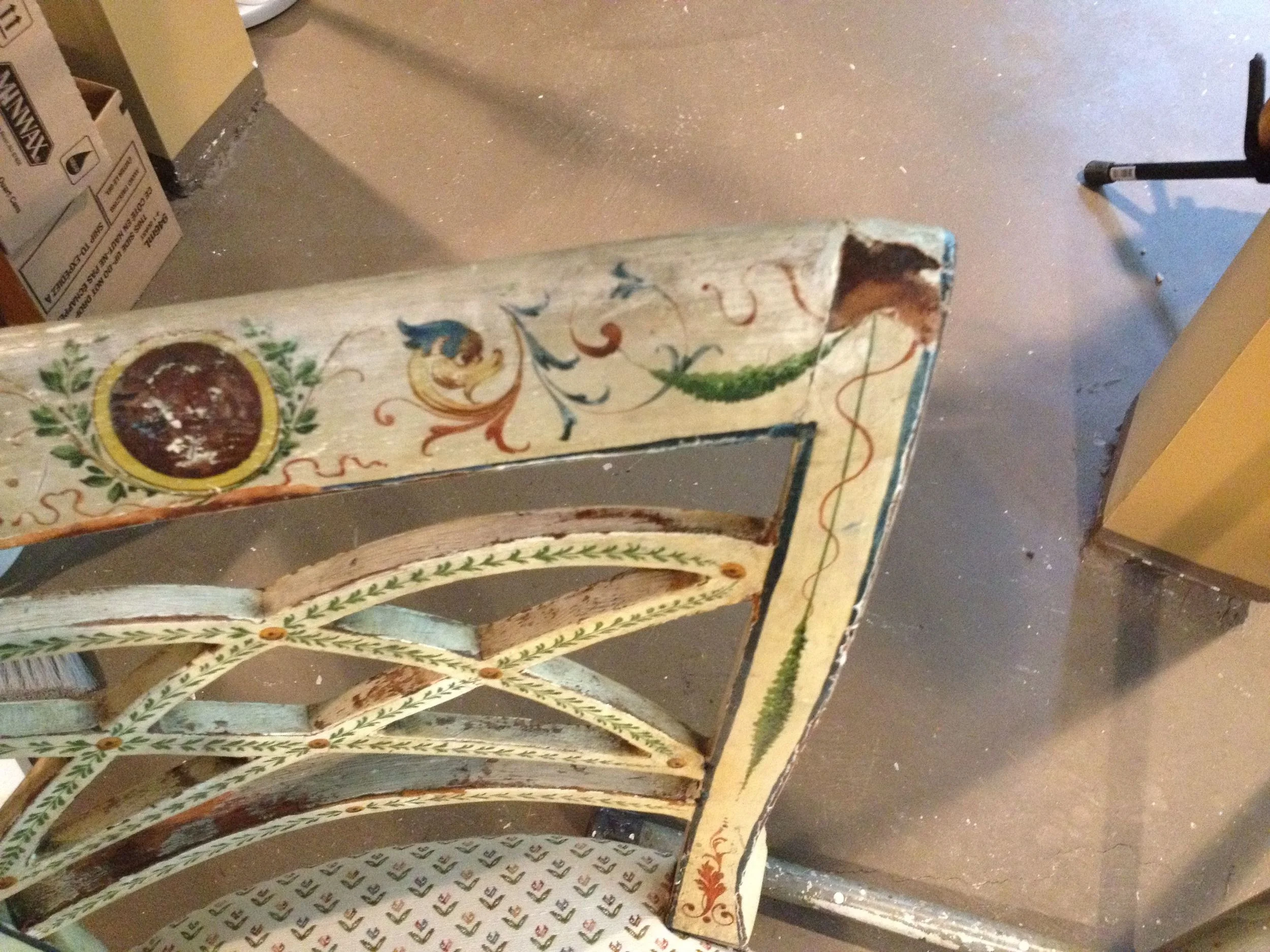
Following are a number of “before” and “After” shots showing different sections of the chair.  Enjoy!

Before

Before

After

After

Before

Before

After

After

Before

Before

After

After

Before

Before

After

After

Repairing Brick with Paint

The painting challenges I encounter take on many forms – including my recent project of repairing bricks with paint!

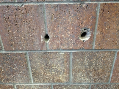
My client is a contractor who is renovating the interior of a commercial space in Chelmsford, MA.  In the process of the renovation, they needed to drill a few holes in an interior brick wall, only to find that the specific bricks in this wall are no longer available!

With the option of replacing the bricks out of the question, they reached out to me to see if I could paint gray concrete patches to look just like the surrounding brick.

Below are some of the pictures of the bricks before and after my painting repair.  Probably the best compliment I could receive is when the person who did the patching had a hard time finding the spots once I had painted them!

Enjoy,

Jason


Holes 1 and 2

Holes 1 and 2

Holes 1 & 2 patched

Holes 1 & 2 patched

Holes 1 and 2 painted

Holes 1 and 2 painted

Hole 3

Hole 3

Hole 3 patched

Hole 3 patched

Hole 3 painted

Hole 3 painted

Hole 4

Hole 4

Hole 4 patched and painted

Hole 4 patched and painted

Portrait From a WWII Photo

After seeing the sepia portrait I did of my client Julie’s grandmother, my client Jim got the idea to do something special with a treasured picture of his grandfather.

Growing up, Jim and his siblings and cousins all loved to look at the collection of old, yellowing black-and-white photographs from WWII their grandfather had displayed in his house.  The pictures show airplanes, jeeps, amazing landscapes and, of course, Jim’s grandfather and fellow soldiers.  Of these, the following shot of his grandfather on a military Harley-Davidson was a favorite of Jim’s:

Unfortunately, Jim’s grandfather passed away and when cleaning out his house, Jim made sure the pictures were kept safe.  He is considering having the collection scanned to be able to share digital versions with his entire family, but with Father’s Day coming, Jim wanted to do something more for his dad.

To really honor the picture on the Harley, Jim asked me to use the old 5”x3.5” photo to paint a 10”x8” portrait.  He wanted to keep pretty true to the original, but to focus more on his grandfather, we decided to crop in a bit on his grandfather and the bike while also taking out his friend sitting on the back.  I also decided to subdue the background a bit to make the focus more about the foreground.  Finally, I decided to make the lessen the contrast in the painting so I could get more focus on the details you can see in the larger version, while also keeping the old-time feel of the original.

Jim is thrilled with the result and can't wait to see his father's reaction!  


Enjoy,

Jason

How Can a Mural Make Plumbing and HVAC "Beautiful and Calming"?

That was my latest challenge! 

My clients at Seaman Engineering in Auburn, MA have recently done a fantastic redesign of their office space, and wanted a statement piece for their conference room to cap it off. Thanks to Linda Sbrogna at Sbrogna's Artistic Promotions, I was brought in to make this happen! When we talked about goals for the mural, their priorities were to create a dynamic representation of their business for client meetings that would also be engaging and soothing for high-pressure internal meetings.

My contact Deb (who started the company with her husband Kevin) had a collage in mind, which she described as a “Where’s Waldo?” of plumbing, HVAC and fire protection engineering.  Her idea was for people to see more in the mural as they spent more time looking at it.  She brainstormed everything from toilets and sinks to water heaters and HVAC ducts.  When Deb talked about the pride her engineers take in their work- seeing their plumbing as art- I started to put together a vision for the piece.  Deb also mentioned that her team focuses on the importance of balance in their designs, which became important in my final design.

Other priorities for the mural were to include the psychrometric chart (which is also part of their logo) and the U.S. Green Building logo (they are LEED certified).  As I looked around the office, I also took inspiration from their color scheme of warm grays together with the blue of their logo.  Finally, Deb shared that she and Kevin love the ocean - and that they hatched the idea of starting Seaman Engineering while they were at the sea! Measuring the wall, we decided on 48” x 32” as the perfect size for the space. Below are some of these images:

Seaman company logo

Seaman company logo

U.S. Green Building logo

U.S. Green Building logo

Shot of Seaman plumbing job

Shot of Seaman plumbing job

Shot of Seaman HVAC job

Shot of Seaman HVAC job

Seaman engineering drawing

Seaman engineering drawing

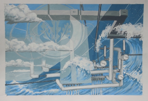
My first step was to put together what I call a concept “sketch” – which is a scale painting (in this case ¼ scale) of what I propose for the final piece.  In this, I try to get all of the elements, color and proportions as close as possible to what I envision for the final, larger mural.  My concept was to play with the “balance” idea between air/HVAC and water/plumbing, using the psychrometric chart as the dividing line between the 2 parts.  I then played with the idea of plumbing and ducts as art and intertwined them with nature to emphasize the water and air elements while creating a calming scene and incorporating the importance of the ocean for Deb and Kevin. I also wanted to include aspects from the engineering drawings, with the fan symbol and other call-outs from the drawings they shared. Below is the concept:

Concept "sketch"

Concept "sketch"

After reviewing this concept sketch, the only change the Seaman team wanted was to include a sprinkler head to include the fire protection part of their business.  Below is the image I used for this:

With this in hand, I moved forward to painting the final piece.  When I delivered it, Deb was thrilled, sharing that it was so much more than she had envisioned!  I’m happy that it will be enjoyed during many meetings to come.

Enjoy,

Jason
Final 48"x32" mural panel

Final 48"x32" mural panel

Re-painting Decorative Cabinets

Sometimes doing touch-ups can go a long way toward freshening a space, which was definitely the case on a few recent projects.  With all of the daily use, kitchen and bathroom cabinets can take a beating and show wear that drags down the appearance of otherwise perfectly good cabinets!

Touching them up can be a challenge, however – particularly when they have a decorative finish.  Typically, you see this with a glazed, “old-world” look where a second color is rubbed into the base paint color to give the surface a nice patina.  Doing repair work in these cases requires not only a perfect match of the base color, but also the second “rubbed” color and the technique used to make it all blend seamlessly.

In some cases, I needed to sand down and completely re-paint select doors/drawers, while others needed just certain areas to be re-worked.  In the end, the homeowners ended up with new-looking cabinets at a fraction of the time and cost to replace them!

Below are some before and after pictures

Enjoy,

Jason

before

before

after

after

before

before

before close-up

before close-up

after

after

after close-up

after close-up

Mural Panel for a Granddaughter's "Room"

When I do my mural work, a big part of the process is understanding my client’s vision for the piece – which was a treat with my latest client Sarah.  Sarah is a proud and loving grandmother who wanted a mural panel to surprise her granddaughter Rachel!

Sarah recently moved to a condo, and when her 23-year old granddaughter visited, she immediately fell in love with the beautiful craftsman-style porch, exclaiming “can this be my room?!”  Of course, a screen porch couldn’t be a dedicated “room” per se, but Sarah took note of Rachel’s enthusiasm.

While Rachel is traveling abroad, Sarah reached out to her interior designer Nancy Elacqua (http://www.nancyelacquainteriors.com) with the idea to create a sign for the porch which would say “Rachel’s Room” and incorporate Rachel’s love for ducks.  Nancy reached out to me, and we started by looking at the craftsman style of the porch and Sarah’s affinity for Asian prints.  Below is my first concept sketch, which was intended to be simple, clean and calming, while incorporating some of the Asian influence of Sarah’s prints and the Craftsman style of the porch.

When we met with Sarah to review this, she loved the story about capturing the drama of the moment the duck takes off while still making a piece that is beautiful and serene.  To add to a narrative that Sarah envisioned to go along with the piece, she asked that I add a second duck.

Below is the final 30”x20” mural panel and a shot of it installed on the porch.  Sarah is absolutely thrilled with it and is anxious for Rachel to return to see her surprise!

Enjoy,

Jason

Stenciled Floor

So far, I have had the opportunity to do my decorative painting on walls, ceilings and stairs… so I was excited to jump at the opportunity to do a decorative floor!

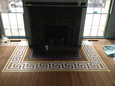
For this project, I worked with a designer and another decorative painter on a home in Newton.  As a component of his overall remake of these two rooms, the designer wanted a roman key pattern stained into the floors. The floors were in rough shape to begin with, so they were sanded down and re-stained – but before they were coated, we came in with our stencils!

Raw floor with stenciled loosely placed

Raw floor with stenciled loosely placed

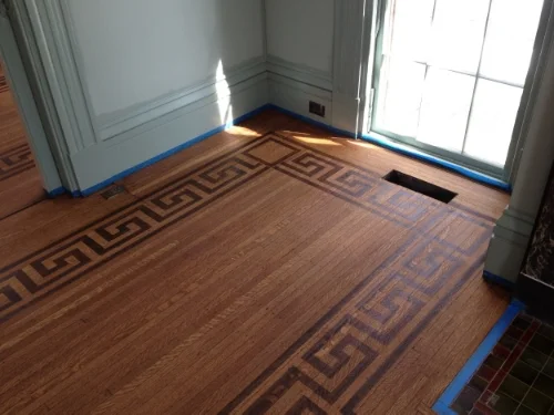
The biggest challenge was laying out the pattern to get a clean, symmetrical look in rooms that were not necessarily symmetrical (or square!). To help in the corner transitions, we used a separate square pattern – but the hearth was particularly challenging (and fun!) because we needed to match up the rectangular pattern to “turn” in a way that looked natural without using the squares.   After some intensive problem-solving, this ended up being a highlight of the room.

Stencil with square corner applied

Stencil with square corner applied

Stencil wrapped around hearth with corner "turns"

Stencil wrapped around hearth with corner "turns"

Once the stencils were down, it was a matter of careful staining to make sure the stain didn’t creep underneath the stencil.  Here we figured out an approach to use a lighter application with 2 coats to give a nice crisp edge.


The result drew many “wow’s” (!) from other people working on the house – and from the designer!


Enjoy,

Jason

IMG_2451.JPG

A Portrait From an 82 Year-Old Photograph

I love that I become part of a special moment through some of my commissioned art work.  This was definitely the case with my most recent portrait.  My client Julie’s grandmother unfortunately passed away recently at the age of 95, and Julie wanted something special to remember her with as a gift for her mother.

To start the process, Julie came to me with a fantastic old 2”x3” sepia photograph of her grandmother back when she was only about 13 years old. Her grandmother grew up in Alaska, and you can really get a sense of the rugged Alaskan terrain in the background of the 82-year old photo

The original photograph

The original photograph

For the gift, Julie wanted to go larger – but still small enough that her mother could easily put the painting on her desk.  We settled on a 5”x7” final size, and then cropped the image to enlarge her grandmother and cut out some of the overhanging eaves at the top of the photo.

When I painted it, I wanted to capture the feel of the time and place as well as the likeness and expression of her grandmother.  After some time focusing on these things, I feel like I can sense the place and even get a sense of the person - which I try to infuse into the painting. Focusing on these details was worth it when I delivered the painting to Julie.  She was overjoyed, and marveled that the painting was better than the photo!  She can’t wait to give the painting to her mother – and I can’t wait to hear the story!

To see more of my portraits and other commissioned work, check out: http://www.blackbeakstudios.com/commissioned-art/

Enjoy,

Jason