Painting Furniture for a New Look

One of my interior design partners recently called me with a fun challenge.  Her clients had purchased a large armoire and they loved the piece – but unfortunately, the color was not working well with the room.  The armoire sits next to a beautiful old light-wood dining table in a white room, and the clients wanted a pop of color to prevent the armoire from blending in with the table and to pull out some of the color accents in the room.

Knowing her clients well, the designer suggested a “washed color” look in different blues to accomplish these goals.  After talking a bit about the look she wanted to accomplish and looking at some inspiration photos, I had a good sense of what we were shooting for.

My first step was to paint some concept boards – showing 3 different options from light to dark.  When doing custom finishes, this step is key to making sure everyone is happy with the final result.  This is also one of my favorite parts of the process because it is where I get to figure out how to translate the client’s vision into something that can be accomplished with paint! In this case, all of the options were painted a base color, then “washed” with a lighter color that is thinned down with water.  When this dried, I then did a light sand of the entire surface to soften the streakiness of the wash.

The designer and client were thrilled with all of the samples and ultimately chose the lightest option.  With this choice made, it was on to painting the piece!

As with my cabinet jobs, once I was on-site, the first step was to prepare the surface.  The key here is that paint won’t stick to shiny surfaces – so the existing finish needs to be dulled.  With this done, I moved on to painting the base color of a light grayish blue.  Once the base coat dried, I applied the wash of a slightly darker, greener blue-gray to create the streaky look.  Finally, as with the board – I did a light sand of the entire surface to give it a soft, smooth look.

In the end, thanks to the input from the designer and client, the armoire looks perfect in the room!  Most importantly, they are thrilled with the armoire and the completely new impact it has on the space.

I forgot to take “before” pictures of this project – but below are some of “after” shots along with the manufacturer’s pictures of what it used to look like.

Enjoy,

Jason

The armoire with the dining table in front

The armoire with the dining table in front

IMG_6284.JPG
IMG_6274.JPG
What it looked like before!

What it looked like before!

Painting Bathroom Vanities in Holliston to make them look like new!

Similar to the work I have done painting kitchen cabinets, painting old bathroom vanities is a great way to make the cabinets look new and customize them to your tastes!

My client Charlene called me in to help with her bathrooms as part of a refresh she was doing to put her house on the market.  Since the vanities in her 2 upstairs bathrooms were high-quality wood (and in good shape!), Charlene knew she could save some money and get the benefits of customizing the color by having me paint them.

The first step was collaborating with Charlene on color.  She wanted both of the bathrooms to look fresh and modern, but she is not a fan of white cabinetry.  Of course, she knew the house was going on the market, so the color also needed to be somewhat neutral.  To address these concerns and also tie in to Charlene’s other décor decisions, we went with a taupe for the master bath and a light, warm grey for the second bath.

With these decisions made, I was on to my usual process of disassembling, scrubbing, sanding, priming, sanding, painting, sanding (again!) and finishing with the final coat of paint.  All of this scrubbing and sanding is essential in making sure the paint sticks and is durable – while also creating a nice even finish.

When I had everything reassembled, Charlene and her husband were thrilled with the results!  Here are some before and after shots.

Enjoy,

Jason

Master bath before (right half)

Master bath before (right half)

After

After

Master bath before (left side)

Master bath before (left side)

Master bath after

Master bath after

Guest bath before

Guest bath before

Guest bath after

Guest bath after

Painting Furniture to be a Centerpiece

Painting furniture can give an old, tired piece a new lease on life – but a specialty paint finish can take this a step further and turn a wallflower into a centerpiece!

My client Carol called me to help rejuvenate a writer’s desk to make it fit better with her recently re-done living room.  The desk is a high-quality piece that was in great shape, but its worn cherry finish just wasn’t working in a room decorated in greys, blues, blacks and naturals. 

When Carol and I discussed her goals for the look of the desk, we settled on a very dark grey/light black for the color to pick up on other accents in the room and fit with the overall color scheme. 

With this decided, we the collaborated on the finish.  After talking through some ideas, we settled on a distressed treatment with hand-rubbed wax finish to complement the early American style of the desk. 

Giving the desk this look also picked up on the light distressing of some other pieces in the room while also nicely complementing the clean lines of her couch and fireplace and millwork in the room.  With the hand-crafted finish in this rich color, the desk not only goes perfectly in the room, but it is now a centerpiece!

To complete the look, Carol also had me paint the chair used at this desk.  Again, the chair was in great shape and recently reupholstered, but the light finish didn’t ties it with either the desk or the room.  With the chair, I used the same color, but applied only tiny accents of distressing.  The goal was to tie it to the look of the desk without looking too cluttered with the pattern on the upholstery.

Most importantly, Carol was happy that we hit the nail on the head in creating something dynamic and new out her 20-year old desk!

Below are some pictures of the project

Enjoy!

Jason

The desk before refinishing.  I forgot to take a "before" shot of the chair (!), but you can just see the frame behind the desk

The desk before refinishing.  I forgot to take a "before" shot of the chair (!), but you can just see the frame behind the desk

The finished desk in my studio

The finished desk in my studio

The desk and chair in Carol's home!

The desk and chair in Carol's home!

A Dog Portrait to Celebrate a Big Birthday

It has been a while since I have had the opportunity to do a project for friends or family – so I was thrilled when my sister in-law Becky reached out to have me do a drawing as a gift to celebrate my brother Matt’s 50th birthday!

After seeing my recent pencil drawing of a dog (and his owner!) done as a birthday gift for another client, Becky got the idea to give Matt a special keepsake of his beloved furry boys – a chocolate lab named Bruin and a Swiss Mountain Dog named Harvey.

The only challenge was finding a good picture of both the dogs in the same photo.  After recruiting their sons in the effort and digging through a bunch of options, we found a great snapshot - minus issues with shining eyes and Harvey’s paw being cropped off.  This is one of the great parts of doing a portrait, though!  By using other pictures, it was easy to address these issues and make a less-than-perfect picture into a piece of art that is exactly what they wanted!

Below are the original photo and the final drawing.

The original photo

The original photo

The final drawing!

The final drawing!


Enjoy,

Jason

Relaxing with Distressed Painted Cabinets

One of the best parts of painting cabinets is the ability to CUSTOMIZE!  My recent client Robin took advantage of this opportunity when she decided to go from her traditional dark wood kitchen cabinets to white (actually a very light gray).  Instead of a flat white finish, though, Robin wanted to change it up and create a more casual look with a lightly distressed finish. Which is all the more fun for me!

To create a distressed finish, I have a different process – using chalk paint instead of my usual cabinet paint.  Chalk paint dries super-hard, so when it is distressed with sandpaper, it doesn’t create any weak spots in the paint finish.  The only down-side to chalk paint is that it is porous, so it needs to be finished with wax or a clear polyurethane.  Since poly is way more durable, so it is the far better option for cabinets!  To go with the feel Robin was looking for, I used a matte-finish poly, which is great to the touch and is not too reflective.

Robin was thrilled with the results and is now relaxing in her distressed kitchen!

Enjoy,

Jason

Before

Before

After!

After!

Close-up of distressed finish

Close-up of distressed finish

Detail of cabinet door

Detail of cabinet door

Mural Tree

I am excited for my full-room mural project (!) coming up at the Fells Branch of the Wellesley Free Library this fall.  In the meantime, the library reached out to me to paint a tree on a plywood cut-out to help call attention to the project at the Library Gala taking place tonight!

The Fells Branch project will also include extensive carpentry, with cut-outs of buildings and trees – all of which will be provided by carpenter Sean Reidy.  For this project, Sean did the plywood cut-out so I could take care of the painting.  Using the color scheme selected for the library, I wanted this to be a teaser for the final mural.

The tree was a hit with the team, and hopefully with the Gala attendees as well!

Enjoy,

Jason

Gala tree.jpg
The tree being set up at the Gala!

The tree being set up at the Gala!

Faux Painting a Concrete Wall

I absolutely love challenges that start with the phrase “Can you paint….?” In this case, the question was: “Can you faux paint a plaster wall to look like concrete?”

Yes!

My client is opening a restaurant soon in Sutton, MA – and the designer had the concept of making the main wall of the space look like concrete with a section of exposed brick.  After lining up the mason and plasterer, the designer called me to see if faux-painting could make her vision a reality.

After visiting the space and talking with the designer and restaurant owner, I had a great sense of what they were looking for. I started by studying concrete wherever I went, looking at my color books and taking notes.  I then started the process of collaborating with the designer on the colors that would make up the concrete look (I ended up using 5 different colors!). To go with the floors and clearly read as “concrete”, we needed grays, but we also wanted to keep some warmth in the colors to help create the rustic (and realistic!) feel they were going for.

When the plaster work was complete, I was on to my painting!  I started with the lightest of my warmer colors as the base paint, and then added my first layer of texture/patterning in a darker warm tone.  When this was dry, I was able to go back through with the grays to make the mottled look you see here.

Between the mason doing the brick work, the plasterer and my faux painting – we were able to nail the look they were going for! Now I can’t wait to see the rest of the work completed and the space completed for the restaurant opening.

Enjoy,

Jason

A section of the finished wall

A section of the finished wall

Detail of final result

Detail of final result

The first steps! (just base color at top right, adding first layer of texture)

The first steps! (just base color at top right, adding first layer of texture)

With the grays added

With the grays added

Table view!

Table view!

Painted Cabinets Help Transform Kitchen!

As they kick off their retirement years together, my clients Leonid and Maya wanted to update their kitchen.  Rather than ripping out the old kitchen and starting from scratch, however, they decided use paint to transform the existing cabinets – and even the floor!

The cabinet doors are laminated in white formica and were in great shape, but the cabinet frames, end panels and finger rails were dated in a dark brown and worn from years of use. After collaborating with Maya and Leonid, we settled on a nice neutral gray that would stand out against the white while cleaning up the overall look.  We also chose the wall color, a bluish gray, to go with the décor in their house and add a bit of color to the kitchen.  Finally, I suggested they paint the dark brown grout in their tile floor to go along with the rest of their changes!

While I was painting the cabinets, Leonid and Maya had another painter strip the wallpaper and paint the walls while also having the counter top replaced.  When all of that was complete, I got down to the final task of painting the grout – which had a huge impact on the overall look of the kitchen! 

The backsplash tile is yet to come, but you can still get a great sense of how things are turning out!

Below are some before and after pictures showing this big transformation

Before

Before

After

After

Before

Before

After

After

The floor in progress

The floor in progress

mindlin_kitchen_after2.jpg

Dedham Public Library Mural of Quotes

The most recent of my mural painting projects with the Dedham Public Library was this mural of quotes!

As we started discussing this project, the original direction was loose.  The library team knew they wanted inspirational quotes on this particular wall, but from there we needed to collaborate on how to get it done.

To start, I suggested the team work together to come up with quotes, with the guideline to look at relatively short quotes.  I wanted to keep them short to give flexibility to make a more interesting design – but I also wanted to keep each quote brief to insure people would read them!

Once the library team had compiled a list of (fantastic!) quotes to work with, I went on to come up with a concept layout.  For the colors, I knew I definitely wanted to use some of the same blues and greens in my circuit board mural (which is in the same space), but I also wanted to pull in red and grey tones that are used in the room adjacent to this wall.

To keep the mural visually interesting, I chose to use 3 different fonts with different sizes – and then I worked up a layout to keep the look of the completed wall balanced.  I also needed to keep in mind the need to work around the fire alarm and step-down at the ceiling!

Once the team was able to review and approve my concept, it was on to painting the mural.

Below is a picture of the mural and also a long-view shot to show the quotes mural together with the circuit board mural.

Enjoy,

Jason

fullsizeoutput_dfc.jpeg
IMG_5838.JPG

BlackBeak Studios Awarded Best of Houzz 2018!!

BlackBeak Studios

Awarded Best Of Houzz 2018


Over 40 Million Monthly Unique Users Nominated Best Home Building, Remodeling and Design Professionals in North America and Around the World

Norfolk, MA February, 2018 – BlackBeak Studios of Norfolk, MA has won “Best Of Customer Service” on Houzz®, the leading platform for home remodeling and design. The custom mural and decorative painting firm was chosen by the more than 40 million monthly unique users that comprise the Houzz community from among more than one million active home building, remodeling and design industry professionals.

The Best Of Houzz is awarded annually in three categories: Design, Customer Service and Photography. Design award winners’ work was the most popular among the more than 40 million monthly users on Houzz. Customer Service honors are based on several factors, including the number and quality of client reviews a professional received in 2017. Architecture and interior design photographers whose images were most popular are recognized with the Photography award. A “Best Of Houzz 2018” badge will appear on winners’ profiles, as a sign of their commitment to excellence. These badges help homeowners identify popular and top-rated home professionals in every metro area on Houzz.

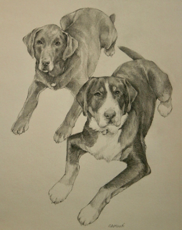
“We are thrilled to be recognized by Houzz,” said Jason Sawtelle, Owner and Artist at BlackBeak Studios. “Collaboration with our partners and clients is the very core of our business, so we are delighted and inspired by this Customer Service honor.”

 "The Houzz community selected a phenomenal group of Best of Houzz 2018 award winners, so this year's recipients should be very proud,” said Liza Hausman, Vice President of Industry Marketing at Houzz. “Best of Houzz winners represent some of the most talented and customer-focused professionals in our industry, and we are extremely pleased to give them both this recognition and a platform on which to showcase their expertise."

 About BlackBeak Studios

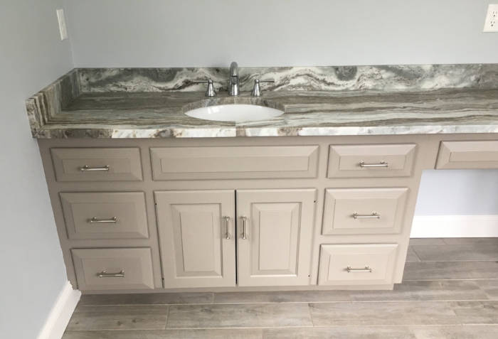
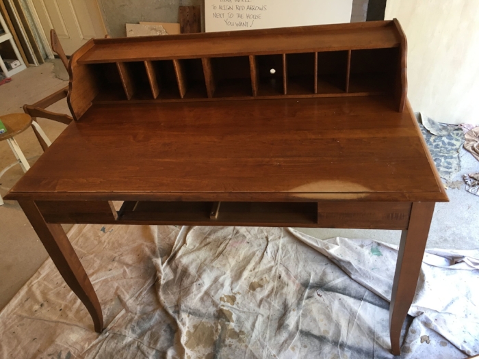
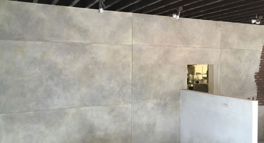
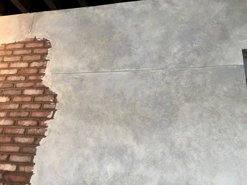
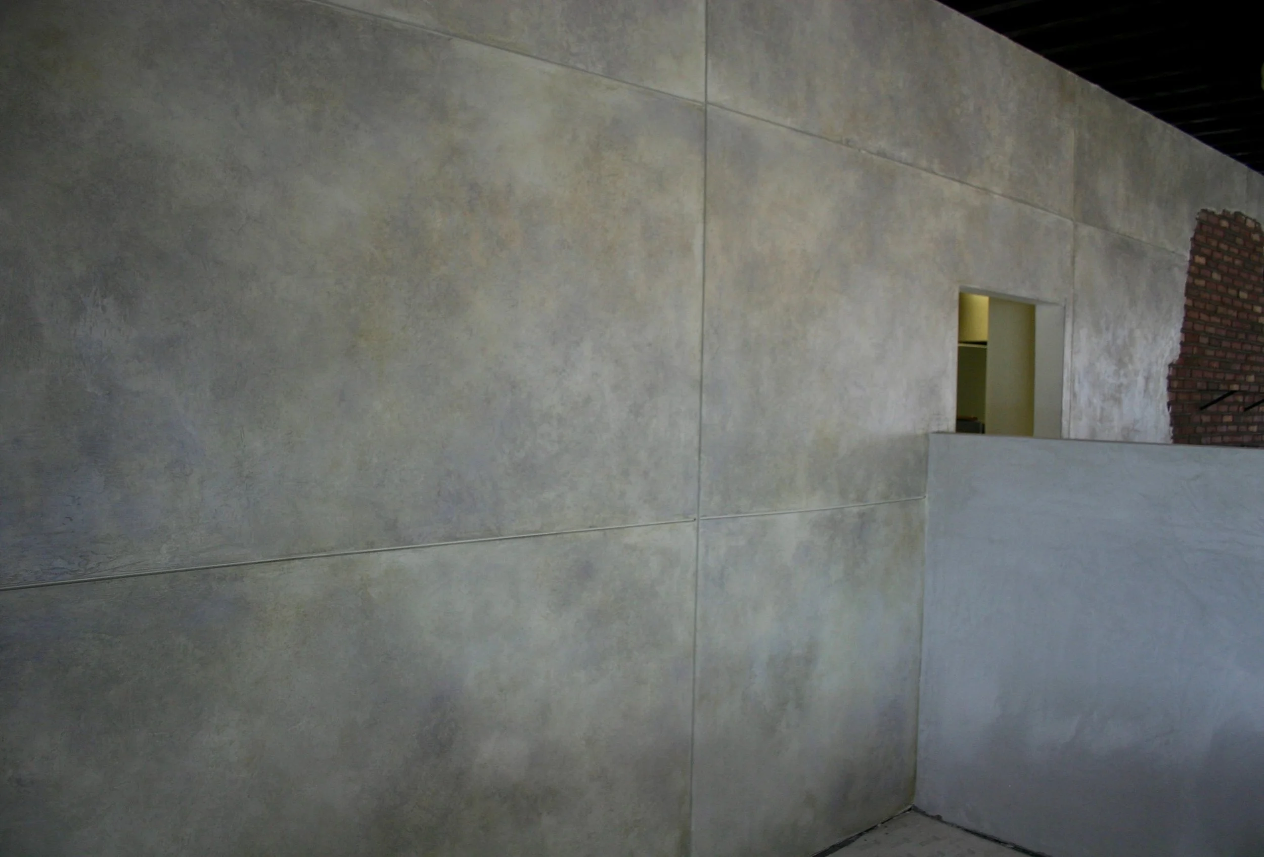
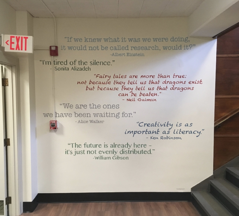
BlackBeak Studios turns your vision into an inspiring reality.  Serving the greater Boston, MA area, BlackBeak Studios specializes in custom murals and decorative painting for residential and commercial spaces. BlackBeak’s focus on artistry and collaboration helps make clients’ ideas for a mural, statement wall or decorative painting finish come to life. For more information, visit blackbeakstudios.com

About Houzz

Houzz is the leading platform for home remodeling and design, providing people with everything they need to improve their homes from start to finish – online or from a mobile device. From decorating a small room to building a custom home and everything in between, Houzz connects millions of homeowners, home design enthusiasts and home improvement professionals across the country and around the world. With the largest residential design database in the world and a vibrant community empowered by technology, Houzz is the easiest way for people to find inspiration, get advice, buy products and hire the professionals they need to help turn their ideas into reality. Headquartered in Palo Alto, CA, Houzz also has international offices in London, Berlin, Sydney, Moscow, Tel Aviv and Tokyo. Houzz and the Houzz logo are registered trademarks of Houzz Inc. worldwide. For more information, visit houzz.com.

# # #

Screen Shot 2018-01-17 at 8.03.45 PM.png

Stairwell Mural at the Dedham Public Library

As part of my project with the Dedham Public Library, I recently completed this “circuit board” mural!

Just adjacent to this mural is a space dedicated to video games, so the interior designer, Anne Mueller, asked that I somehow incorporate a digital theme in my mural. To do this, Anne wanted something that would not be quickly dated, but instead was a bit more abstract.  To go with the rest of the space and the building itself, Anne also wanted the mural to incorporate historic colors, and very specifically a color called Buckland blue that is used in the room at the bottom of these stairs.

As I looked at the wall, I knew I wanted to work with the angle of the railing, rather than try to fight against it.  After running through various ideas in my head, I came the idea of using a circuit board as my base concept and decided to run with it!  Following Anne’s guidance, I didn’t want to quite do a literal depiction of a circuit board, but instead I went with this clean, graphic approach that builds off the angle of the stairs.  For the colors, we went with greens to go along with the circuit board idea, but tweaked them to historic greens to also flow with the area around the mural. 

Finally, I wanted to play with the fact that the mural was in a stairwell and also tie in a bit of the video game idea.  This is where my idea for the buttons came from.  Rather than just the circuits, I wanted them connected to something – in this case buttons like you would have on a game.  Here is where I tied in the historic blue colors and had fun with the idea that the stairs go up and down.

Below is the final result.  I hope it is enjoyed by library-goers for many years to come!

Enjoy,

Jason

fullsizeoutput_dfa.jpeg
Close-up of the buttons

Close-up of the buttons

Portrait Pencil Drawing

Most of my commissioned art work is done as oil paintings, so it was a fun change of pace to do this pencil drawing portrait for my client Jules!

To celebrate a good friend's birthday, Jules wanted to surprise her with the perfect gift .  After considering different options, Jules decided to really make the present special by having it custom-made, so she reached out to me to create art as the gift!

Knowing how much her friend Allison loves her dog, Jules decided to have me capture this in a portrait of her Allison with her dog.  To accomplish a cleaner, simpler look, she opted to have me do a pencil drawing instead of a full-blown oil painting.

When I delivered the drawing, Jules was thrilled -- but most importantly, Jules shared that Allison had received it and absolutely "LOVED" it!!

Below is the picture I worked from and my final drawing

Jules 1.jpg
fullsizeoutput_cc6.jpeg

Enjoy!

Jason

BlackBeak in the News for Up-Coming Library Mural Project!

The Wellesley Free Library is renovating their Fells branch facility -- and I have been selected to create the full-room murals that are part of the plan!

An article was published today in Wicked Local Wellesley about the plans for the Fells branch, including a mention of BlackBeak Studios.  Click here for the full story:

 http://wellesley.wickedlocal.com/news/20180212/wellesleys-fells-branch-returns-to-its-roots


Screen Shot 2018-02-12 at 7.30.51 PM.png

Faux Wood Painting Repair

I know I have said this many times before in this blog, but I love the diversity of the projects I get to do!  A recent example was a fun faux wood challenge my client Cathie in Newton recently presented me with.

Cathie’s upstairs has 5 doors that were all painted with a faux wood treatment (along with all of the trim) well before Cathie owned the house.  Unfortunately, one of these 5 faux wood doors was taken off the hinges years ago and stored next to the boiler.  The extreme heat degraded the paint – leaving it faded, chipped and looking extremely out of place next to the other doors.  When the previous owners sold the house, they re-hung the door, but left it in this rough state.

To bring this tired door back to life, Cathie called me in to re-do the faux painting!  Last summer, I had touched up all the faux trim - which had many chips and nicks over the years that I was able to make disappear– so I was excited to do this project and finish making this space look like new again!  The room behind this door also has a faux wood painted radiator cover that was worn and chipped, so Cathie had me fix this as well.

The first step with both the door and the radiator cover was to get them ready for paint.  Both pieces got scraped, scrubbed and sanded (lots of sanding was required on this door!).  From there, I used a quality bonding primer and base coat of paint to make a good stable surface that matched the “base” color of the other doors.  With this step done, it was on to creating the wood grain using gel stains.  In addition to matching the color, I also wanted to make sure I matched the grain of the trim and other doors!

With the door done, I moved on to the radiator cover.  It was just the lid of the cover that needed to be addressed – so for this project, I matched my colors and grain pattern on the lid to the rest of the cover.

Cathie was thrilled with the results, and I was happy to see the impact of my work on her upstairs space!

Enjoy,

Jason

The door before rehab

The door before rehab

Close-up of damage

Close-up of damage

The door after!

The door after!

The radiator cover before

The radiator cover before

The radiator cover after!

The radiator cover after!

High Gloss Painted Furniture

When my clients come to me to paint furniture, part of the fun is exploring the different finishes that are possible.  Recently, I have done everything from an antiqued and distressed paint finish to a specialty matte finish – and with my most recent client, I got to do a high gloss finish!

My client and her husband are moving into a newly renovated home, and as part of this renovation, they needed to update some of their furniture to fit into the new space.  One piece is a dresser that is a great example of the value of painting furniture.  The (very large!) dresser was a high-quality piece that was in good shape, but the dark brown color and slightly worn and dinged finish would have looked completely out of place with their new décor.  Rather than buying something new, my client and her designer chose a nice neutral gray color and asked to have me paint the piece in high gloss to clean it up and give it a great visual impact.  Because I do everything by hand (I don’t use sprayers), it adds a bespoke look with my subtle brush marks in the high-gloss finish that adds a special touch they were looking for.  Similar to painting cabinets, my process involves lots of sanding (sanding the original finish and then again after priming and again between coats of paint) – which results in a beautiful finish that will be durable for many years to some.

In addition to this large dresser, my client also had me paint a reclaimed decorative window pane in the same grey, as well as a sewing table and bench in a high-gloss black.

The painted furniture is now in their beautiful new home and they are thrilled with the results! (The pictures below are from my studio, unfortunately NOT in their beautiful home)

Enjoy,

Jason

The dresser before

The dresser before

The dresser after

The dresser after

The sewing table before

The sewing table before

The sewing table after

The sewing table after

Painting a Birch Tree Mural on Lally Columns!

As part of my multi-project partnership with the Dedham Public Library, I just completed a mural transformation of previously ugly steel lally columns to look like birch trees!

As the library updates its Endicott Branch, they needed a solution for these columns that are in eye-shot when you enter the building and frame an exit that will lead to their new patio!

The library’s interior designer, Anne Mueller, wanted a solution that would tie the outside to the inside, while complementing her new interior finishes.  To accomplish this and add a sense of serenity, Anne decided to have me paint the columns to look like birch trees!

With this guidance, I decided to have fun and bring my fine-art painting skills into play by making the trees look as realistic and 3-D as possible.  Without needing to do any concept drawings on this project, I was able to just dive in paint like I do when I am in my studio painting a fine-art canvas.

The library staff and visitors were thrilled with the results, which they will hopefully continue to enjoy for years to come!

Below are some before and after shots showing this transformation

Enjoy,

Jason

The final birch trees

The final birch trees

The columns before transformation!

The columns before transformation!

The second column

The second column

fullsizeoutput_c94.jpeg

Painting a Kids' Mural in the Dedham Public Library

I love painting murals and doing kids-themed work, so it was a blast to paint this 9’x9’ “Explorer’s map” mural for the Endicott branch of the Dedham Public Library!

To redesign and update both of their branches, the library is working with interior designer Anne Mueller of Briar Design- who has called me in for some of the custom touches!  As she was planning the Endicott space, Anne wanted something impactful and whimsical for the kids who frequent the branch  - and she thought of a fun, treasure-map themed wallpaper that she was familiar with.  To make a bigger impact, though, she wanted the map theme enlarged to fill the entire wall – which is where I came in.

Using the wallpaper as our starting point, Anne and I met to look at the colors she was planning for the space and chose paint colors that would work with the theme of the map while still tying in to the décor of the rest of the space.

With my colors in hand, my first step was to do a scale drawing (in this case, 9”x9”) to make sure my plans were in line with Anne’s vision for the space.  Anne was thrilled with the drawing – so it was on to the final wall!

As I looked at the wall, my first challenge was figuring out how to deal with a large air duct that went from floor to ceiling at the right side of the wall I was to paint.  Rather than work around this – I decided to incorporate it!  The original plan was to fill the wall with the mural, but stead, I decided to make it look like a piece of parchment – and the duct became a scroll that the parchment was wrapping around.

Once I had my plan mapped out, it was on to the drawing and painting – which in this case was even more fun than usual as I had an audience throughout the process!!

Following are pictures of the final product --

Enjoy!

Jason

fullsizeoutput_c4a.jpeg
IMG_5488.JPG
IMG_5494.JPG
IMG_5495.JPG
IMG_5497.JPG

Painted and Antiqued Furniture in Dover, MA

It’s been a little while since I have done an antiqued look with painted furniture, so I was excited to work with my client Sarah on a recent project in Dover!

Sarah and her husband recently moved into a new home and have been in the process of decorating the space to make it their own.  With the help of their interior designer Anne Mueller of Briar Design, they have been making incremental changes that are making a big difference!

One of the suggestions Anne made was to keep their existing media cabinet even though the look was not quite right for the room.  Rather than buying a new cabinet, Anne suggested they paint the piece they had and give it a lightly distressed/antiqued look to go with their décor and make it a statement piece in the room.

With the color suggestion from Anne, I did a sample board for Sarah and her husband so they could get a sense of how the antiqued finish would impact the color and the overall look – and Sarah loved it!

With this all set, it was time to paint the piece.  Using a lot of my techniques from painting cabinets (staring with scrubbing and sanding!), I was able to accomplish a finish that will last. Unlike my cabinet work, however, I used chalk paint on this piece.  After painting 2 coats, I sanded lightly again to achieve a lightly distressed look – which is aided by the hard durability of the chalk paint.  To add to the aged look, I also used 2 waxes for the final finish.  First, I applied a light antique wax which gives the entire piece a slight yellowish patina.  On top of this, I strategically applied a darker wax to show subtle “aged” color variation.

It was satisfying to buff the wax to a beautiful soft shine and show off the final result to Sarah – who loved it!

Below are pictures to give a sense of the project.

Enjoy!

Jason

The cabinet before painting

The cabinet before painting

After!

After!

IMG_5426.JPG
fullsizeoutput_bf2.jpeg

Painting Kitchen Cabinets in Newton, MA

The last time I painted kitchen cabinets, it was to prepare a home for sale – and this time was for clients who just bought a new home!

My client Maggie and her husband just moved to a new home in Newton, MA and are in the process of freshening up the house and updating the style to their tastes.  Part of this project includes their kitchen – which had high-quality cabinets, but in a dark cherry color that does not fit with Maggie’s tastes or her plans for redecorating her downstairs.  Rather than incurring the high costs of replacing her kitchen cabinets, Maggie reached out to me to explore having them painted instead!

For the bulk of the kitchen, Maggie wanted to go with white to brighten things up and make the kitchen look more modern.  Maggie has also had white kitchens in the past and strongly prefers the clean look of white to the dark wood.  For the island, Maggie wanted to spice things up and add a contrasting, bold color.  To tie in with surrounding rooms, she wanted a darker color in the green family – but she still wanted to keep it bright.  After looking through options, Maggie gravitated toward a darker green in the teal family, and ultimately decided to go with Benjamin Moore color “intercoastal green”.

With colors decided, I proceeded to go through my typical process of removing cabinets, sanding, priming, sanding, painting, more sanding(!) and more painting.  In the end, Maggie and her husband were thrilled and are enjoying their "brand new" kitchen!!

There is still some work to be done to the walls behind the cabinets – but following are the “before” and “after” shots of the kitchen so far!

Enjoy,

Jason

The kitchen before painting

The kitchen before painting

And after!

And after!

close-up of the island

close-up of the island