When decorating children’s rooms, there are so many things to consider with all the great furniture, bedding and accessory options out there – but will a nice wall color and sheet pattern combination truly transform your kid’s bedroom into a magical space he or she will cherish? You know you want to do something special and create a room that will inspire your kid’s imagination (and maybe make them hang out in their room a little longer on weekend mornings before waking you up), but how?
Ditching the traditional flat wall color and going with a custom kid’s room mural is a great option. It is easy to see how surrounding your child with a painted scene on his or her walls can engage their creative side, but there have also been scientific studies that show how viewing art actually makes us feel better, with other benefits ranging from improved health to reduced stress to increased empathy (one of the articles talking about the benefits of art can be found here: https://www.psychologytoday.com/blog/in-the-neighborhood/201303/the-art-stress-relief ).
This is all well and good, but particularly with young kids (or babies on the way!), how do we know what kind of mural to paint? Collaborating with a mural artist is your best bet, but the following list of things to consider should give you a good place to start:
1) Avoid popular cartoon characters. From Elsa of “Frozen” to Blue of “Blues Clues”, these types of characters are sure to evoke a squeal of delight from your kids at the first unveiling, but the effect will soon wear off. One problem with the approach of using a known character is that it limits the extent to which it will engage your kid’s imagination. More problematic, however, is how short-lived the appeal is likely to be. Let’s face it, kids only love Elsa or Blue for so long – and after that year or so is up, you are back to square one in the process of figuring out how to re-invent a great space for your kids who now love SpongeBob SquarePants.
2) Avoid going too “cutesy.” Smiling suns and floating hearts can certainly create a happy-feeling space, but they won’t go far in terms of inspiring your kid’s creativity. Similar to the trap of #1 above, it is also important to remember that while your son or daughter may be three when you have the mural painted, it’s best to avoid the rosy-cheeked train they will lose interest in when they are five.
3) Avoid letting your own interests hijack the planning process. You may be an avid football fan, but turning your infant son’s room into a gridiron may not necessarily have the desired effect of giving him a space that he really loves and cherishes.
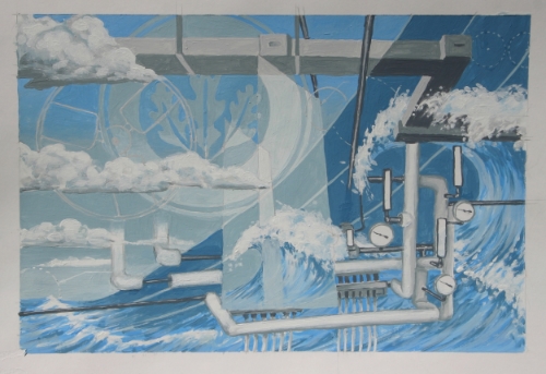
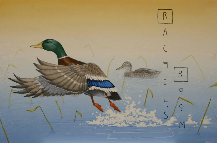
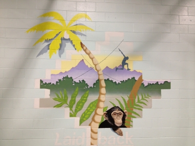
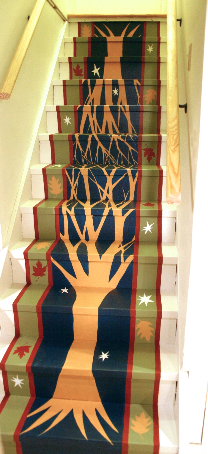
4) For younger (or expected) kids, do stick to bigger, more universal themes when planning the room. Kids room murals based on nature and/or or animals tend to be the most successful and long-lasting. Think about how your child will engage with the images on the wall… keeping it open for them to find patterns in clouds, or create adventures for animals or put themselves into another space and story is what makes a mural successful. It can also be fun and meaningful to incorporate something specific to your family in these larger-themed murals (for example, a sea scene if you love to vacation on the ocean every year, or including an eagle because it is their grandfather’s favorite animal). I have also been surprised to see how these types of murals can be cherished by kids from infancy all the way into their teens.
5) For older kids, do incorporate things they love. If your son or daughter has developed a passion for music, or sports, or dance, or owls, or cats (you get the idea) – using these interests as part of the overall mural or even as the central theme can be a great way to give your son or daughter a room they can’t wait to spend time in and share with their friends.
Most importantly, focus on the warm feelings you want your child to have for (and in) their room and have fun with it! With a little bit of planning and a good dash of art, you will be able to create a space that is more than just a bedroom.