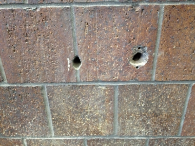
When my clients Brett and Kristen bought their home in Canton many years ago, they surprised themselves by falling in love with a golf-themed mural that had been painted in their downstairs bathroom. For years they enjoyed the mural, until a leak unfortunately required the plumber to cut two holes in the middle of one section of the mural. The patches left two roughly 1-foot square white spots – and Brett and Kristen thought they lost their mural for good.
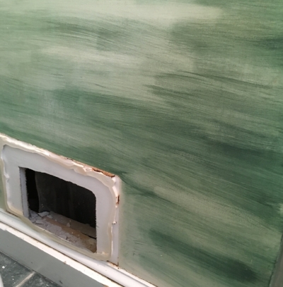
Serendipitously, I Brett and I met before they decided to paint over the entire mural. Upon hearing that I paint (and repair!) murals, he had me come check out the project. In addition to the two holes, I also noticed a vent covering that had rusted and suggested we replace it and re-paint that to match as well. Brett had conservative expectations, comparing the matching of someone else’s painting with matching someone else’s handwriting – but I assured him I could get close!
The first step is matching the colors. To get close, I use paint swatch books, holding different colors up to the mural to get the best match possible. Since murals have blended colors, however – this can only get me so far. Fortunately, I have accumulated a vast library of different colors of paint – so I brought a selection with me that enabled me to mix the colors onsite.
The next challenge is to match the technique. The muralist who did the original painting used a lot of glaze washes and different brushes to get the textures of the sky, grass and trees. I brought a spare board with me to test techniques that I thought would match, giving me good confidence in my approach when I started on the wall.
In the end, Brett and Kristen were shocked at how seamless the match was – and how happy they were that I had “saved” their mural!
Enjoy!
Jason

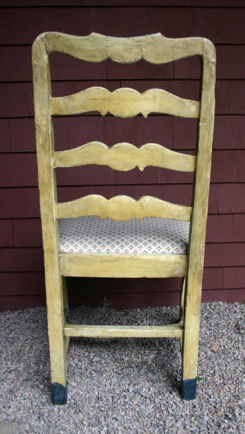
The full "Before" and "After"

"Before" on spot #1

"After" on spot #1

"Before" on spot #2

"After" on spot #2
"Before" on spot #3

"After" on spot #3