Faux Painting Plastic to look like Aged Copper and Distressed Wood

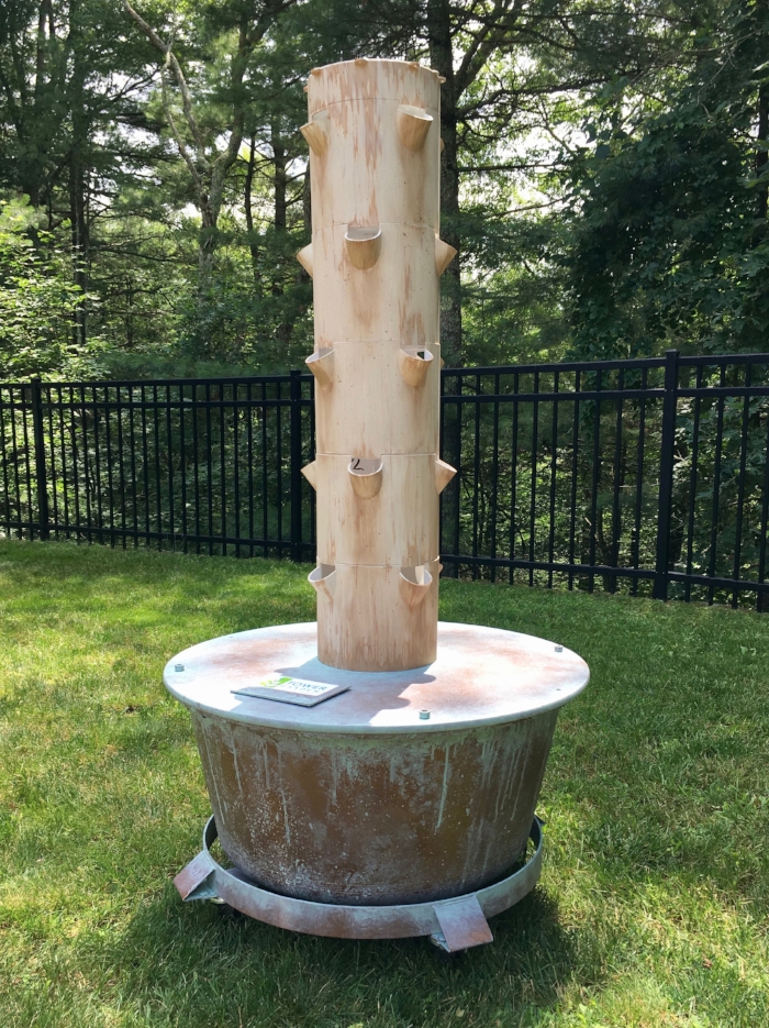
I have faux painted a lot of different things since I started, but this was my first faux painting of a plastic Tower Garden!  My client Pam works with Juice Plus, and part of her healthy living offering includes a Tower Garden designed to grow vegetables and herbs year-round, inside or out.

While the Tower Garden is fantastically designed for aeroponic growing in a small footprint, the green and white plastic may not go with every décor.  To address this issue, Pam had me faux-paint her Tower Garden to look like the bottom tub and stand were aged, patinated copper, and the tower was distressed white-painted wood (the tower needs to stay light in color to prevent it from getting too hot).

My first challenge was making sure my paint would stick (which can be tricky with plastic!) to make sure the finish would be durable enough for indoor and outdoor use.  The lid of the tub and the tower just needed some good bonding primer, and I was ready to go! The tub, however, needed to be sanded first, before I could get the bonding primer (and ultimately the paint) to stick. With this addressed, I started creating the aged copper look.

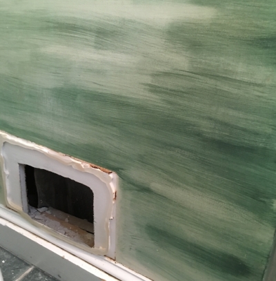
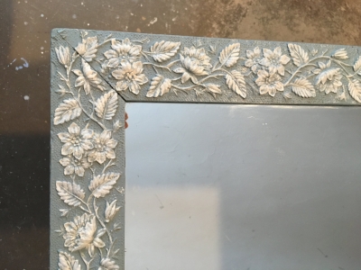
As a first layer, I used a spray paint color called, conveniently, “aged copper”.  This gave me the metallic look that I needed and was a good, rich color to build off of. To make it look older, I then rubbed a dark brown exterior stain over the aged copper spray paint, rubbing it off in some places to reveal the glimmer of the metallic paint, but leaving it looking dull and smudged in other places.  Already I had the look of a large old kettle!  To complete the effect, I then added the patina, using the exterior stain in a color I mixed to get that great old-copper green.

For the tower portion, I started with an aged white color and then added in chips and wear in the areas where it would logically happen – using colors to make it look like exposed wood under the chipped paint and years of patina from outdoor use.

It was a fun project and best of all, it was exactly what Pam was looking for!  Below are some shots of the before and after -

Enjoy!

Jason

The Tower Garden before transformation

The Tower Garden before transformation

After!

After!

Close-up of the "copper" tub

Close-up of the "copper" tub

Detail of the tower

Detail of the tower

The lid showing that shiny and dull look

The lid showing that shiny and dull look

Nature's Faux Painting

Well, not painting really – but with all of my focus in making colors and patterns align seamlessly in my faux painting and restoration work, I definitely enjoyed this photo taken by my daughter!  As it turns out, she shares my appreciation for tricking the eye.

Can you find the toad in the shot below??

Here it is!!

And a close-up to show just how amazing this is:

Enjoy!

Jason

Mural Restoration in Brookline, MA

As I experienced during my most recent project, I have come to enjoy restoring murals almost as much as creating them!

When my clients Jean and Peter explained to their interior designer Anne Langton that they had a mural that needed to be repaired, Anne called me to come check it out.  The mural was originally painted in 1992 in a room of Jean and Peter’s house that began as a porch, but had been converted many years ago into a 4-season sitting room.  Even at 25 years old, the mural was in great shape – except for the unfortunate damage caused by a recent leak in the ceiling.  The water affected the walls as well as the ceiling, and the corner of the room would need to be re-plastered.  Fortunately, Anne called me in before the plastering was done, so I was able to see the mural in the damaged area before it was covered over.  In my first visit, I took pictures of the area that needed repairs and used my paint swatch books to match all of the various colors in the mural.

Once the plastering was complete, I came back to see some fresh white walls and other various patched areas that would need to be re-painted and blended to match the rest of the room.

I began along the ceiling of the damaged wall, making sure I had my paints mixed to match the off-white background as well as all of the subtle variations of color streaked over it.  With these colors matched, I moved to the right corner where the damage was worst.  Using my pictures, I was able to first re-create the breaks where the off-white blended with yellow and then into a light greyish-blue that is a continuation of water from the other side of the door.  With the background painted, I was able to replicate the leaves that were once there – and added my own twist with a branch that balanced things out nicely.  At the bottom of the corner, there was a distant mountain that needed to be replicated – and all of the areas needed a light wash of a taupe color to match the subtle patina of the rest of the mural.

There were a few other spots throughout the room that I touched up while I was there – and then I finished off by replacing the names of the original artists!

Jean and Peter were shocked and thrilled with the results… saying that it looked like I took a picture of the old mural and figured out how to stick the picture back up on the walls!  Following are some shots to show the original (damaged) wall, how it looked when it was plastered - and then the final result.

Enjoy!

Jason

The final mural including my repairs above and to the right of the door

The final mural including my repairs above and to the right of the door

The corner before plastering -- showing damage and original mural

The corner before plastering -- showing damage and original mural

The corner after plastering -- my newly white "canvas"!

The corner after plastering -- my newly white "canvas"!

The corner with restored mural

The corner with restored mural

The bottom corner before plaster

The bottom corner before plaster

The bottom corner after plaster

The bottom corner after plaster

The bottom corner restored!

The bottom corner restored!

Repairing Faux Wood Painted Trim and Doors

Sometimes the lowest-impact solution to a problem is the best! That was the case with my recent project helping my client Cathie fix up her dinged-up trim.

The trim has shown this wear since Cathie and her husband Kurt moved in, so they weren’t certain how the damage happened. After looking closely, Kurt deduced that instead of being stained wood as it appeared – it was actually faux-painted. When I came to take a look, I found that Kurt was right – and that it was actually the paint that had chipped off making the damage more obvious than it might have been if the woodwork was stained.

The solutions seemed a bit more difficult than deducing the problem, however.  One option was to remove the trim so it could be completely stripped down and re-finished – but this ran the risk of damaging the surrounding venetian plaster.  Another option would be to sand the trim down in place, but that would be less than ideal in terms of associated time, mess and cost.

After talking with Cathie, I offered a 3rd solution – which was to just re-paint the damaged areas – matching the existing faux painting around these areas to make it all blend in.  This would be tricky to match all the different colors and patterns – but certainly possible and far less impactful!

After less than 3 days on-site, I was able to take care of all the trim and doors on their second floor --- and the difference was significant!  Cathie and Kurt were thrilled with the results and how easy it ended up to get there!

Below are a few “before” and “after” pictures.  I forgot to get before shots of the doors – but these images of the trim help tell the story.

Enjoy!

Jason

A Mural of an Historic Airplane to Celebrate an Historic Pilot!

As part of my mural painting and commissioned art business, I get the opportunity to paint a wide variety of subjects – as witnessed by my most recent project! My client MaryLou reached out to me with the idea to paint a Boeing KC97 airplane as a present for her husband Bob.  Bob’s 84th (!) birthday is coming up, and flying for the Air Force after college is a treasured memory from his younger years.  The plane he spent the most time flying was the KC97, a mid-air refueling plane that he flew in 1957 and 1958..

To pick the location of the mural, we looked to Bob’s favorite spot to enjoy his crossword puzzles and the occasional golf tournament on television. His chair in this room looks up at a wall with a great horizontal space that is perfect for this 5 foot by 2 foot mural!  Rather than paint the mural directly on the wall, we decided to do this one on canvas so they would have the flexibility to move it if they need to down the road.

My first step was to measure the space to suggest a size that would fit the space well without overwhelming the room.  We also looked at the colors in the room to pick blues that would go with the other pictures as well as the rug in the room.

With this done, I then did online research on the KC97 and sent pictures that I was considering using to Bob for him to review.  Since I am not an expert on aircraft, I wanted to make sure I picked an image that was exactly what Bob was looking for!

With an approved picture of the plane, a final size and colors picked – it was on to the final painting!  Based on my conversations with Bob and MaryLou, I wanted to keep the painting very clean and bold – with the emphasis on the plane itself.  Since Bob is a history buff, it was also important for my details to be completely accurate!  With that said, though – I did decide to make one small change as a fun surprise for Bob by making the tail number his birthday!

When I delivered and hung the final mural painting, Bob and MaryLou were thrilled!  It was “even better” than what they had in mind.  Bob loved the accuracy of the painting – and the customized tail number was a hit.  Happy 84th Bob!!

Below is a close-up of the mural, a shot with me installing it to show the scale -- and a shot with the proud new owner!

Close-up of the painting

Close-up of the painting

Faux Wood-Grain Painting in Walpole, MA

According to Wikipedia,  "faux painting or faux finishing are terms used to describe decorative paint finishes that replicate the appearance of materials such as marble, wood or stone”.  While I have done faux finishing that replicates marble, wood and stone – I have also found that sometimes I need to replicate somebody else’s faux painting!

My most recent client Charlie called me when the faux wood-grain painting he had on the railings of stairwells in his home had worn off after many years of use.  Since there were 2 stairwells with this faux treatment and not all of it was worn down, we wanted to re-do only certain sections, touch up other parts and leave the portions without damage alone.  This meant that my challenge was to not only accomplish the wood look my client wanted, but also to match the previous faux painting job to make it all look seamless together.

To make sure my work would last, I began by sanding down the sections that needed to be re painted.  For the sections that needed touch-up, I used a deglosser to help with paint adhesion without marring the surrounding areas.  Once the prep work was done, I could begin the 4-layer process involved to recreate the wood grain look.   Most often when doing faux painting, I use latex interior paint (with lots of mixing to match colors!) and a latex glaze.  For this project, however, I found that I needed to use acrylic artist’s paints to match the saturation of color that was in the existing faux paint job.

Once I had my colors mixed and started laying in the “wood-grain” layers, it all came together! I was able to accomplish both the grain and the colors of the existing finish to the point where Charlie couldn’t tell where my work ended and the previous finish began.

By wrapping it all up with a gloss polyurethane, I was able to get all of the railings looking the same – and good as new for years to come!

Following are “before” and “after” shots of some of the section of the railings I painted

Enjoy!

Jason

Faux Painting to Match Barn Board

I have mentioned several times in this blog how much I like the diversity of the projects I get to do with BlackBeak Studios – but I also thoroughly enjoyed two very similar back-to back jobs that tested my faux painting and matching skills!

The most recent of these projects was part of a redesign of a unique space in Wellesley.  The room started as a partially finished garage, and it was being transformed into a game room with a golf simulator.  The homeowner worked closely with their contractor Tim to come up with a look for the room that included reclaimed barn board paneling on all of the walls – which looked fantastic.  The problem they encountered was with the windows (and the door frame!).  Once the barn board was installed, the plain, stark white of the windows and door frame looked completely out of place (the door itself will have a unique tin treatment).  They considered painting them a single color that would match the barn board as close as possible – but what they really wanted was for the windows to look like they were also made from the same old wood…. Which is where I came in!

I have worked with Tim in the past (matching wallpaper, matching damaged faux finishes), so he had an idea that I may be able to also match the barn board.  I first visited the space to get a sense of what was needed, and Tim sent me home with samples of the wood to help collect the perfect paint colors.

Once on site, I was able to dive right in.  I started by painting the windows in flat colors that I mixed to match the “general” look of the surrounding wood. I then approached each section of wood as a separate painting to make it look like the windows, like the walls around them, were made from different pieces of previously distressed wood. As a reference, all I needed to do was look around me!  In addition to the striated texture, I incorporated what I saw in the paneling – from knotholes, to water damage, to cracks, chips and even bullet holes!

For projects like this, just seeing that match come to life is extremely rewarding – but nothing is better than a happy customer.  Both the contractor and the homeowner were enthusiastic about the results!  Below are some of the pictures – enjoy!

Window 1 before

Window 1 before

Window 1 after

Window 1 after

Window 1 detail

Window 1 detail

Window 2 before

Window 2 before

Window 2 after

Window 2 after

Window 2 detail

Window 2 detail

Door frame before

Door frame before

Door frame after

Door frame after

Painting Wood Floor Vent Grates to Match Tile

I love a challenge – and jobs where I need to match existing textures and colors with paint definitely fit the bill!  A project I just finished in Orleans on the Cape is a great example of this.

My client Janet is the designer for a new home being built, and she was at a loss for how to handle 6 wooden floor-vent grates that stood out like sore thumbs next the surrounding tile floors… which is when she called me!

The vents were in 4 different rooms with 3 different types of tile.  Typically, I visit the site first so I can spec the colors I will need with my color-deck.  In this case, though – the long distance meant I was working from the following pictures Janet sent me:

Bath 1 before

Bath 1 before

Mud room 1 before

Mud room 1 before

Mud room 2 before

Mud room 2 before

Powder room before

Powder room before

Once I was on-site, the first thing I needed to do was to get a good coat of primer on the grates to insure good adhesion of the paint.  From there, my goal was to find a “base” color for each tile -  which is the dominant color you see when looking at the tile. This can either be the “background” color behind the texture (if there is one), or it is essentially the “average” of all the colors together (basically the color you see if you stand back and blur your eyes).   I mixed each of these colors on site and got Janet’s approval before moving on.  After this was dry, each grate became its own little painting.  I started by mixing all of the subtle colors I could see bordering each tile, and then went to work with my small brushes to align all of the patterns and colors to make the match seamless.

To protect these “paintings”, I then applied a few coats of water-based polyurethane, which won’t yellow and will protect the color as well as the durability of the paint.

In the end, Janet was thrilled with the result and we had fun watching the previously blatant vent grates now disappear into the tile around them!  Here are the results - enjoy!:

Bath 1 after

Bath 1 after

Upstairs bath after (no before picture available!)

Upstairs bath after (no before picture available!)

Mud room 1 after

Mud room 1 after

Mud room 2 after

Mud room 2 after

Mud room 3 after

Mud room 3 after

Powder room after

Powder room after

Swirl-Patterned Gold Ceiling in Newton, MA

My most recent client Jessica found me online when considering options for a creating a dynamic gold treatment for the ceiling in her office.  As it turns out, Jessica is an interior designer, so she already had a great idea for what she wanted – including a swirl pattern to really accentuate how the gold paint catches the light.

Thanks to Heather Bourgeios, a fantastic Sherwin-Williams rep I have worked with, I was aware of a product called Crescent Bronze that was a great fit for this project!  This paint has actual metal fleck in it that makes it perfect for accomplishing Jessica’s goal of optimizing how the paint reflects light in interesting ways.

To create a deep, rich look, I started by painting a smooth finish of gold over the entire ceiling.  Once this was dry, I went back to paint my second coat- but with this coat, I used my 4-inch brush to lightly sweep in the swirl pattern after rolling out the paint. The metal fleck in the paint makes it “directional” – meaning the direction in which you apply it will catch the light differently – so this enables the swirls to stand out dynamically without adding any actual texture to the ceiling.

Jessica was thrilled with the result, and I enjoyed just looking at the finished result, watching the pattern change as I walked around the room!

Enjoy!

Jason

Faux finish in Medfield, MA

My client Cathy in Medfied called me when she wanted to update the faux painting in her entry foyer, stairwell and upstairs hallway.  The project started with a new tile floor in the entry foyer, which did not go with the existing faux finish from almost 18 years ago.  The tile is a nice combination of cool and warm grays – while the existing faux finish was creamy yellow with a brown accent color.

The new tile floor

The new tile floor

The old faux finish

The old faux finish

We started by looking through different options for faux finishes, and Cathy opted to stick with the “raged” finish she had, just with updated colors.  With color book in hand, we walked through the house and narrowed down our options to 2 different families of gray – one of which was warmer/more brown, while the other was cooler/more blue.

Since Cathy wasn’t completely sure which colors she wanted, I painted a concept board showing 4 different options that she could look at in her house.  This step was particularly important with grays – as they tend to look very different depending on the light.  Cathy was amazed at the differences depending on time of day, but seeing all of the options helped make her comfortable with her decision.  I was happy Cathy chose a combination where the lighter color was the faux/accent color – as that tends to give the finish a great pearlescent look.

The concept board

The concept board

Once we had the final color combination, it was time to get started!  The one change I made from the concept was to try to get more of a repeated pattern in the finish – giving it a damask look, which Cathy really liked. 

The walls now go beautifully with the new tile floor, and Cathy and her husband are thrilled with their new faux-painted hallways!

Enjoy!

Jason

"All-over" Wall Stenciling

In addition to faux painting and wallpaper -- "all over" stenciling can be a great way to create a "wow" factor in your space!  The idea is to repeat the stencil pattern to cover an entire wall or entire room, giving a wallpaper-like effect.  Using paint and stencil gives a different look than wallpaper - and you get the fringe benefit of having complete control over the colors and patterns.  Additionally, with stenciling, you also don't have to worry about limitations wallpaper has in wet spaces like bathrooms and kitchens.

I recently had the opportunity to work with designer Ally Maloney of Maloney Interiors on 2 rooms she designed for the RI show home.  Ally decided to treat the walls of both of her rooms with stencil patterns and she called me in to help make it happen!

The first space used a fun "dalmatian" pattern in dark grey and white, while the second used a more ornate pattern in a Tiffany blue over bright green.  The dynamic result in both rooms garnered plenty of attention and rave reviews!

Following are some shots of the process and end results.  Enjoy!

Painting the dalmatian spots

Painting the dalmatian spots

A close-up of the second room stenciling

A close-up of the second room stenciling

The final room

The final room

Helping Communicate Company Branding with Murals

When looking at the range of mural painting I have done, one of the things I enjoy most is the diversity of the things I get to paint! 

My most recent project is a great example of this, as it was different than a lot of the work I usually do.  My client was Mastodon moving in Ashland, MA, and they wanted elevate the look of their warehouse to reflect their company image and mission.  The approach to accomplishing this goal ranged from painting their logo to painting inspirational quotes to giving one wall the look of their website.

Starting with the logo, I collaborated with the owner JJ on the ideal size and placement.  We ended up with a 4’x5’ size that is oriented so his employees and clients see as they enter the front door.  The logo is painted on the wall opposite the door, and it is perfectly framed by the doorway as you walk into the space.  Capping it off, we decided to include their tagline “Moving Beyond Expectation” just above the logo to highlight the importance of Mastodon’s goal to be better than any other moving company.

Immediately next to the logo, JJ wanted to include their mission statement to set the stage for what clients and employees should expect as they walk (figuratively and literally) into Mastodon moving!

Staying with the theme of painting motivational lines on the walls of the warehouse, there were 3 more locations where JJ wanted quotes to help keep his team motivated and focused on being the best.  One of these quotes is positioned above the desk of his office manager, while the others are strategically placed over the doorways as you leave the main section of the warehouse, and another as you walk out door on the way to take care of a client move!

Finally, there is one large wall in the warehouse where a 20’x7’ section of raised wall is framed by a recessed section that surrounds it.  To add visual interest to this large space while keeping consistent with their branding, we decided to replicate the look of the background on Matstodon’s website.  JJ and his team are still brainstorming what they want to paint on the large “canvas” of raised wall that is now framed by this background – so more is to come on this project!

Enjoy,

Jason

Painting a Wedding Portrait (or 2!)

Sometimes my clients request paintings that present new challenges for me – and my latest portrait project is a great example!  My client Pat had a picture from his wedding that he wanted to use as the reference for a portrait he planned to give as a gift.  The first challenge is that the picture was of 4 people – and previously, the most I had done in one portrait was 2 people. While I knew it would be tough to make sure that I captured the likeness of all 4 people, I was still confident I could do it.  The bigger challenge, however, is that he wanted me to paint two copies of the same painting!!

The picture is of Pat and his wife on their wedding day, posed with his wife’s grandparents.  Unfortunately, her grandfather became ill and passed away shortly after this picture was taken.  Pat wanted 2 copies of the painting so he could give one to his wife and the other to her grandmother as a special celebration of their relationship and the grandfather’s life.

I explained that it wouldn’t be possible for the two paintings to be identical, but I felt that I could get them very close.  Knowing that the 2 portraits would never be hung next to each other, Pat was more than comfortable with this, and was excited to be able to give such a special gift!

To get started, I sent Pat ideas of how I would crop the photo to make sure we captured as much as possible of the torsos while still keeping the focus on the faces.  Pat liked what I proposed, which dictated a horizontal format – and we chose 12”x24” as the size that would best suit his needs. Otherwise, the only major edit was the background in the picture – which was not ideal.  Instead of manufacturing a new background, we decided to go with something neutral to make sure the paintings did not look cluttered.

With these decisions made, it was on to painting the portraits! To make sure the 2 paintings looked as close as possible, I painted them piece by piece, going back and forth between the two canvases.  For example, after painting the grandfather’s suit jacket in the first painting, I then painted the same jacket in the second painting.  With that done, I went back to the first canvas to paint the shirt and immediately followed with the same shirt on the second painting. This helped insure that I used the same paint color mixtures and that I use the same exact technique on both canvases.  I did this back and forth for every part of the painting – whether it was for the background, an outfit or a face.

In the end, I accomplished Pat’s goal of creating two almost identical portraits!

Below are pictures from the process-

Enjoy!

Jason

The original photo

The original photo

The cropped version of the photo

The cropped version of the photo

Portrait #1

Portrait #1

Portrait #2

Portrait #2

Mural Repair in Canton, MA

When my clients Brett and Kristen bought their home in Canton many years ago, they surprised themselves by falling in love with a golf-themed mural that had been painted in their downstairs bathroom.  For years they enjoyed the mural, until a leak unfortunately required the plumber to cut two holes in the middle of one section of the mural.  The patches left two roughly 1-foot square white spots – and Brett and Kristen thought they lost their mural for good.

Serendipitously, I Brett and I met before they decided to paint over the entire mural.  Upon hearing that I paint (and repair!) murals, he had me come check out the project.  In addition to the two holes, I also noticed a vent covering that had rusted and suggested we replace it and re-paint that to match as well. Brett had conservative expectations, comparing the matching of someone else’s painting with matching someone else’s handwriting – but I assured him I could get close!

The first step is matching the colors.  To get close, I use paint swatch books, holding different colors up to the mural to get the best match possible.  Since murals have blended colors, however – this can only get me so far.  Fortunately, I have accumulated a vast library of different colors of paint – so I brought a selection with me that enabled me to mix the colors onsite.

The next challenge is to match the technique.  The muralist who did the original painting used a lot of glaze washes and different brushes to get the textures of the sky, grass and trees.  I brought a spare board with me to test techniques that I thought would match, giving me good confidence in my approach when I started on the wall.

In the end, Brett and Kristen were shocked at how seamless the match was – and how happy they were that I had “saved” their mural!

Enjoy!

Jason

The full "Before" and "After"

The full "Before" and "After"

"Before" on spot #1

"Before" on spot #1

"After" on spot #1

"After" on spot #1

"Before" on spot #2

"Before" on spot #2

"After" on spot #2

"After" on spot #2

"Before" on spot #3

"Before" on spot #3

"After" on spot #3

"After" on spot #3

Harry Potter "Photo Station"/ Mural Panel in Wellesley, MA

Just last weekend, the Wellesley Free Library (in Wellesley, MA) hosted a great mini-golf event, and they contacted me about adding some fun to the event with a “photo station” or “selfie station”.

The “selfie station” is a new term, but the concept is the age-old approach of creating a scene on a board with a hole for kids to insert their faces for great snapshots.  In talking with the director for the event, her guidance was for the scene to be related to a book for children, but the rest was up to me!

After some thinking and collaborating with my family, we settled on Harry Potter as a popular draw for kids of all ages.  With that decided, I then needed to figure out which scene I was going to paint...  I also wanted to add an interactive element – which led me to think of the sorting hat scene!

My idea was to create a mechanism for kids to choose which house the sorting hat calls out for their photo in the selfie station.  To do this, I cut an additional hole in the board for the house name and mounted a wheel behind it, so kids could turn the wheel and reveal their house of choice.  I included a picture of the back of the board (below) to show how this worked.

Knowing that many kids of all ages would be interacting with this, I was also concerned about safety.  To make sure the board was stable and secure, I used the largest brackets I could find to mount the board to 2 pieces of 3-foot long landscaping timber.  As a result, the board did not move at all when it was assembled!

Then I was on to the designing and painting of the mural.  I wanted enough detail to tell the full story of the sorting , with the castle interior, night sky and of course Dumbledor – but I also wanted to keep it simple enough to avoid clutter.  I ended up with the design below, which ended up being a hit with the kids at the event (as well as the ones in my house!)

Enjoy!

Jason

Kid 1

Kid 1

Kid 2

Kid 2

Kid 3

Kid 3

The brackets and supports kept everything stable!

The brackets and supports kept everything stable!

The back of the board

The back of the board

Painted Furniture!

Painting furniture can take on many different “stripes” – from unique, specialty finishes to pieces painted a straight-forward single color.  A few of myrecent projects are good examples of this range!

The first example is a collection of dining room chairs.  The chairs I started with were great, solid chairs that were just a bit dated looking- with a tired, yellowed oak finish (see below).

Chairs before painting

Chairs before painting

My clients are moving the chairs to their sea-side home in Plymouth, so they wanted something light in color that would go with the “ocean” look.  They also need to go along with the dining table I did for this same client a few months ago (picture below).

The dining table previously painted

The dining table previously painted

Working with their fantastic interior designer, we came up with a subtle “driftwood” look, using varying shades of light, brownish-gray.  I first painted the darker shade, and then using a thinned version of the lighter color, I created the wood-like pattern.  Because it was subtle, it was hard to catch in a photograph, but the pictures below give an idea of how they turned out.  Most importantly, the client loves them!

The final paint finish showing pattern detail

The final paint finish showing pattern detail

The second example is an old mirror for the same client.  The mirror has a great relief pattern around the frame that my client loves, but the dark color did not go with their new space.

The mirror before painting

The mirror before painting

When considering options, I wanted to make sure anything we did highlighted the floral pattern, so I suggested using two colors, with a lighter color “rubbed” over the relief pattern.  The space where the mirror is hung is a clean, modern room – so I wanted the final result to balance on a fine line between the “antique” of the mirror and the “fresh” of the room.  The colors we chose pick up on colors in their room, and I used a lightly tinted wax finish to hint at age without being too heavy-handed.  Again, the result was a hit!:

The mirror after painting

The mirror after painting

Mirror detail

Mirror detail

The last example is more straight-forward, but equally impactful.  My client moved into a new home and had 2 media cabinets that fit perfectly on either side of their chimney (over which the television is mounted).  The only problem was that the finish of the cabinets before I started (below) did not go with the clean, bright look of the room.

Cabinet before painting

Cabinet before painting

Second cabinet before painting

Second cabinet before painting

To address this, we painted them a simple white – and the result looked great!

Cabinets after paint!

Cabinets after paint!

When trying to fit old furniture into a new space – consider paint!!


Enjoy!

Jason

A Bright, Bold Statement Wall

My most recent client Terry called me when he finally got tired of looking at the same big, drab wall while walking down the stairs of his home.

The hallway before...E

The hallway before...E

Because of the position of the wall, it never looked right to hang a picture – but with the family staring at it every morning on the way to start their day, Terry definitely wanted to make it a dynamic feature in their home.

Doing a mural in the space was a great solution, but we needed to figure out what the mural needed to be!  Terry wanted the colors to be bright and cheery- with blues, oranges and yellows (but no greens!).  He liked the idea of alluding to beach, water, waves and sunrise – but he wanted it to be abstract and not a realistic ocean scene.  Most importantly, he wanted it to be an experience where he would see something new in it each time he looked, and everybody in the house would have their own impressions.

As we collaborated about ideas, I shared my recent “Statement Walls” using patterns from nature.  Terry liked the concept, and I started to share patterns from pieces of agate with suggestions for edits to achieve the look he was going for.  We settled on a pattern that had the sense of churning water in the foreground with mountains and atmosphere in the background.  Below is the picture of the agate:

Picture of agate

Picture of agate

I then edited some of the patterning and colors to dial in the look and feel to capture what Terry was looking for and did a concept painting to scale:

The concept painting

The concept painting

Terry loved what he saw, with just a few edits to some of the colors.  From there, I was on to the wall!

Below is the final result, which hit the nail on the head of what Terry wanted!

The final mural!

The final mural!

Enjoy!

Jason

A Dog Portrait for Christmas

With the holidays rapidly approaching, my client Sue Ellen found herself in the familiar place of needing to find that special gift for her husband John.

Sue Ellen and John love their pets, and each dog they have had over the years is honored with a picture on their wall.  As Sue Ellen was thinking about how their current (and beloved!) dog Winslow is getting on in years, she thought of taking things to another level and honoring Winslow with a portrait!  Since John is extremely attached to Winslow, Sue Ellen knew this would be the perfect gift.

As she looked through her pictures, her favorite was one that was taken at the vet’s office.  It is a great picture of Winslow, and we decided to use colors from Sue Ellen and John’s living room in the background to make the painting look more like a formal portrait and to put all of the attention on Winslow.  Even better than just a good picture, I also got to meet Winslow! Being able to interact with him (he is super-sweet dog) made it easier and more fun to make sure my painting "captured" him.

I delivered the painting to Sue Ellen today and she loves it - sharing that I "captured his spirit" (a huge compliment)! Now she can’t wait to give it to John (and I can’t wait to hear about his reaction!)

Enjoy!

Jason

Gold (Ceiling) for Christmas!

Are you looking to enhance a room?  Consider a specialty finish on the ceiling!

When my client Sara was re-doing her dining room in Brookline, she was thrilled with the warmth of the red color she chose for the walls – at least until the ceiling was painting a cold, stark white.  The coolness of the ceiling white was accentuated by the fact that the trim was a warm off-white.  In the end, she felt that any warmth she had gained from the walls was taken away by the “chill” of that ceiling!

Sara and her family lived with the room for a while, as she considered her options for getting the room back to her original vision.  After looking around, she decided to go with a gold called “Pale Luster Gold” which would bring in the warmth, but would not overwhelm the rest of the room due to the subtle, soft gold color.  Adding to the interest, Sara chose to go with a “hammered metal” finish as opposed to just doing a flat metallic.

Painting metallic can be tricky, so Sara’s house painter chose to pass on the job – which is when she called me!  I had done the hammered metal finish before, so I knew how to make the finish look right (hint – following the instructions doesn’t necessarily do it!)

An additional challenge we had were some sizable sagging cracks in the ceiling.  These were the kind of cracks that couldn’t just be patched without replacing or re-plastering the ceiling, so Sara decided to leave it.

In the end, the color was perfect to achieve exactly what Sara was looking for!  We also found that the slightly mottled look of the hammered metal finish actually looked better with the ceiling cracks than the white did – giving it almost a look of parchment.

It helped too that we got it done in time for Christmas!

Below are some before and after pictures of the project.

"Before" #1

"Before" #1

"After" #1

"After" #1

"Before" #2

"Before" #2

"After" #2

"After" #2

Enjoy!

Jason

Portrait of Beloved Family Dog "Rosie"

I have said this in my blog before, but the diversity of what I do is one of my favorite things!  After my 15’x16’ and 5’x8’ mural projects, it was fun to get back into my studio and do this intimate little 8”x10” dog portrait.

The best part about commissioned art is talking with my clients about images that are special to them, which was the case when I connected with my latest client Gretchen. Gretchen and her husband have a small “collection” of portraits of the dogs they have had over the years, but their current dog Rosie had not yet had her portrait done!  Gretchen is actually the sister of another client that I did a dog portrait for (“Gus”) and she wanted “Rosie” done in the same style to make her Rosie portrait stand out in the crowd.

We began the process with Gretchen sending a few different photos, and I started looking at them in terms of the quality of the photo and the composition of the shot.  It wasn’t until Gretchen focused instead on who Rosie is that we settled on this final shot. While some of the other pictures were great, this shot of her inside on the couch was perfect – as Rosie so prefers to be indoors that her family nickname is “Hothouse Rosie”

The reference photo

The reference photo

Having the additional photos is still a big help, however.  I find when I do any kind of portrait (dog, human or otherwise), the more views I have of my subject, the more I can get a sense of what distinctive features they have that really make them look like them!

With the picture chosen, I did some cropping and editing to get a good composition and started my painting!  For this piece, the expression on Rosie’s face and the texture of her fur were key to get the “look” correct.

Now that it is complete, Rosie is waiting to be a gift from Gretchen to her husband.  I look forward to hearing his response!


The final painting

The final painting

Enjoy!

Jason