High Gloss, High End Faux Finish in Newton, MA

As a decorative painter, I am aware of the perception that faux finishes on walls are old-fashioned and out of date --- and looking at some of the sponge-painted finishes that were big DIY projects back in the 80’s and 90’s, I can understand why!

However, the right finish in the right space can be bold, fresh and downright opulent.  Of course, a good interior designer can make all the difference in making these decisions – which was the case with my most recent faux finish project in Newton.

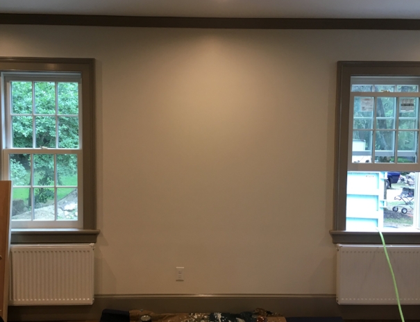
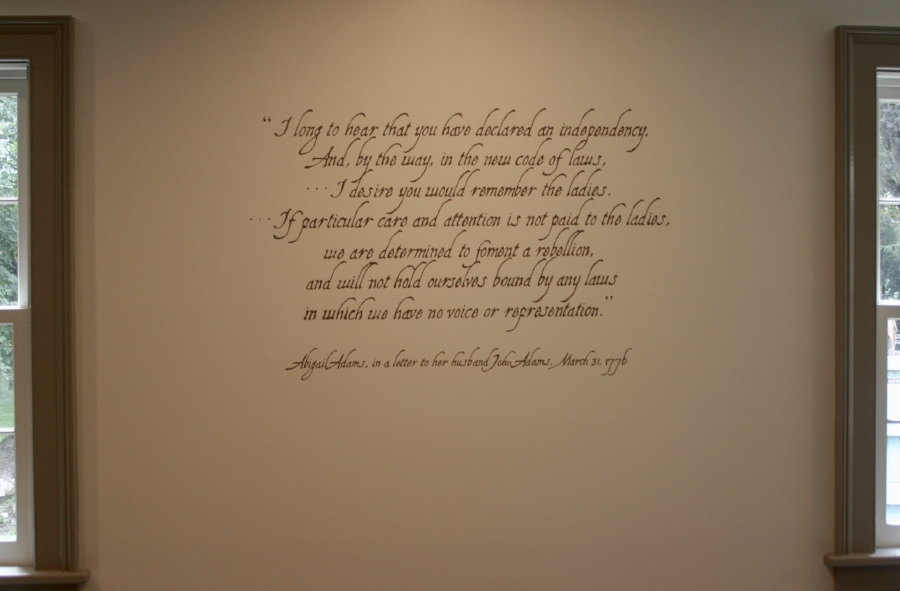
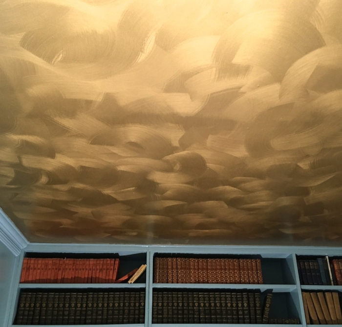
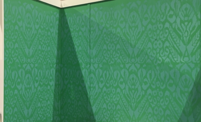
Interior designer Jessica Seth of Jackson Seth Designs was working on a re-model project and called me in to help make the dining room a centerpiece of the home.  Jessica had already chosen a patterned grass paper for the ceiling and had the trim and walls painted a base color to work with the tones in the paper.  To take the whole look to another level, Jessica asked me to come up with a faux finish that would tie in to the darker tones in the wallpaper and have a mottled look – similar to venetian plaster but more subtle.  To pack some extra visual punch, she also wanted the walls to have a high-gloss finish!

As usual, my process started with creating a board to show Jessica my interpretation of what this could look like.  We reviewed my board and decided to look at another design option (more subtle in the patterning) and different gloss options for the homeowner to choose from.  Jessica and I were both happy to find that the client liked all the options – but after some fun collaboration, they settled on the more subtle pattern with the highest gloss as the final option. To accomplish this finish, I first did a 2-step glaze technique to produce the pattern that would not be too busy, but would still have nice depth and interest.  Once this was done, I was on to the high-gloss challenge!

Oil-based options offer a nice gloss with a smooth finish, but some are not well-suited for walls – and any of them would quickly yellow and throw off the color scheme!  Instead I used a water-based polyurethane, which can be challenging to get a smooth application.  To address this, I used a very low-nap mohair roller and applied 4 light coats – which achieved a smooth, even finish with a nice deep gloss!

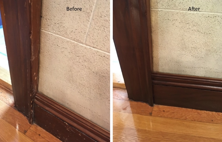
Following are some pictures of the final result.  The wallpaper is not yet installed, but you can easily see how this finish is a great way to make a stylish statement!

fullsizeoutput_b42.jpeg
IMG_0016.JPG
fullsizeoutput_b43.jpeg
IMG_5194.JPG
IMG_5186.JPG

Enjoy!

Jason

Specialty Paint Repairs

How do you fix a damaged decorative plaster fireplace surround? How can you address chipped tiles without replacing them?  My faux walls are dinged, but I don’t want to re-paint the entire room – what do I do?  I drilled holes in the wrong place on my new cabinets – what now?! I want to address water damage without re-doing my entire room, is that possible?

These are all questions I have recently been able to answer with paint!

The first example is a fireplace surround in a Newton home that was originally crafted in decorative plaster.  The effect is fantastic, but unfortunately over the years, the plaster had chipped in many places – in addition to getting slathered in some sloppy painting. What was once an elegant look had become an eyesore in the room. To get this back to its original look, a contractor partner called me in!

After filling in the holes, I was on to my favorite part – mixing paint to match!  Each tile has multiple colors that make up the mottled pattern, and in each the colors are different than the next!  Toaddress this, I treated each tile like its own little painting.  Along the edges, I needed also re-create grout to cover the white wall paint that overlapped on to the tiles.  There were damaged areas in many places, but below are a couple of before and after examples.

Before and After fireplace (1).jpg
Before and After fireplace edge (1).jpg

The second example was a smaller fix to help complete a kitchen remodel. While the counter top and cabinets were being replaced, the homeowner wanted to keep the original tile.  This would have been no problem – but there were chips that presented a challenge to the contractor because the tile is no longer available and therefore impossible to replace! 

However, with some plaster and some careful color-matching, I was able to make the problem go away:

Before and After tiles (1).jpg

The next example is something I have done a number of times – touching up existing faux finishes!  In this client’s home, their entry foyer, stairway and upstairs hallway were all done in the same faux finish.  Overall, the paint was in decent shape, but after about 10 years of use, there were dings and wear marks.  Additionally, there was a finished basement that was done entirely in a different faux finish that had a good amount of chips and dings after many years of being the teenager hang-out space. Rather than re-paint all of these spaces, my client decided to save time and money and have me patch all of these spots by matching the faux finish in both rooms!  I forgot to take “before” pictures of the entry/stairwell space, but below is just one example of the many chips I needed to make disappear in the basement:

Before and After faux (1).jpg

Another service I have provided a number of times is touching up newly installed kitchen cabinets.  Sometimes cabinets are delivered with small dings, or sometimes during installation there can be some damage --- and sometimes, the holes are drilled in the wrong place!

Obviously with cabinets, I don’t need to worry about replicating patterns or complicated detail – but matching the color and finish exactly is essential!  Here are a couple of recent examples where I have helped make the new cabinet owners happy by making damage go away:

Before and After cabinet.jpg
Before and After grey cabinet holes (1).jpg

The final example was some water damage in an 1859 home in Boston.  The damage was an eyesore to say the least – but my client couldn’t get a quote to fix just that area (without re-doing the entire room).  Doing this was a challenge, as the paint color and finish for the ceiling, trim and wall all needed to match up – but the end result was one of the most dramatic before and after paint fixes I have done!

Before and After ceiling (1).jpg

Enjoy,

Jason

The 3 P's of How to Paint Cabinets

So you want to update the look of your tired old wood cabinets, but you don’t want the big spend of replacing them? Painting cabinets can be a fantastic answer to overhauling your kitchen or bathroom on a budget!


Like most projects, however, knowing the right way to paint your cabinets can make all the difference in how successful and long-lasting your efforts are.  Following are tips I have learned along the way that will get you great results that you can enjoy for years to come! 

At a high level, there are 3 P’s that need to be heeded to make your job a success… PROCESS,

 PREPARATION and the right PRODUCTS

The first step in the PROCESS is disassembling your cabinets by taking off all of the cabinet doors and drawer faces --- but don’t start yet!!  It may seem like it will be easy to put everything back – but it is essential that you know which doors and drawer faces go back where --- otherwise, you will create big headaches for yourself later on. First, make sure you have plenty of zip-top plastic baggies, a permanent marker and some masking tape. Then follow these steps:

1)    Inside of each door, put a piece of tape with a key code that is specific to that door/position.  For example, I always start at the top, left-most door and call it “T1” for “Top, number 1”. 

IMG_4914.JPG

2)    Before removing the door, mark with a fine-point sharpie where the tops and bottoms of the hinges are on the frames.  You will use these marks later to align the hinges in the same exact position for re-hanging

3)    Now take the door off by removing the hinges from the frame (they will still be attached to the door at this point)

IMG_4913.JPG

4)    As you take the hinges off the door, put tape on each one and mark it “T” for the top hinge and “B” for the bottom hinge.  The hinges and ALL of your screws then go into a zip-top baggie labeled “T1” so you know which hinges and screws go with which doors.  The handle/knob and associated screws for T1 also go into this same baggie.

5)    Finally, label the cabinet door with “T1”.  The best way to do this is to write it in sharpie on the inside of the door where the hinge gets mounted.  That way, your writing gets covered up when you put the hinge back on (just make sure you don’t paint over it!).

Repeat this process for each door and drawer face.  Each door and each drawer face gets its own code and baggie!  The naming convention is not all that important -- as long as it makes sense to you and you don’t re-use any codes.  I usually continue with “T2”, “T3”, etc on the top, then “B1”, “B2”, etc on the bottom and “D1”, “D2”, etc for drawer faces.  I keep all of the baggies with screws, hinges and hardware together in one bucket and put that aside in a safe place.

OK – now you have a stack of doors, drawer faces and a bucket full of hardware-filled baggies.  The next step takes you to PREPARATION – which starts with CLEANING.  Yep – it is not glamorous, but it is absolutely essential.  Paint does not stick to dirt or grease – so if you just paint over it, your paint will crack, peel or chip off.  Adding to this, cabinets by nature have way more dirt and grease than normal painting projects – so don’t use any past success you may have had painting without cleaning as your guide! For this cleaning step, I use a heavy-duty degreaser called TSP – which is specially formulated to remove grease and dirt for painting.  Because you want to paint a clean surface, I usually start with the frames and go right to the next step of sanding and priming – and THEN move on to cleaning the doors. When cleaning the doors, you will often need a scraper to take off heavy residue and/or old adhesive bumpers.

You are not done with PREPARATION yet!  A clean surface is essential, but paint also does not stick to the shiny surfaces you will have on your original cabinets.  To address this, the next step is sanding.  I use 220 grit sandpaper on a sponge sanding block and start with the frames.  Since you only need to dull the surfaces (not actually remove the finish), I hand-sand everything. You want to sand in the direction of the wood grain and make sure you hit all surfaces.  You can check your work by looking at your surfaces at an angle in the light – this will show you what is still shiny, and what is now nice and dull for painting.

Ready for paint?! Not yet!! There is still more to the PROCESS.  Now you have dust from sanding all over your project – so you will need to vacuum it off with a brush attachment and make sure your surface is dust-free.

Now, we are on to the importance of the type of PRODUCTS you use --- starting with the right PRIMER.  Primer covers any knots or blemishes in the wood, but more importantly, it acts as a bonding agent to make sure your paint gets good, hard adhesion for long life.  You will want to use a bonding primer for this; my favorite is a product by INSL-X called STIX that you can pick up at any store that sells Benjamin Moore products.  If you are painting your cabinets a medium or darker color, have your paint store tint the primer to get it as close as possible to the final paint color.  The primer will never actually match the exact paint color – but the closer you get it, the better your paint will cover the primer (a dark color paint over white primer is a big challenge!). To apply the primer and paint, I use a 1.5” high-quality angled brush to cut in the edges, and then a mini roller with a mohair blend roller sleeve to get a nice smooth rolled finish on the flat surfaces.  When applying primer, make sure you don’t let it drip or glop up anywhere – you want your surface to be as smooth as possible.  Prime all surfaces you will want to paint (both sides of doors, faces and edges of frames).  When priming the edges of frames, paint right up to your thin sharpie lines for the hinges so you know where to re-hang the hinges when you are done.  Likewise, do not cover the code on your doors and drawers as you will need that to be readable when you reassemble!

Paint around where the hinges go!

Paint around where the hinges go!

And paint around code on door (it will be covered by the hinge!)

And paint around code on door (it will be covered by the hinge!)

Let your primer dry – and then you get to sand again!  This is a light sanding to smooth out any brush marks or drips that also helps the paint bond to the primed surface.  And of course, now that you have sanded – you need to vacuum again!

OK – NOW we get to PAINT. Choosing the right paint may be the most important step of all in this process.  A regular satin or semi-gloss trim paint won’t be smooth or hard enough to get you a good cabinet-grade finish.  I recommend a urethane acrylic paint or a waterborne alkyd paint.  These give you the nice smooth leveling and hard finish of an oil paint, but the faster drying time and low fumes of a water-based paint.  My favorite is a product called Cabinet Coat by INSL-X, which can be purchased anywhere Benjamin Moore products are sold.  The only limitation of Cabinet Coat is that you can only get it in light colors.  For darker colors, I use Benjamin Moore Advance (Advance takes longer to dry and can be a bit trickier to use than Cabinet Coat, but it creates a beautiful finish!).  In either paint, I always use a satin finish – which gives you great washability but does not highlight flaws as much as semi-gloss or gloss paints will do.

When applying these types of paint – you want to do it in nice, thin smooth coats. You will have to do 2 coats anyway – so remember that 2 thin coats are much better than trying it in one thick coat!  Again, I use a high-quality brush to cut in the edges and a mohair blend mini-roller for the flat surfaces.  When loading the roller, make sure you don’t get too much paint on the roller as you don’t want to get the “orange-peel” look that can result.

Let your first coat dry overnight (read instructions on your paint – some paints need 16 plus hours before re-coating!).  Before applying your second coat, you will want to do another light sanding!  This is important for bonding purposes – you definitely want your second coat to stick to the first coat!

OK – you are almost there!!!  If you can, it is best to give your newly painted surfaces a couple of days to cure before re-assembling your cabinets.  Once you are ready to put everything back together, you will be very happy you followed this PROCESS.  Using your coded baggies, put the hinges back on the corresponding doors, and then hang the doors where you have your hinges marked….

And enjoy what looks like a brand-new room!

Before

Before

After

After

Before

Before

After

After

Before

Before

After

After

Illustrations of Antique Vehicles for the AACA Museum

I recently had a fun change of pace in my mix of projects when the AACA Museum (an Automotive Museum in Hershey, PA) reached out to have me do some illustrations of antique vehicles for them!

The museum is launching a new Automotive Heritage Award that will be presented at a ceremony coming up in October.  As the AACA team was designing the award, they settled on an approach that incorporated line drawings of 5 vehicles that would be etched into the award.  With pictures of the vehicles and a trophy vendor chosen, they just needed someone to turn the pictures into illustrations – and I’m thrilled they called me!

The first step was to collaborate on the final images to be used – pairing down a number of options to the final 5 images based on which would work best in the layout and would translate well into line drawings.  I then worked with the AACA team on the layout.  The plan was to place each image in a 2” circle and arrange than in a horseshoe pattern.  Based on this, I suggested we place images that showed a ¾ view facing right on the left side of the horseshoe so they point in toward the middle, and do the opposite on the right side.  For the top-most image, I suggested a head-on view to keep everything balanced.  Below is my (very) rough layout “sketch” to illustrate this

museum trophy rough layout.jpg

With this idea approved, I then needed to design the circle border that would be used around each vehicle illustration.  Rather than do just a circle or a decorative pattern, I decided to run with the automotive theme and use a steering wheel rim!  I looked online at different options, and landed on the steering wheel of the Austin 7 since on this car you can clearly see the ridges from the front of the wheel.  Below is the drawing that was approved to be used as the border around the vehicles:

Border for all_Austin 7 steering wheel.jpg

With this done, it was on to doing the final drawings! The images we chose were a 1929 Cord, a 1921 Duesenberg race car, a 1948 Tucker, a Gump Bus and a vintage police motorcycle.  The final images will measure about 1.5” in the largest dimension (to fit inside a 2” circle), but I drew them at 3” to capture more detail and then reduced the scans of my drawings to the final 1.5” size.

Following are the final drawings:

1929 Cord Drawing (1).jpg
1921 Duesenberg drawing.jpg
1948 Tucker drawing.jpg
Gump bus drawing.jpg
police motorcycle drawing.jpg

I was happy to hear that the AACA team was pleased with the results – and we all look forward to seeing them on the final trophy!

In the meantime, they sent me this proof of how it is shaping up!

AACA updated proof png.png

Enjoy,

Jason

A Mural of a Colonial Quote for a Colonial Home Remodel in Milton, MA

While most of my murals depict a scene or pattern, my most recent mural changed things up a bit with an Abigail Adams quote!

My client Suzy is in the process of refurbishing a beautiful home that was originally built in 1802.  While Suzy and her husband are doing a pretty comprehensive remodel, they are paying special attention to keeping the colonial style in tact.

Keeping this in mind, Suzy looked to history when considering how address a feature wall she wanted in a sitting room.  As a proud Massachusetts native, Suzy wanted something that was connected to the area while being consistent with the age of the house – and of course she wanted something that was meaningful to her!

To address all of the above, Suzy hit the nail on the head with a fantastic quote pulled from a letter Abigail Adams wrote to her husband John Adams in 1776:

“I long to hear that you have declared an independency.  And, by the way, in the new code of laws …I desire you would remember the ladies. …If particular care and attention is not paid to the ladies, we are determined to foment a rebellion, and will not hold ourselves bound by any laws in which we have no voice or representation.” (When Suzy first called me to talk through her idea, I was surprised to hear she wanted this particular quote as I was actually familiar with it!  My wife Gwynne uses this very letter when teaching her students about literature from this era.)

To keep with the theme, Suzy and I then looked for a font that would look appropriate for something written in 1776 without being too fussy.  To accomplish this, we landed on the font “Allegheny”, which worked perfectly!

The only decision left was the color.  To make it stand out without being too harsh, we decided on a taupe color that was slightly darker (but in the same family) as the window trim. With all of this decided, it was on to laying out and leveling the quote on the wall and painting it to keep the look of the Allegheny font!

Suzy and her family are thrilled with the results – and I am excited to see pictures with the special light she will have mounted above it!

Enjoy,

Jason

The wall before the quote

The wall before the quote

The finished product!

The finished product!

Transforming a Dresser With Faux Burl Wood Paint

In the process of moving and prioritizing furniture to keep, my client Nancy almost got rid of a small dresser that had a heavy, cracked and peeling coat of white gloss paint (over many coats of various other colors!).  In this state, Nancy didn’t see a spot for this dresser – until her sister (also a client!) suggested she have me do a faux wood finish similar to the look of a larger piece Nancy was going to keep.

Below are pictures of the dresser before refinishing and the “reference” bureau.  The first step was to scrape off all the loose paint and sand all the surfaces to clean it up as much as possible and to make sure my paint would stick.  Adhesion is always important – so my next step was to go over all of the painted surfaces with a good bonding primer (I have had great luck with a product called Stix by INSL-X).

The dresser before faux painting

The dresser before faux painting

The "reference" dresser

The "reference" dresser

Before painting the dresser, I then did some test finishes on a separate board.  First was the task of picking colors.  I wanted the result to look fresh and clean – but it still needed to have a slightly aged, yellowed cast to look in place with the other pieces.  To accomplish this, I chose a wood tone that was slightly darker and more yellow than “new” wood as a base color, and a slightly darker shade of the same hue for the wood grain on the sides and back.  For the burl, I used my fine-art acrylic paints and mixed colors using Nancy’s pictures of the larger dresser as a guide.  Once I was happy with the test – it was on to the dresser.

First, all surfaces got 2 coats of my base color and then I jumped into creating the faux wood grain on the top and back.  When this was dry, I went over the surfaces with a thin coat of dark walnut stain to get the color where I wanted it and create a more authentic stained wood look. The drawers I did using a chip brush and a few different colors of my thinned-down acrylic paint to simulate the swirling wood grain and knots of the burl.  As I did this, I put the drawers in the dresser to make sure the overall look was cohesive between the drawers and the dresser frame, and between the drawers themselves.

Once I got this to where I wanted it, I sent pictures to Nancy who thought it looked great!  To finish it up, all that was left was a few coats of acrylic polyurethane to give the finished product some shine and protect it for years to come. Now it just needs the antique brass knobs Nancy has for it!!

Enjoy!

Jason

The completed dresser (just waiting on knobs!)

The completed dresser (just waiting on knobs!)

Before

Before

After

After

Before

Before

Faux Painting Plastic to look like Aged Copper and Distressed Wood

I have faux painted a lot of different things since I started, but this was my first faux painting of a plastic Tower Garden!  My client Pam works with Juice Plus, and part of her healthy living offering includes a Tower Garden designed to grow vegetables and herbs year-round, inside or out.

While the Tower Garden is fantastically designed for aeroponic growing in a small footprint, the green and white plastic may not go with every décor.  To address this issue, Pam had me faux-paint her Tower Garden to look like the bottom tub and stand were aged, patinated copper, and the tower was distressed white-painted wood (the tower needs to stay light in color to prevent it from getting too hot).

My first challenge was making sure my paint would stick (which can be tricky with plastic!) to make sure the finish would be durable enough for indoor and outdoor use.  The lid of the tub and the tower just needed some good bonding primer, and I was ready to go! The tub, however, needed to be sanded first, before I could get the bonding primer (and ultimately the paint) to stick. With this addressed, I started creating the aged copper look.

As a first layer, I used a spray paint color called, conveniently, “aged copper”.  This gave me the metallic look that I needed and was a good, rich color to build off of. To make it look older, I then rubbed a dark brown exterior stain over the aged copper spray paint, rubbing it off in some places to reveal the glimmer of the metallic paint, but leaving it looking dull and smudged in other places.  Already I had the look of a large old kettle!  To complete the effect, I then added the patina, using the exterior stain in a color I mixed to get that great old-copper green.

For the tower portion, I started with an aged white color and then added in chips and wear in the areas where it would logically happen – using colors to make it look like exposed wood under the chipped paint and years of patina from outdoor use.

It was a fun project and best of all, it was exactly what Pam was looking for!  Below are some shots of the before and after -

Enjoy!

Jason

The Tower Garden before transformation

The Tower Garden before transformation

After!

After!

Close-up of the "copper" tub

Close-up of the "copper" tub

Detail of the tower

Detail of the tower

The lid showing that shiny and dull look

The lid showing that shiny and dull look

Nature's Faux Painting

Well, not painting really – but with all of my focus in making colors and patterns align seamlessly in my faux painting and restoration work, I definitely enjoyed this photo taken by my daughter!  As it turns out, she shares my appreciation for tricking the eye.

Can you find the toad in the shot below??

Here it is!!

And a close-up to show just how amazing this is:

Enjoy!

Jason

Mural Restoration in Brookline, MA

As I experienced during my most recent project, I have come to enjoy restoring murals almost as much as creating them!

When my clients Jean and Peter explained to their interior designer Anne Langton that they had a mural that needed to be repaired, Anne called me to come check it out.  The mural was originally painted in 1992 in a room of Jean and Peter’s house that began as a porch, but had been converted many years ago into a 4-season sitting room.  Even at 25 years old, the mural was in great shape – except for the unfortunate damage caused by a recent leak in the ceiling.  The water affected the walls as well as the ceiling, and the corner of the room would need to be re-plastered.  Fortunately, Anne called me in before the plastering was done, so I was able to see the mural in the damaged area before it was covered over.  In my first visit, I took pictures of the area that needed repairs and used my paint swatch books to match all of the various colors in the mural.

Once the plastering was complete, I came back to see some fresh white walls and other various patched areas that would need to be re-painted and blended to match the rest of the room.

I began along the ceiling of the damaged wall, making sure I had my paints mixed to match the off-white background as well as all of the subtle variations of color streaked over it.  With these colors matched, I moved to the right corner where the damage was worst.  Using my pictures, I was able to first re-create the breaks where the off-white blended with yellow and then into a light greyish-blue that is a continuation of water from the other side of the door.  With the background painted, I was able to replicate the leaves that were once there – and added my own twist with a branch that balanced things out nicely.  At the bottom of the corner, there was a distant mountain that needed to be replicated – and all of the areas needed a light wash of a taupe color to match the subtle patina of the rest of the mural.

There were a few other spots throughout the room that I touched up while I was there – and then I finished off by replacing the names of the original artists!

Jean and Peter were shocked and thrilled with the results… saying that it looked like I took a picture of the old mural and figured out how to stick the picture back up on the walls!  Following are some shots to show the original (damaged) wall, how it looked when it was plastered - and then the final result.

Enjoy!

Jason

The final mural including my repairs above and to the right of the door

The final mural including my repairs above and to the right of the door

The corner before plastering -- showing damage and original mural

The corner before plastering -- showing damage and original mural

The corner after plastering -- my newly white "canvas"!

The corner after plastering -- my newly white "canvas"!

The corner with restored mural

The corner with restored mural

The bottom corner before plaster

The bottom corner before plaster

The bottom corner after plaster

The bottom corner after plaster

The bottom corner restored!

The bottom corner restored!

Repairing Faux Wood Painted Trim and Doors

Sometimes the lowest-impact solution to a problem is the best! That was the case with my recent project helping my client Cathie fix up her dinged-up trim.

The trim has shown this wear since Cathie and her husband Kurt moved in, so they weren’t certain how the damage happened. After looking closely, Kurt deduced that instead of being stained wood as it appeared – it was actually faux-painted. When I came to take a look, I found that Kurt was right – and that it was actually the paint that had chipped off making the damage more obvious than it might have been if the woodwork was stained.

The solutions seemed a bit more difficult than deducing the problem, however.  One option was to remove the trim so it could be completely stripped down and re-finished – but this ran the risk of damaging the surrounding venetian plaster.  Another option would be to sand the trim down in place, but that would be less than ideal in terms of associated time, mess and cost.

After talking with Cathie, I offered a 3rd solution – which was to just re-paint the damaged areas – matching the existing faux painting around these areas to make it all blend in.  This would be tricky to match all the different colors and patterns – but certainly possible and far less impactful!

After less than 3 days on-site, I was able to take care of all the trim and doors on their second floor --- and the difference was significant!  Cathie and Kurt were thrilled with the results and how easy it ended up to get there!

Below are a few “before” and “after” pictures.  I forgot to get before shots of the doors – but these images of the trim help tell the story.

Enjoy!

Jason

A Mural of an Historic Airplane to Celebrate an Historic Pilot!

As part of my mural painting and commissioned art business, I get the opportunity to paint a wide variety of subjects – as witnessed by my most recent project! My client MaryLou reached out to me with the idea to paint a Boeing KC97 airplane as a present for her husband Bob.  Bob’s 84th (!) birthday is coming up, and flying for the Air Force after college is a treasured memory from his younger years.  The plane he spent the most time flying was the KC97, a mid-air refueling plane that he flew in 1957 and 1958..

To pick the location of the mural, we looked to Bob’s favorite spot to enjoy his crossword puzzles and the occasional golf tournament on television. His chair in this room looks up at a wall with a great horizontal space that is perfect for this 5 foot by 2 foot mural!  Rather than paint the mural directly on the wall, we decided to do this one on canvas so they would have the flexibility to move it if they need to down the road.

My first step was to measure the space to suggest a size that would fit the space well without overwhelming the room.  We also looked at the colors in the room to pick blues that would go with the other pictures as well as the rug in the room.

With this done, I then did online research on the KC97 and sent pictures that I was considering using to Bob for him to review.  Since I am not an expert on aircraft, I wanted to make sure I picked an image that was exactly what Bob was looking for!

With an approved picture of the plane, a final size and colors picked – it was on to the final painting!  Based on my conversations with Bob and MaryLou, I wanted to keep the painting very clean and bold – with the emphasis on the plane itself.  Since Bob is a history buff, it was also important for my details to be completely accurate!  With that said, though – I did decide to make one small change as a fun surprise for Bob by making the tail number his birthday!

When I delivered and hung the final mural painting, Bob and MaryLou were thrilled!  It was “even better” than what they had in mind.  Bob loved the accuracy of the painting – and the customized tail number was a hit.  Happy 84th Bob!!

Below is a close-up of the mural, a shot with me installing it to show the scale -- and a shot with the proud new owner!

Close-up of the painting

Close-up of the painting

Faux Wood-Grain Painting in Walpole, MA

According to Wikipedia,  "faux painting or faux finishing are terms used to describe decorative paint finishes that replicate the appearance of materials such as marble, wood or stone”.  While I have done faux finishing that replicates marble, wood and stone – I have also found that sometimes I need to replicate somebody else’s faux painting!

My most recent client Charlie called me when the faux wood-grain painting he had on the railings of stairwells in his home had worn off after many years of use.  Since there were 2 stairwells with this faux treatment and not all of it was worn down, we wanted to re-do only certain sections, touch up other parts and leave the portions without damage alone.  This meant that my challenge was to not only accomplish the wood look my client wanted, but also to match the previous faux painting job to make it all look seamless together.

To make sure my work would last, I began by sanding down the sections that needed to be re painted.  For the sections that needed touch-up, I used a deglosser to help with paint adhesion without marring the surrounding areas.  Once the prep work was done, I could begin the 4-layer process involved to recreate the wood grain look.   Most often when doing faux painting, I use latex interior paint (with lots of mixing to match colors!) and a latex glaze.  For this project, however, I found that I needed to use acrylic artist’s paints to match the saturation of color that was in the existing faux paint job.

Once I had my colors mixed and started laying in the “wood-grain” layers, it all came together! I was able to accomplish both the grain and the colors of the existing finish to the point where Charlie couldn’t tell where my work ended and the previous finish began.

By wrapping it all up with a gloss polyurethane, I was able to get all of the railings looking the same – and good as new for years to come!

Following are “before” and “after” shots of some of the section of the railings I painted

Enjoy!

Jason

Faux Painting to Match Barn Board

I have mentioned several times in this blog how much I like the diversity of the projects I get to do with BlackBeak Studios – but I also thoroughly enjoyed two very similar back-to back jobs that tested my faux painting and matching skills!

The most recent of these projects was part of a redesign of a unique space in Wellesley.  The room started as a partially finished garage, and it was being transformed into a game room with a golf simulator.  The homeowner worked closely with their contractor Tim to come up with a look for the room that included reclaimed barn board paneling on all of the walls – which looked fantastic.  The problem they encountered was with the windows (and the door frame!).  Once the barn board was installed, the plain, stark white of the windows and door frame looked completely out of place (the door itself will have a unique tin treatment).  They considered painting them a single color that would match the barn board as close as possible – but what they really wanted was for the windows to look like they were also made from the same old wood…. Which is where I came in!

I have worked with Tim in the past (matching wallpaper, matching damaged faux finishes), so he had an idea that I may be able to also match the barn board.  I first visited the space to get a sense of what was needed, and Tim sent me home with samples of the wood to help collect the perfect paint colors.

Once on site, I was able to dive right in.  I started by painting the windows in flat colors that I mixed to match the “general” look of the surrounding wood. I then approached each section of wood as a separate painting to make it look like the windows, like the walls around them, were made from different pieces of previously distressed wood. As a reference, all I needed to do was look around me!  In addition to the striated texture, I incorporated what I saw in the paneling – from knotholes, to water damage, to cracks, chips and even bullet holes!

For projects like this, just seeing that match come to life is extremely rewarding – but nothing is better than a happy customer.  Both the contractor and the homeowner were enthusiastic about the results!  Below are some of the pictures – enjoy!

Window 1 before

Window 1 before

Window 1 after

Window 1 after

Window 1 detail

Window 1 detail

Window 2 before

Window 2 before

Window 2 after

Window 2 after

Window 2 detail

Window 2 detail

Door frame before

Door frame before

Door frame after

Door frame after

Painting Wood Floor Vent Grates to Match Tile

I love a challenge – and jobs where I need to match existing textures and colors with paint definitely fit the bill!  A project I just finished in Orleans on the Cape is a great example of this.

My client Janet is the designer for a new home being built, and she was at a loss for how to handle 6 wooden floor-vent grates that stood out like sore thumbs next the surrounding tile floors… which is when she called me!

The vents were in 4 different rooms with 3 different types of tile.  Typically, I visit the site first so I can spec the colors I will need with my color-deck.  In this case, though – the long distance meant I was working from the following pictures Janet sent me:

Bath 1 before

Bath 1 before

Mud room 1 before

Mud room 1 before

Mud room 2 before

Mud room 2 before

Powder room before

Powder room before

Once I was on-site, the first thing I needed to do was to get a good coat of primer on the grates to insure good adhesion of the paint.  From there, my goal was to find a “base” color for each tile -  which is the dominant color you see when looking at the tile. This can either be the “background” color behind the texture (if there is one), or it is essentially the “average” of all the colors together (basically the color you see if you stand back and blur your eyes).   I mixed each of these colors on site and got Janet’s approval before moving on.  After this was dry, each grate became its own little painting.  I started by mixing all of the subtle colors I could see bordering each tile, and then went to work with my small brushes to align all of the patterns and colors to make the match seamless.

To protect these “paintings”, I then applied a few coats of water-based polyurethane, which won’t yellow and will protect the color as well as the durability of the paint.

In the end, Janet was thrilled with the result and we had fun watching the previously blatant vent grates now disappear into the tile around them!  Here are the results - enjoy!:

Bath 1 after

Bath 1 after

Upstairs bath after (no before picture available!)

Upstairs bath after (no before picture available!)

Mud room 1 after

Mud room 1 after

Mud room 2 after

Mud room 2 after

Mud room 3 after

Mud room 3 after

Powder room after

Powder room after

Swirl-Patterned Gold Ceiling in Newton, MA

My most recent client Jessica found me online when considering options for a creating a dynamic gold treatment for the ceiling in her office.  As it turns out, Jessica is an interior designer, so she already had a great idea for what she wanted – including a swirl pattern to really accentuate how the gold paint catches the light.

Thanks to Heather Bourgeios, a fantastic Sherwin-Williams rep I have worked with, I was aware of a product called Crescent Bronze that was a great fit for this project!  This paint has actual metal fleck in it that makes it perfect for accomplishing Jessica’s goal of optimizing how the paint reflects light in interesting ways.

To create a deep, rich look, I started by painting a smooth finish of gold over the entire ceiling.  Once this was dry, I went back to paint my second coat- but with this coat, I used my 4-inch brush to lightly sweep in the swirl pattern after rolling out the paint. The metal fleck in the paint makes it “directional” – meaning the direction in which you apply it will catch the light differently – so this enables the swirls to stand out dynamically without adding any actual texture to the ceiling.

Jessica was thrilled with the result, and I enjoyed just looking at the finished result, watching the pattern change as I walked around the room!

Enjoy!

Jason

Faux finish in Medfield, MA

My client Cathy in Medfied called me when she wanted to update the faux painting in her entry foyer, stairwell and upstairs hallway.  The project started with a new tile floor in the entry foyer, which did not go with the existing faux finish from almost 18 years ago.  The tile is a nice combination of cool and warm grays – while the existing faux finish was creamy yellow with a brown accent color.

The new tile floor

The new tile floor

The old faux finish

The old faux finish

We started by looking through different options for faux finishes, and Cathy opted to stick with the “raged” finish she had, just with updated colors.  With color book in hand, we walked through the house and narrowed down our options to 2 different families of gray – one of which was warmer/more brown, while the other was cooler/more blue.

Since Cathy wasn’t completely sure which colors she wanted, I painted a concept board showing 4 different options that she could look at in her house.  This step was particularly important with grays – as they tend to look very different depending on the light.  Cathy was amazed at the differences depending on time of day, but seeing all of the options helped make her comfortable with her decision.  I was happy Cathy chose a combination where the lighter color was the faux/accent color – as that tends to give the finish a great pearlescent look.

The concept board

The concept board

Once we had the final color combination, it was time to get started!  The one change I made from the concept was to try to get more of a repeated pattern in the finish – giving it a damask look, which Cathy really liked. 

The walls now go beautifully with the new tile floor, and Cathy and her husband are thrilled with their new faux-painted hallways!

Enjoy!

Jason

"All-over" Wall Stenciling

In addition to faux painting and wallpaper -- "all over" stenciling can be a great way to create a "wow" factor in your space!  The idea is to repeat the stencil pattern to cover an entire wall or entire room, giving a wallpaper-like effect.  Using paint and stencil gives a different look than wallpaper - and you get the fringe benefit of having complete control over the colors and patterns.  Additionally, with stenciling, you also don't have to worry about limitations wallpaper has in wet spaces like bathrooms and kitchens.

I recently had the opportunity to work with designer Ally Maloney of Maloney Interiors on 2 rooms she designed for the RI show home.  Ally decided to treat the walls of both of her rooms with stencil patterns and she called me in to help make it happen!

The first space used a fun "dalmatian" pattern in dark grey and white, while the second used a more ornate pattern in a Tiffany blue over bright green.  The dynamic result in both rooms garnered plenty of attention and rave reviews!

Following are some shots of the process and end results.  Enjoy!

Painting the dalmatian spots

Painting the dalmatian spots

A close-up of the second room stenciling

A close-up of the second room stenciling

The final room

The final room

Helping Communicate Company Branding with Murals

When looking at the range of mural painting I have done, one of the things I enjoy most is the diversity of the things I get to paint! 

My most recent project is a great example of this, as it was different than a lot of the work I usually do.  My client was Mastodon moving in Ashland, MA, and they wanted elevate the look of their warehouse to reflect their company image and mission.  The approach to accomplishing this goal ranged from painting their logo to painting inspirational quotes to giving one wall the look of their website.

Starting with the logo, I collaborated with the owner JJ on the ideal size and placement.  We ended up with a 4’x5’ size that is oriented so his employees and clients see as they enter the front door.  The logo is painted on the wall opposite the door, and it is perfectly framed by the doorway as you walk into the space.  Capping it off, we decided to include their tagline “Moving Beyond Expectation” just above the logo to highlight the importance of Mastodon’s goal to be better than any other moving company.

Immediately next to the logo, JJ wanted to include their mission statement to set the stage for what clients and employees should expect as they walk (figuratively and literally) into Mastodon moving!

Staying with the theme of painting motivational lines on the walls of the warehouse, there were 3 more locations where JJ wanted quotes to help keep his team motivated and focused on being the best.  One of these quotes is positioned above the desk of his office manager, while the others are strategically placed over the doorways as you leave the main section of the warehouse, and another as you walk out door on the way to take care of a client move!

Finally, there is one large wall in the warehouse where a 20’x7’ section of raised wall is framed by a recessed section that surrounds it.  To add visual interest to this large space while keeping consistent with their branding, we decided to replicate the look of the background on Matstodon’s website.  JJ and his team are still brainstorming what they want to paint on the large “canvas” of raised wall that is now framed by this background – so more is to come on this project!

Enjoy,

Jason

Painting a Wedding Portrait (or 2!)

Sometimes my clients request paintings that present new challenges for me – and my latest portrait project is a great example!  My client Pat had a picture from his wedding that he wanted to use as the reference for a portrait he planned to give as a gift.  The first challenge is that the picture was of 4 people – and previously, the most I had done in one portrait was 2 people. While I knew it would be tough to make sure that I captured the likeness of all 4 people, I was still confident I could do it.  The bigger challenge, however, is that he wanted me to paint two copies of the same painting!!

The picture is of Pat and his wife on their wedding day, posed with his wife’s grandparents.  Unfortunately, her grandfather became ill and passed away shortly after this picture was taken.  Pat wanted 2 copies of the painting so he could give one to his wife and the other to her grandmother as a special celebration of their relationship and the grandfather’s life.

I explained that it wouldn’t be possible for the two paintings to be identical, but I felt that I could get them very close.  Knowing that the 2 portraits would never be hung next to each other, Pat was more than comfortable with this, and was excited to be able to give such a special gift!

To get started, I sent Pat ideas of how I would crop the photo to make sure we captured as much as possible of the torsos while still keeping the focus on the faces.  Pat liked what I proposed, which dictated a horizontal format – and we chose 12”x24” as the size that would best suit his needs. Otherwise, the only major edit was the background in the picture – which was not ideal.  Instead of manufacturing a new background, we decided to go with something neutral to make sure the paintings did not look cluttered.

With these decisions made, it was on to painting the portraits! To make sure the 2 paintings looked as close as possible, I painted them piece by piece, going back and forth between the two canvases.  For example, after painting the grandfather’s suit jacket in the first painting, I then painted the same jacket in the second painting.  With that done, I went back to the first canvas to paint the shirt and immediately followed with the same shirt on the second painting. This helped insure that I used the same paint color mixtures and that I use the same exact technique on both canvases.  I did this back and forth for every part of the painting – whether it was for the background, an outfit or a face.

In the end, I accomplished Pat’s goal of creating two almost identical portraits!

Below are pictures from the process-

Enjoy!

Jason

The original photo

The original photo

The cropped version of the photo

The cropped version of the photo

Portrait #1

Portrait #1

Portrait #2

Portrait #2